Copyright: CC0 1.0
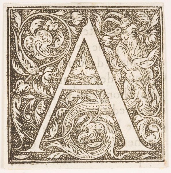
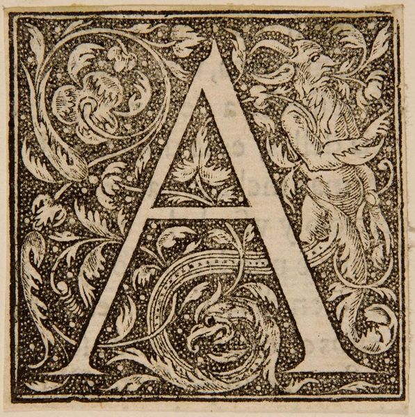
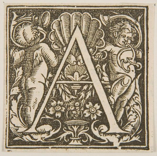
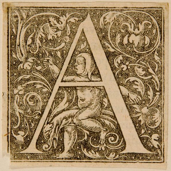
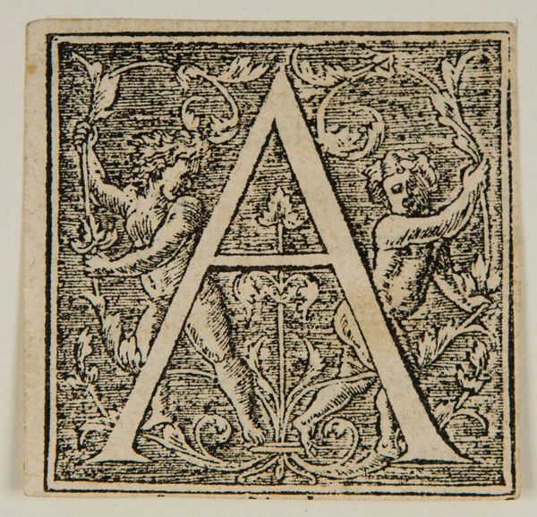
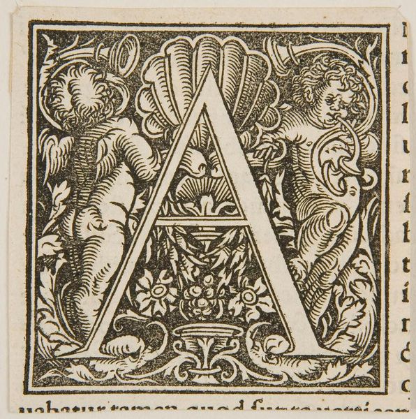
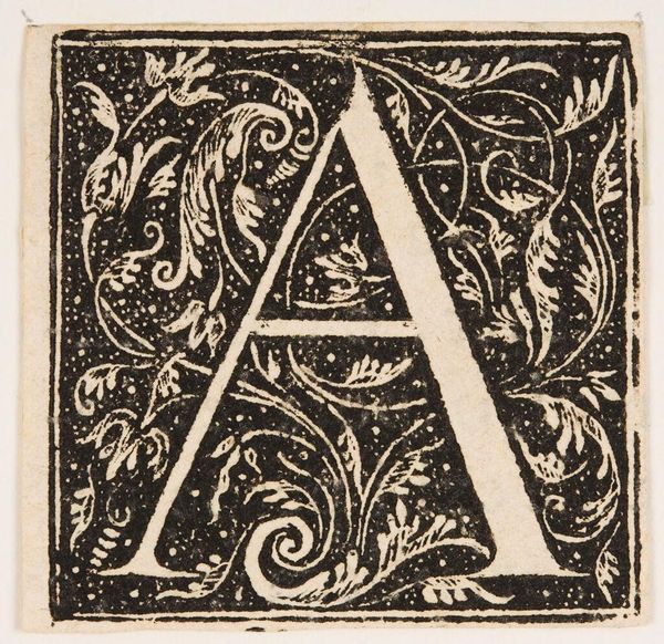
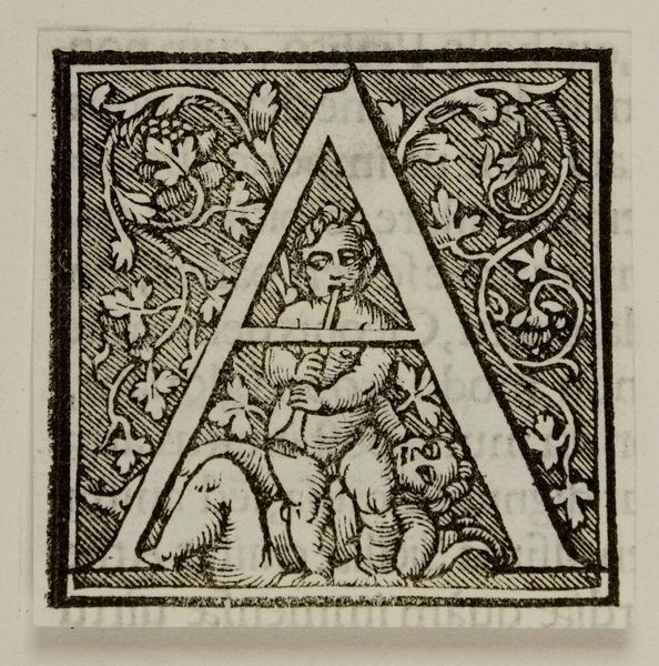
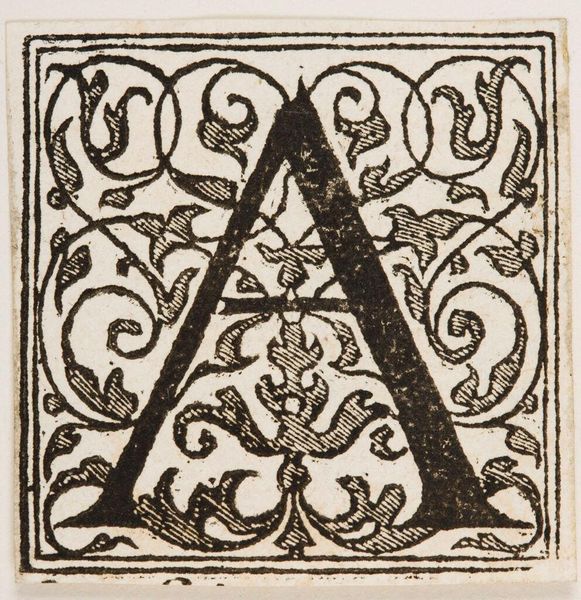
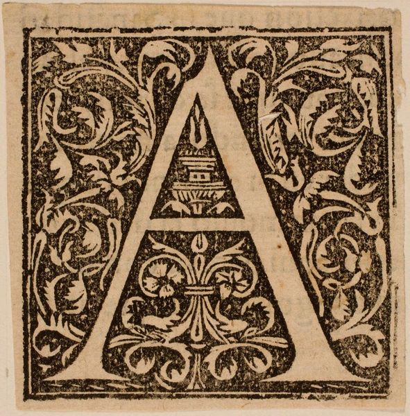
Editor: Here we have "Letter A," an anonymous artwork held at the Harvard Art Museums. The intricate detail within the stark black and white immediately catches my eye. What compositional elements stand out to you? Curator: The interplay between positive and negative space is particularly striking. The solid form of the letter A is juxtaposed against the busy background. Notice the symmetrical arrangement of figures and foliage around the letterform. Editor: The figures almost seem to be emerging from the letter itself, like it’s a portal. Curator: Indeed. The artist uses line and texture to create a sense of depth and movement within a limited field. Editor: I hadn’t thought of it that way. It’s amazing how much detail can be conveyed with so few elements. Curator: Exactly. The artist masterfully uses the basic elements of art to create something quite engaging. Editor: I'll certainly look at typography differently going forward!
Comments
No comments
Be the first to comment and join the conversation on the ultimate creative platform.
More like this