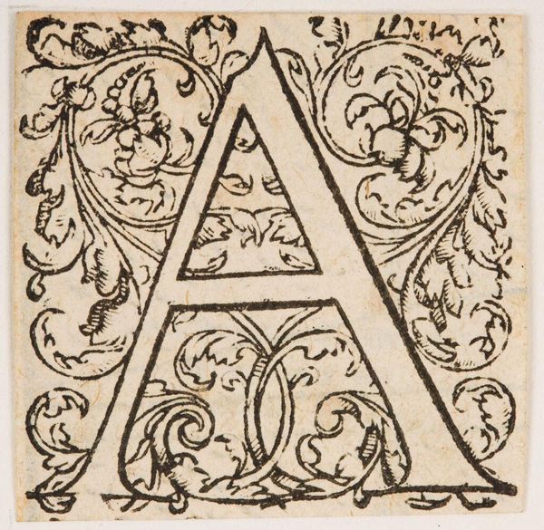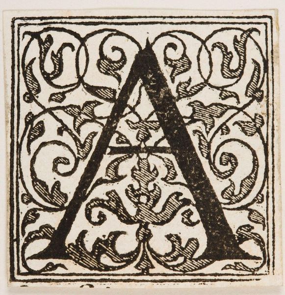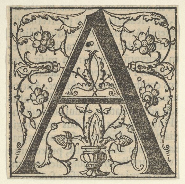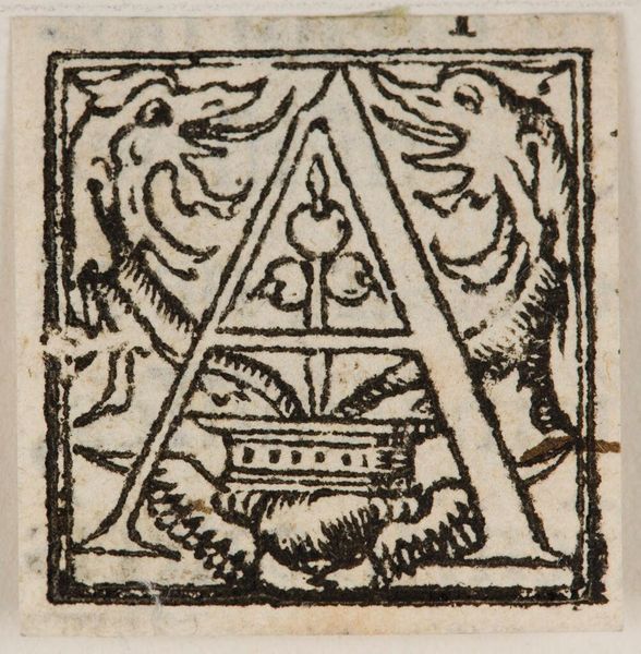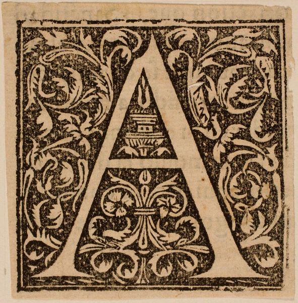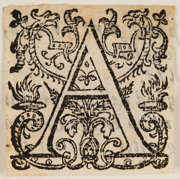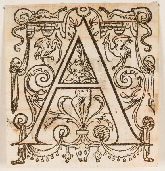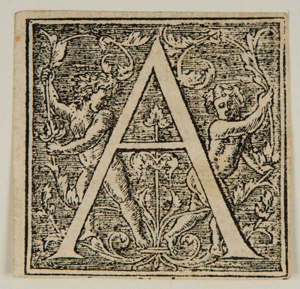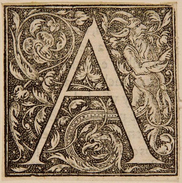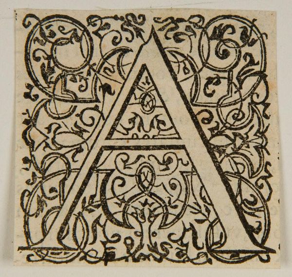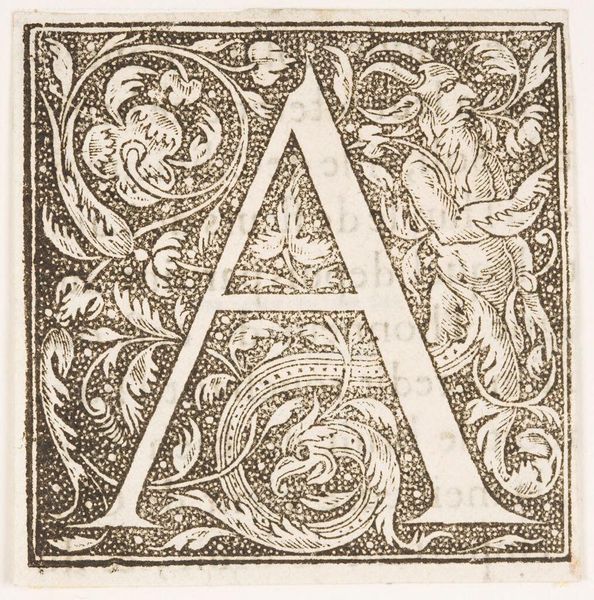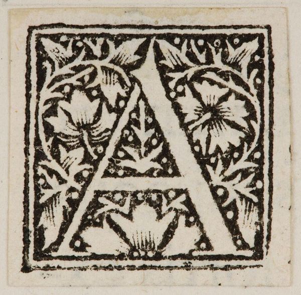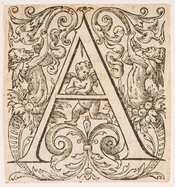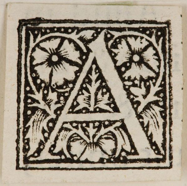
Letter A from the Press of A. Gessner c. 16th century
Copyright: CC0 1.0
Editor: This is Letter A from the Press of A. Gessner, by an anonymous artist. I’m drawn to the intricate floral patterns intertwining with the bold letterform. What do you see in this piece? Curator: Formally, the high contrast of black ink against the off-white paper creates a striking visual tension. The density of the vegetal design competes with the stark geometry of the letter. Note how the serifs of the ‘A’ mimic the curling tendrils. Editor: So the relationship between the letter and its ornamentation is key? Curator: Precisely. The figure/ground relationship is dynamic, each element vying for dominance. Consider the weight of the lines and how they guide the eye. Does the symmetry appeal to you? Editor: It does! I appreciate how analyzing the structure reveals new layers of meaning. Curator: Indeed. Focusing on form yields a richer understanding.
Comments
No comments
Be the first to comment and join the conversation on the ultimate creative platform.
