drawing, print, paper, typography
#
drawing
# print
#
paper
#
typography
#
calligraphy
Dimensions: height 140 mm, width 190 mm
Copyright: Rijks Museum: Open Domain
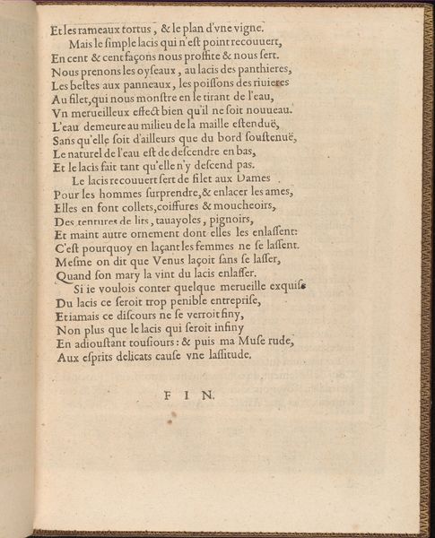
Curator: This is the second page of "Franstalig gedicht op de Nimfen van de Amstel," or "French Poem on the Nymphs of the Amstel," by Crispijn van de Passe the Younger, dating back to 1640. It's a print on paper, with elegant typography forming the body of the work. Editor: It breathes a strange solemnity...it is interesting how words themselves take on the visual weight of monument or memorial through this considered inking and page design. The formality almost seems to counteract the potential playfulness suggested by "nymphs". Curator: The method of production is key to understanding its cultural significance. Van de Passe was a master of engraving and printmaking. Prints like this weren't just art objects; they were vectors for circulating ideas and literary works within a specific social sphere. Who was consuming these, how were they reading them, and what labor processes underpinned them? Those considerations always intrigue me. Editor: Absolutely! You've got the artisanal craft alongside what seems to be intellectual or poetic craft. It begs one to meditate on what craft really entails, no? Beyond skilled trades? The visual layout echoes classic Roman inscriptions; perhaps evoking permanence and the poet’s hope for longevity of verse. One imagines them performing the poem... Or being displayed somewhere rather significant as though they have deep political importance. Curator: Exactly. The choice of typography, the precise layout – all tools Van de Passe employed. Considering this poem appeared alongside images in a book celebrating Amsterdam, we should perhaps appreciate how visual elements serve to legitimise Amsterdam as a cultured centre. A mercantile city making intellectual claims through humanist verses on a godly Amstel River and nymphological allusions. Editor: Right...the nymphs are, then, civic muses rather than beings. I love your phrase “mercantile city making intellectual claims.” Maybe art’s grand role is making statements. Though, for me, I often circle back to something very simple— the careful hand placing each letter- the artist giving shape to thought; each word building on others into meaning for people. Curator: Precisely! The material conditions are essential, but the layers of symbolism that emerge are what still fascinate viewers today. Editor: Definitely…Thank you. Looking more carefully because of that insight gives it resonance now!
Comments
No comments
Be the first to comment and join the conversation on the ultimate creative platform.
More like this