drawing, paper, ink
#
drawing
#
pen illustration
#
pen sketch
#
hand drawn type
#
paper
#
personal sketchbook
#
ink
#
hand-drawn typeface
#
ink drawing experimentation
#
pen-ink sketch
#
pen work
#
sketchbook drawing
#
sketchbook art
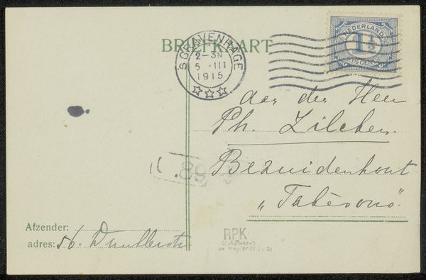
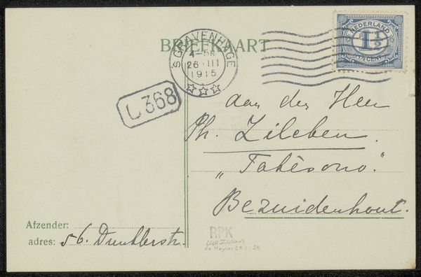
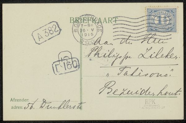
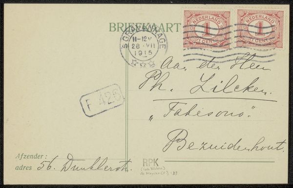
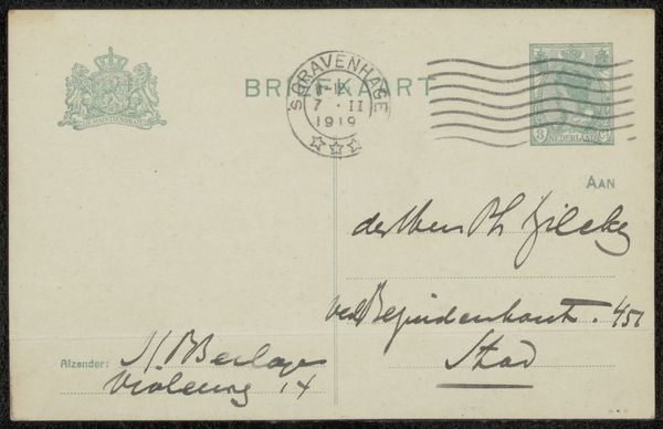
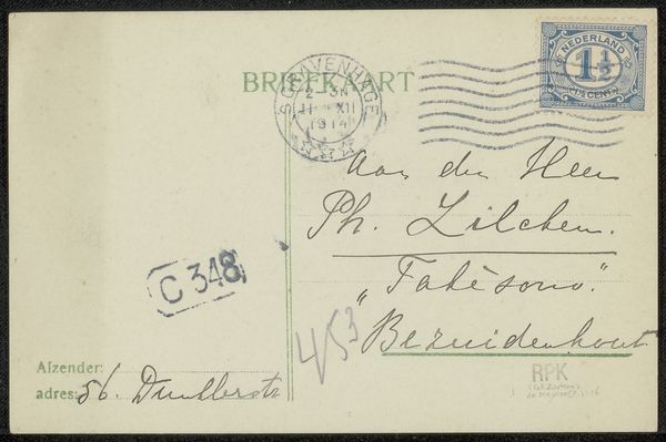
Copyright: Rijks Museum: Open Domain
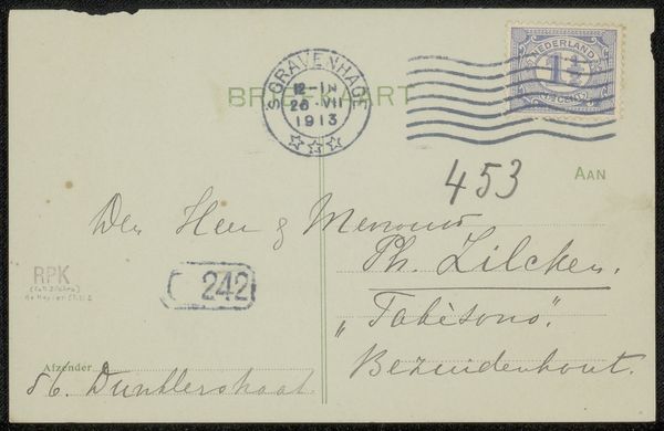
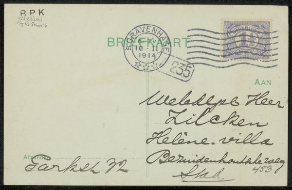
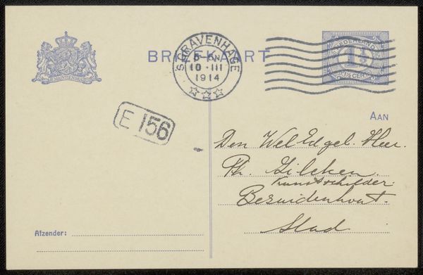
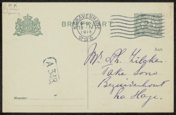
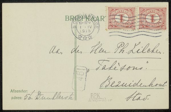
Editor: This unassuming card, entitled "Briefkaart aan Philip Zilcken," predates 1915, created with ink on paper. What strikes you first about this humble object? Curator: The linearity, decidedly. Look at the dynamic interplay between the crisp lines of the postage markings and the fluid, cursive script. It’s a conversation between form and formlessness. Editor: The stamps and postal markings certainly provide a structured contrast to the handwriting, which varies greatly in pressure. It reveals the writing implements used and, perhaps, the writer’s urgency, doesn't it? Consider the availability and expense of different pen types at that time. Curator: Precisely. Observe how the script's legibility is not uniform, shifting between elegant loops and hurried strokes. Semiotically, it speaks volumes about communication—both its intended precision and its inherent subjectivity. The image almost deconstructs itself. Editor: This wasn't conceived as "high art" but it’s incredibly telling about the artist, Fenna de Meyier, and the social rituals of her time. Epistolary exchanges provided ways of connection; think of the sender's materials and how that shaped her message. Curator: I’m most intrigued by the formal components of her gestures across the card, though; its compositional arrangement—how the hand-drawn text interacts with the official postal elements—establishes visual relationships beyond mere function. It is in the space, both visual and metaphysical, where intent meets design. Editor: So true. There's an intimate dialogue created through the use of these everyday materials and this physical transfer. I think we both found something unique within a simple correspondence card. Curator: Agreed, it reveals art within utility—intention rendered formally through mundane means.
Comments
No comments
Be the first to comment and join the conversation on the ultimate creative platform.
More like this