drawing, ink, pen
#
drawing
#
hand-lettering
#
hand drawn type
#
hand lettering
#
personal sketchbook
#
ink
#
hand-drawn typeface
#
pen-ink sketch
#
pen work
#
sketchbook drawing
#
pen
#
sketchbook art
#
coloring book page
Copyright: Rijks Museum: Open Domain
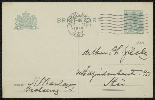
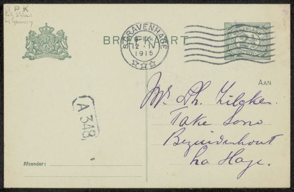
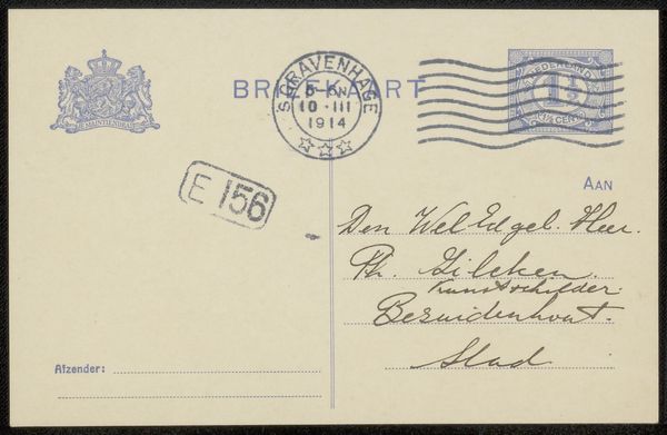
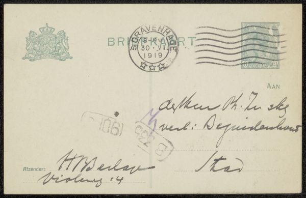
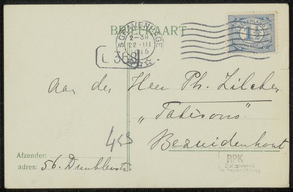
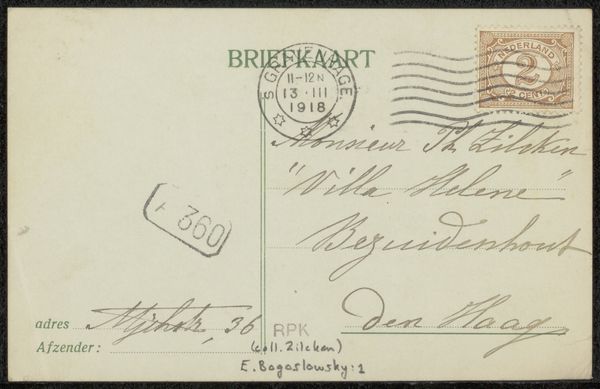
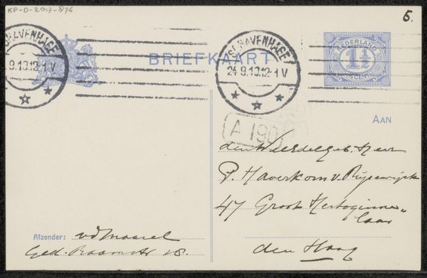
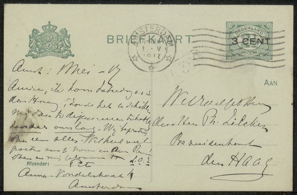
Curator: This is "Briefkaart aan Max Dittmar Henkel," a pen and ink drawing made before 1913 by Theo van Hoytema. It's currently held at the Rijksmuseum. Editor: My first impression is one of understated charm; there’s something intimate about seeing personal correspondence laid bare like this. It is the kind of intimacy one expects to see within the pages of a personal sketchbook. Curator: Precisely. Beyond its surface-level appeal, this postcard represents a slice of early 20th-century communication, and, crucially, reveals connections within artistic and intellectual circles of the period. Editor: Indeed, the handwritten text creates an interesting compositional challenge. It balances utility with artistic intent. Curator: Yes. The gesture of writing is not merely functional. Here it's embedded within a historical and social context. These everyday communications were largely how political discourse, even the propagation of particular philosophies, transpired within smaller, more private groups. Note the date stamp—October 24, 1913. What political and social changes were happening at that specific time? Editor: I’m drawn to the contrasting forms within the handwritten typeface; it has an interesting juxtaposition of sharp, angular strokes and softer, more fluid lines. It strikes me as informal yet deliberate. Curator: Looking at this postcard today also brings into view issues of access and privilege in archival spaces, doesn’t it? Who gets remembered? Whose mail is considered worthy of preservation and display, and what does that say about our curatorial values? Editor: That’s a powerful point. Thinking purely visually, though, there's a raw, almost unfinished quality. I am sure that contributes to its emotional appeal. It's as if we are witnessing a momentary exchange frozen in time. Curator: Agreed. And reflecting on Hoytema’s choice of medium—simple pen and ink on a pre-printed card—emphasizes that, often, it's in these mundane traces of existence where some of the most potent societal dialogues are found. Editor: A fascinating exploration, indeed, highlighting how the intersection of form and context deepens our understanding of seemingly simple artefacts. Curator: It seems we can consider that which appears as "everyday" to expose more about who we are and what we remember—or choose to forget.
Comments
No comments
Be the first to comment and join the conversation on the ultimate creative platform.
More like this