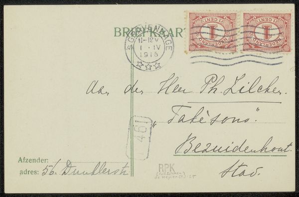
drawing, print, ink, pen
drawing
script typography
hand-lettering
hand drawn type
hand lettering
personal sketchbook
ink
hand-drawn typeface
pen-ink sketch
pen work
sketchbook drawing
pen
sketchbook art
calligraphy
Copyright: Rijks Museum: Open Domain
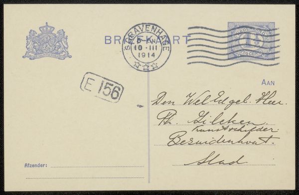
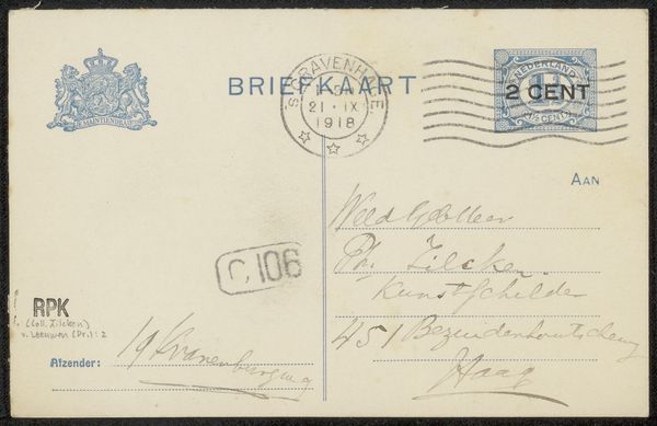
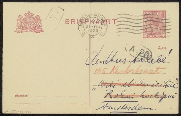
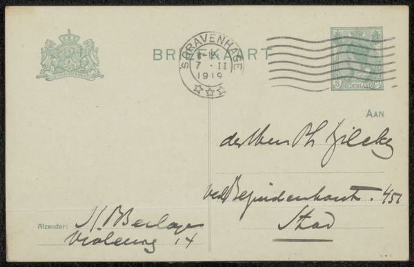
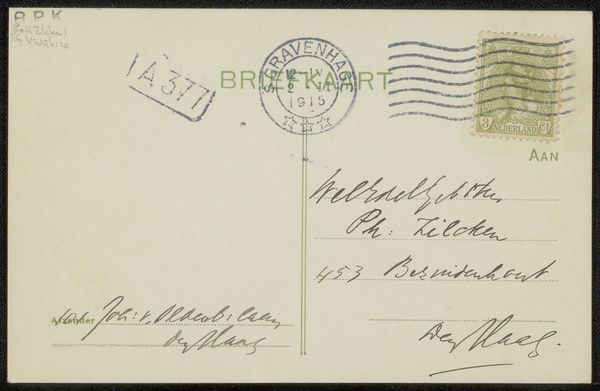
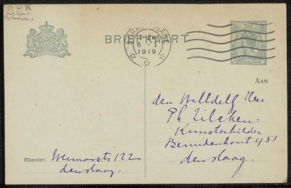
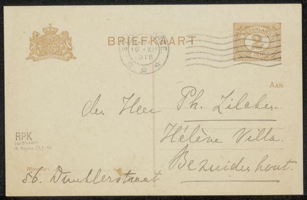
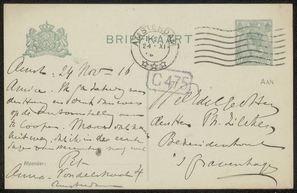
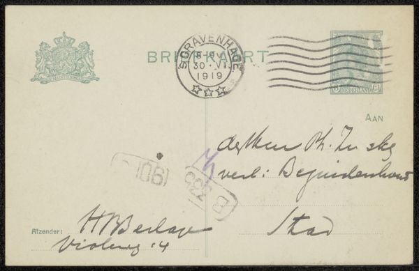
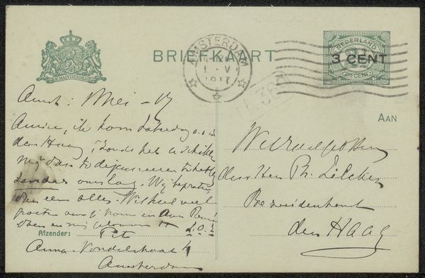
Editor: Here we have "Briefkaart aan Philip Zilcken," a pre-1915 drawing, likely a print with ink, by Carla van Geuns. It's a postcard featuring some very elegant script typography, and it definitely evokes a sense of early 20th-century correspondence. How do you interpret this work? Curator: This piece speaks volumes about the culture of communication in a pre-digital age. Beyond just the aesthetic appeal of the hand-lettering and calligraphy, consider the socio-economic context. Who had the literacy skills, the leisure time, and the resources to engage in such correspondence? The postal system itself was a vital, and sometimes fraught, public service. Editor: That's interesting. I hadn't thought about access. The handwriting does suggest a certain level of education, I suppose. Curator: Exactly. The very act of sending a handwritten note, especially in such a stylized form, implies a network of social relationships and a system of privilege. This wasn't simply about conveying information, but also about performing identity and solidifying social bonds. How does the notion of a "briefkaart" -- a brief card -- intersect with gendered expectations and class differences of the time? Editor: Hmm, I guess a shorter, less formal note might suggest different social dynamics compared to a longer letter. Perhaps reflecting a more public or transactional exchange. Curator: Precisely! Now think about the imagery embedded on the card - the official emblems and stamps. What power structures were at play? This card isn't merely a personal message; it's a document embedded in a complex web of institutional authority and social convention. The "briefkaart" embodies class status. Editor: It's fascinating to think of something so small and seemingly personal as being so intertwined with larger societal forces. Curator: And it's a good reminder that art, in all its forms, always operates within, and often reflects, the power dynamics of its time. Editor: Thank you for illuminating the intersections between society and what at first seemed like a basic correspondence card. It provides insights into that period.
Comments
No comments
Be the first to comment and join the conversation on the ultimate creative platform.