drawing, ink, pen
#
drawing
#
hand-lettering
#
hand drawn type
#
hand lettering
#
personal sketchbook
#
ink
#
hand-drawn typeface
#
ink drawing experimentation
#
pen-ink sketch
#
pen work
#
sketchbook drawing
#
pen
#
sketchbook art
Copyright: Rijks Museum: Open Domain
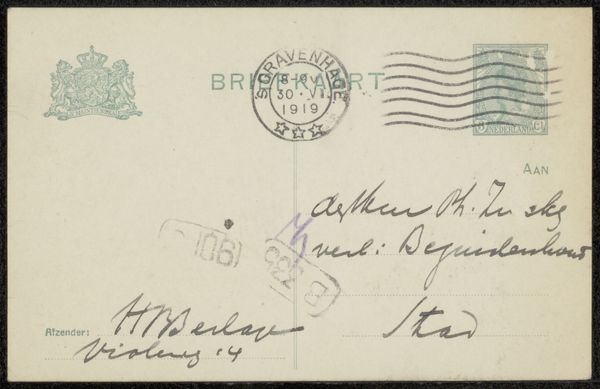
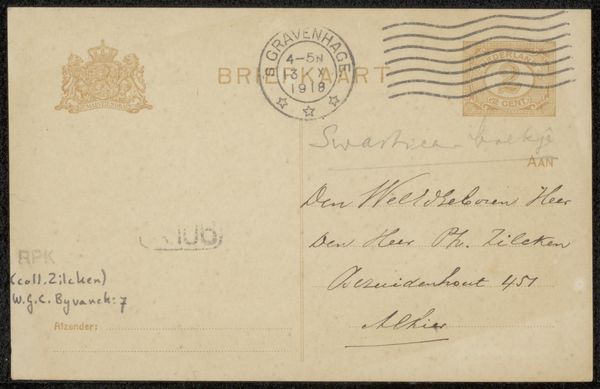
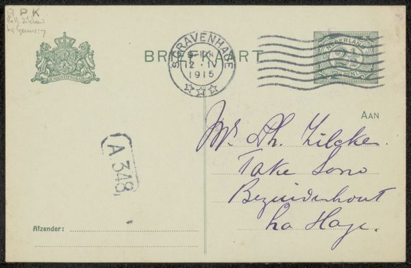
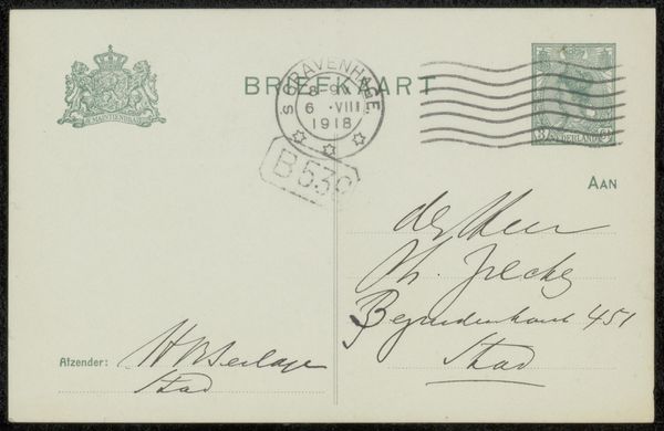
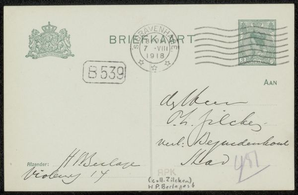
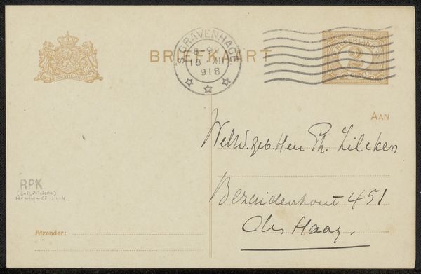
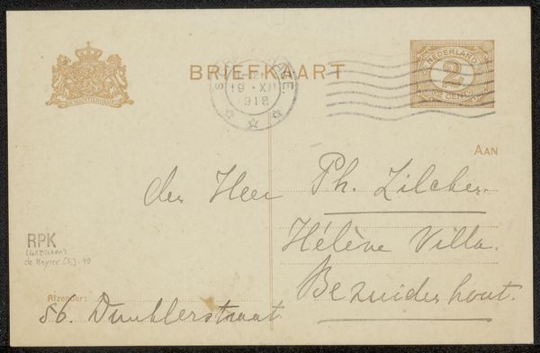
This is the back of a 1919 postcard to Philip Zilcken by Hendrik Petrus Berlage, constructed from paper with ink markings. The surface is divided into distinct zones, each with its own set of signs. Notice how the top left features a heraldic crest and textual information. The green ink denotes official postal use, contrasting with the handwritten address and sender details in black. A series of horizontal wavy lines visually suggest the path of its journey. This visual language communicates not just information, but also a sense of time and distance. The composition of the card functions as a structured system of communication. The layout also reflects the modernist ethos of rational design. Information is clearly segmented, the handwriting provides a personal touch, yet the overall effect is one of efficiency and order. Consider how this design elevates a simple form of communication into a sophisticated piece of visual culture. It prompts us to see everyday objects as carriers of both aesthetic and cultural meaning.
Comments
No comments
Be the first to comment and join the conversation on the ultimate creative platform.
More like this