drawing, graphic-art, print, paper, ink
#
art-deco
#
drawing
#
graphic-art
# print
#
old engraving style
#
paper
#
ink
#
linocut print
#
pattern repetition
#
monochrome
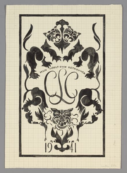
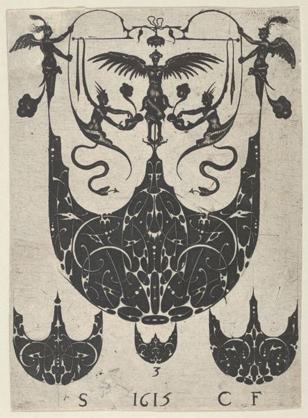
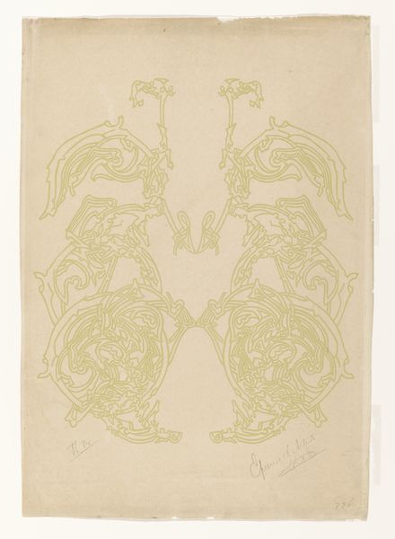
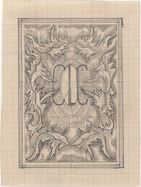
Dimensions: height 431 mm, width 335 mm
Copyright: Rijks Museum: Open Domain
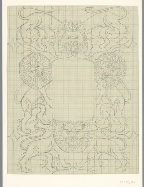
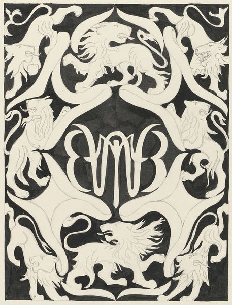
Editor: Here we have Carel Lion Cachet’s "Ontwerp voor de ex libris van Carel Lion Cachet," made in 1941, employing ink, paper and print techniques. It gives off a somewhat heraldic vibe, quite rigid. What can you tell me about it? Curator: This print design speaks to the complexities of identity and representation within a specific historical moment. The repeated, almost symmetrical imagery and the use of the family name begs the question: what is Cachet trying to convey through these symbolic choices, especially considering this was created during World War II? Editor: It’s interesting to consider the context. So the choice of imagery isn’t just decorative, but potentially a statement? Curator: Precisely. The roaring lion, the symmetry—they all suggest power, legacy, and a perhaps even a resistance to erasure. It’s crucial to dissect how visual languages become carriers of ideological meaning, particularly when considering the rise of fascism and nationalism during this era. How do you see this playing into the aesthetic choices here? Editor: I guess I hadn’t considered it in that way, viewing the animal motifs as powerful... perhaps defiant under occupation. Curator: It is a poignant reminder of how art, even in its most functional forms like a bookplate, can serve as a visual declaration. Analyzing such artworks demands that we engage with not just art history but also the broader tapestry of social and political narratives in the artwork itself. Editor: Thanks for this perspective. It definitely shifted my view and gave me a deeper appreciation for this seemingly simple graphic. Curator: It's a necessary reminder of the subtle yet forceful dialogues art can hold, if we're willing to listen.
Comments
No comments
Be the first to comment and join the conversation on the ultimate creative platform.
More like this