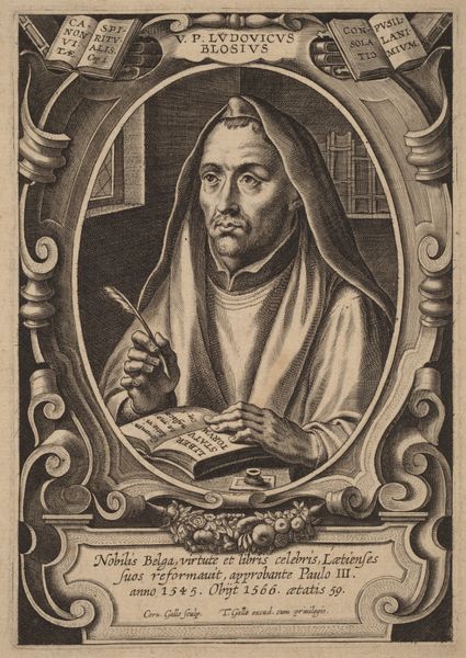
drawing, print, engraving
#
portrait
#
drawing
#
medieval
#
baroque
# print
#
pen illustration
#
old engraving style
#
caricature
#
figuration
#
limited contrast and shading
#
line
#
pen work
#
engraving
Dimensions: height 148 mm, width 103 mm
Copyright: Rijks Museum: Open Domain
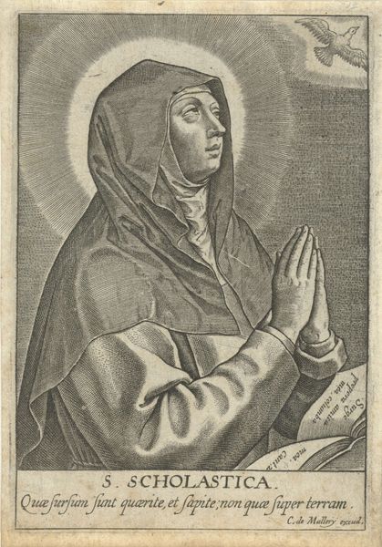
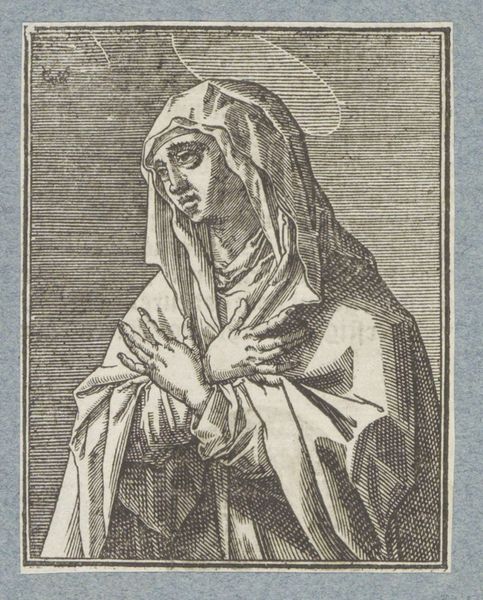
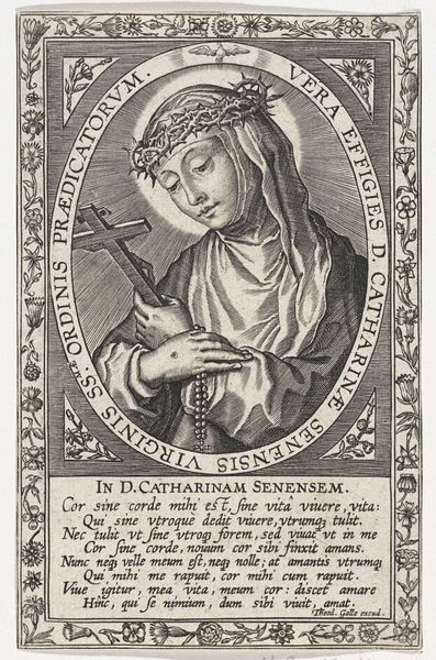
Curator: Oh, what a strikingly serene portrait. It gives me a sense of profound tranquility. Editor: Indeed. This is "Portret van H. Scholastica," or "Portrait of St. Scholastica," dating somewhere between 1611 and 1647, crafted by Michel van Lochom. It's an engraving, so we're seeing it in print form. Curator: Van Lochom captured something really beautiful here. Her face is so calm, even hopeful. The framing device, with its embellishments, feels…well, very baroque, even a little busy for my taste against that serenity. And the soft light falling behind her—it's not just light, it's almost a presence, right? A little dove seems to dive out of that light! Editor: Absolutely. Let's analyze the formal aspects further. The oval frame isolates and elevates Scholastica. Look at the strategic use of lines – thin, deliberate strokes defining her features versus the heavier, more decorative lines forming the frame itself. There is definitely an organized balance that creates a sense of formality. The figure’s stillness contrasts dramatically against the ornamentally engraved surround which uses much curvilinear style. The whole thing verges into Medieval territory, even with the Baroque trappings! Curator: Medieval austerity meets Baroque flamboyance! That contrast resonates. The dove and her almost-clasped hands suggests deep devotion; and then the text at the bottom, hemmed in by yet more Baroque flurishes makes her appear hemmed in herself...like being enclosed in your faith. It gives me this odd tension between devotion and a kind of silent endurance... She appears to stare beyond it all though... Editor: Notice too, how Van Lochom manipulates light and shadow despite the constraints of the engraving medium. Light isn't merely illumination; it signifies divine presence and directs your attention to the key subject, adding symbolic weight to the entire composition, don't you think? The inscription beneath confirms her as the sister of Saint Benedict, reinforcing the themes of devotion and religious order that are structurally and visually encoded within. Curator: It makes you wonder what her life might have been like. Not a wild time, maybe, but her spirit really shines through. Almost feels like a challenge for us in this world of infinite choice...can one embrace a more constrained spiritual path in an age where you can access everything? The limited contrast really highlights the important aspects of her features. The pen work has an interesting old engraving style! Editor: A question art continually poses - its historical constraints and visual possibilities can illuminate very new perceptions. Curator: Indeed. It gives us so much to contemplate. A simple portrait can have such a resonating meaning for anyone looking at it, from any moment in time.
Comments
No comments
Be the first to comment and join the conversation on the ultimate creative platform.
More like this