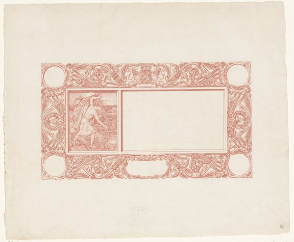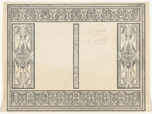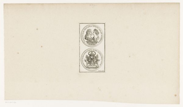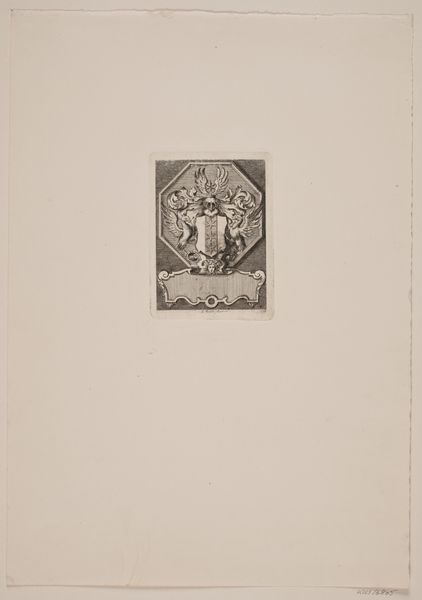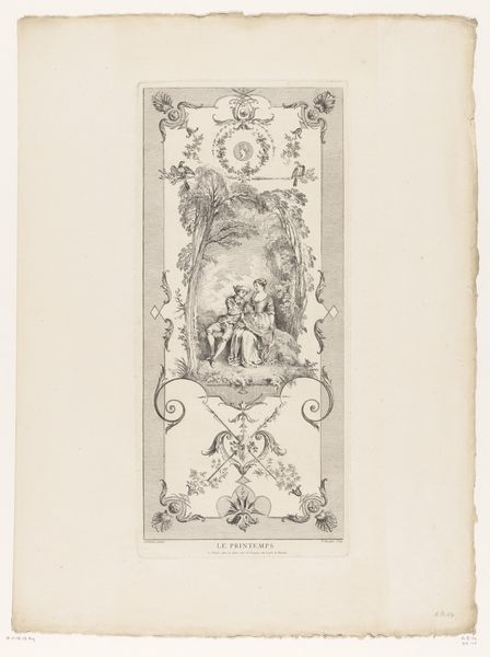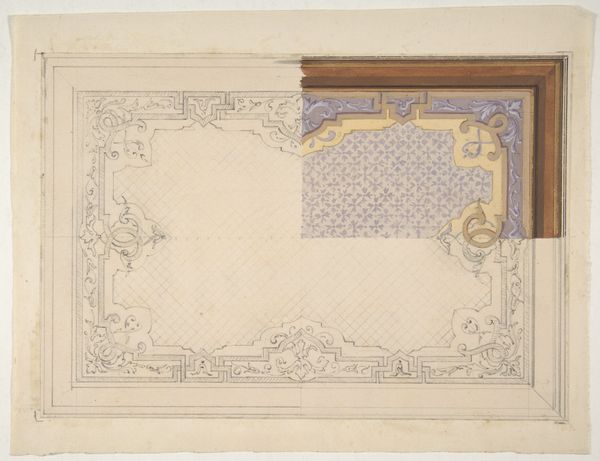
Omslagontwerp voor: Wendingen, Houtsnijdersnummer, 1919 1919
0:00
0:00
richardnicolausrolandholst
Rijksmuseum
drawing, graphic-art, print, paper, woodcut, poster
#
photo of handprinted image
#
drawing
#
graphic-art
#
art-nouveau
# print
#
etching
#
paper
#
linocut print
#
woodcut
#
symbolism
#
poster
Dimensions: height 568 mm, width 748 mm
Copyright: Rijks Museum: Open Domain
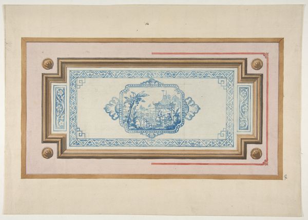
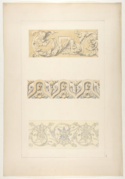
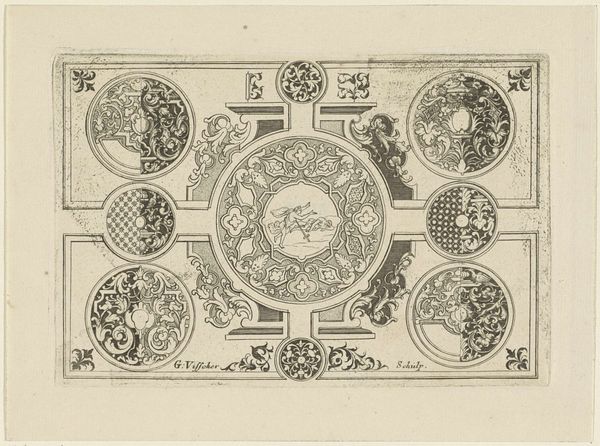
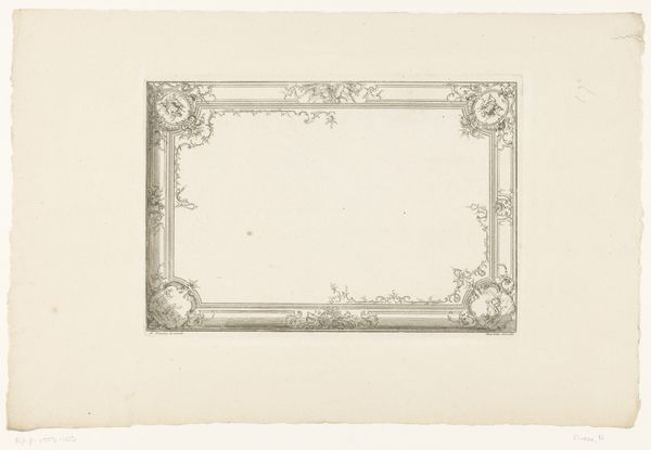
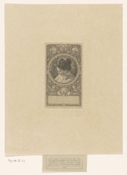
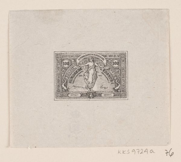
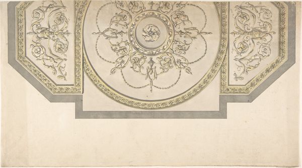
This is Richard Nicolaüs Roland Holst’s cover design for the journal ‘Wendingen’, made in 1919, probably with watercolor or gouache on paper. Look at the way Holst layers these soft, muted greens and grays, creating a hazy, dreamlike atmosphere. You can sense the artist figuring things out as he goes. The figures are these sort of ghostly forms intertwined at the center, surrounded by almost Art Nouveau style details. Notice the careful hatching and cross-hatching, building up tone and texture, giving a real sense of depth and volume, even within such a limited palette. Then, look at the lettering, the way he’s carved out each letter with such precision, like a sculptor working with stone. It all comes together to create this feeling of timelessness. It reminds me a little of the symbolist Odilon Redon, but with a graphic, almost architectural sensibility. It’s like Holst is inviting us to step into a world where the boundaries between reality and imagination blur. Isn’t that what art is all about, anyway?
Comments
No comments
Be the first to comment and join the conversation on the ultimate creative platform.
