Copyright: Modern Artists: Artvee
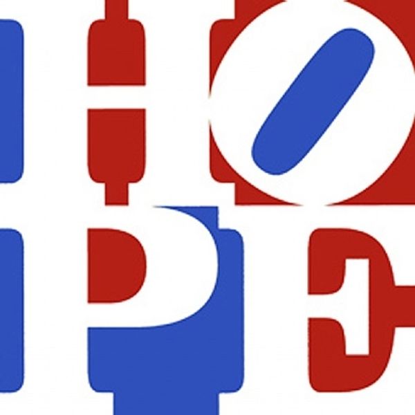
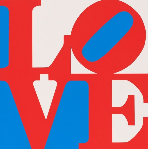
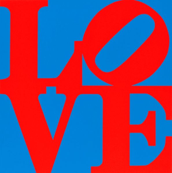
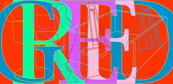
Robert Indiana made this piece, titled "Hope," using a screen-printing process, turning language into image. The color choices—red, blue, and white—are so declarative! I feel like he started with an idea, then simplified and simplified, ending up with these powerful, hard-edged forms. The surface is smooth, almost machine-made, but the colors vibrate against each other, especially the red against the blue. Look at the "O," how the blue oval pushes against the red, creating tension. You can see that “Hope” is derived from “Love”, but it’s like the hopeful cousin who’s trying to make a difference in the world. Indiana’s work reminds me a little bit of Corita Kent, the pop-art nun, in that they both use text in their pieces. But Indiana's work has a starkness, whereas Kent is all about joyful abundance. In the end, it all comes down to how we want to see the world, right?
Comments
No comments
Be the first to comment and join the conversation on the ultimate creative platform.
More like this