Copyright: Modern Artists: Artvee
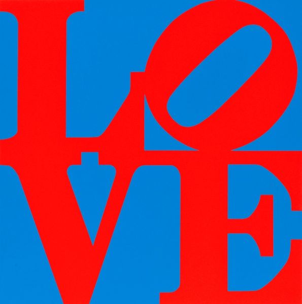
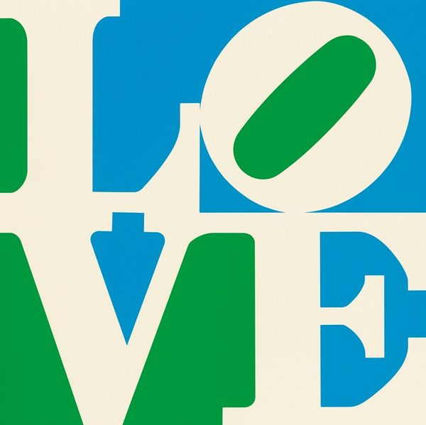
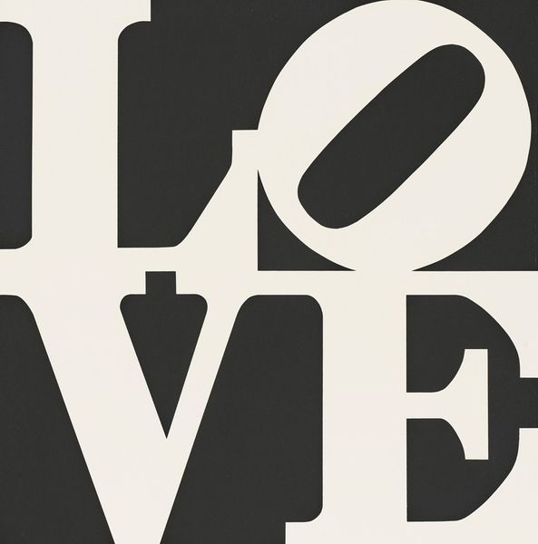
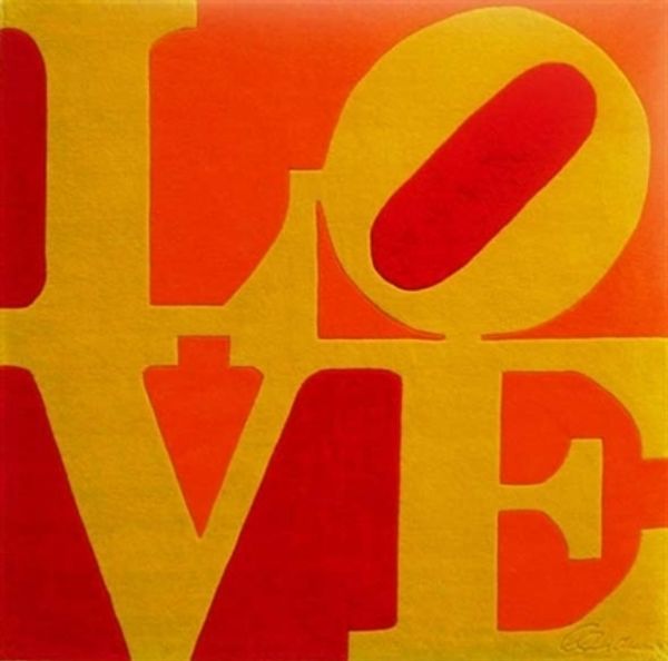
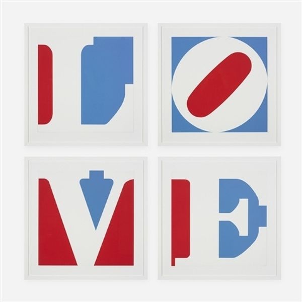
Editor: Here we have Robert Indiana's "Book of Love #7," from 1996, done with acrylic paint and print. It’s so vibrant and graphic, almost like a sign you’d see on the street, but it uses that really recognizable LOVE design. What jumps out at you when you look at this? Curator: Well, immediately I see the interplay of memory and expectation. The iconic "LOVE" image, with its stacked letters and tilted "O," is instantly recognizable; it’s become embedded in our collective visual vocabulary. Editor: Right! I’ve seen it everywhere. Curator: Precisely! Indiana's genius lies in taking a universal concept and distilling it to its most fundamental visual form. But let's consider the symbolism. Red is passion, blue stability… does the arrangement change your understanding of those terms? The tilted O subverts our expectation of order, almost like love itself; slightly off-kilter. Editor: That's interesting; I hadn't thought about the tilted 'O' as destabilizing the whole composition like that. I was too busy seeing just 'LOVE'. Curator: The power of iconography! Now, consider this in light of Indiana's earlier work and the broader Pop Art movement. What cultural echoes do you hear? Editor: It’s so mass-producible, I see echoes of Warhol and commercialism for sure, but also…maybe a bit naive? It feels sincere in its message. Curator: And there you have it! The tension between commercial image and heartfelt emotion. Indiana’s work speaks to how symbols shape our understanding of something as deeply personal as love. A great reflection, don’t you think? Editor: Definitely! I’ll never see it the same way again. Thanks!
Comments
No comments
Be the first to comment and join the conversation on the ultimate creative platform.
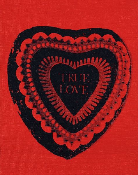
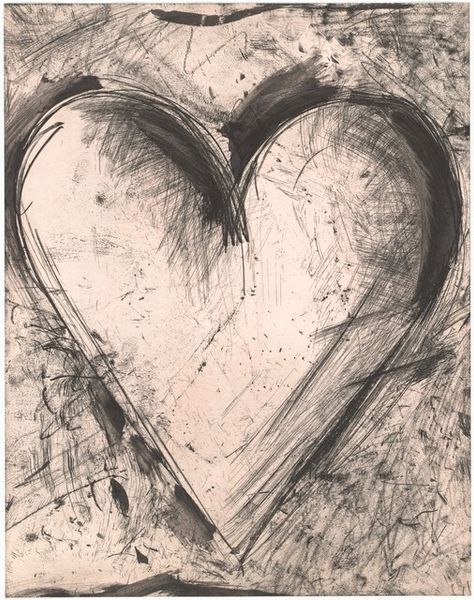
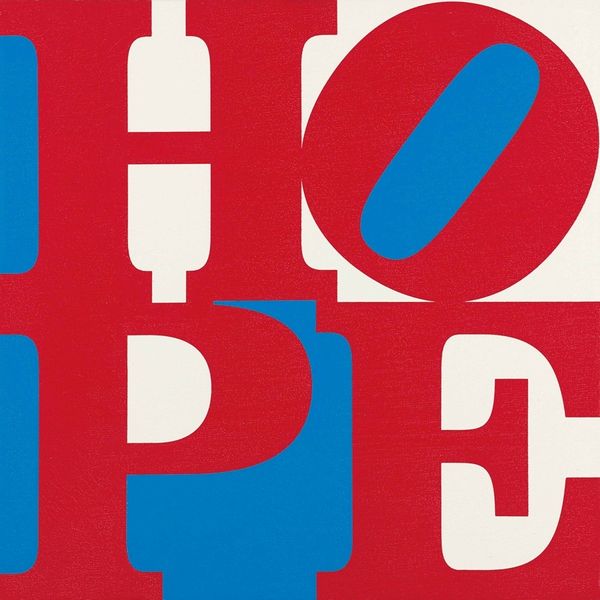
More like this