Copyright: Robert Indiana,Fair Use
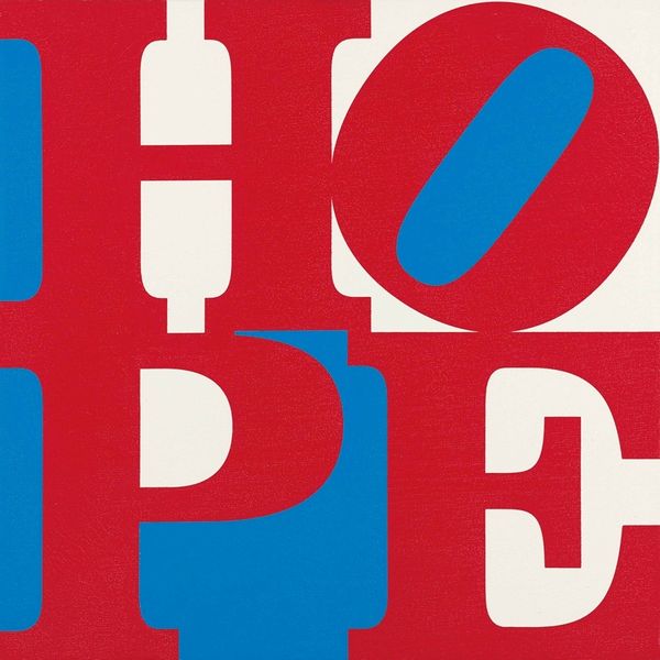
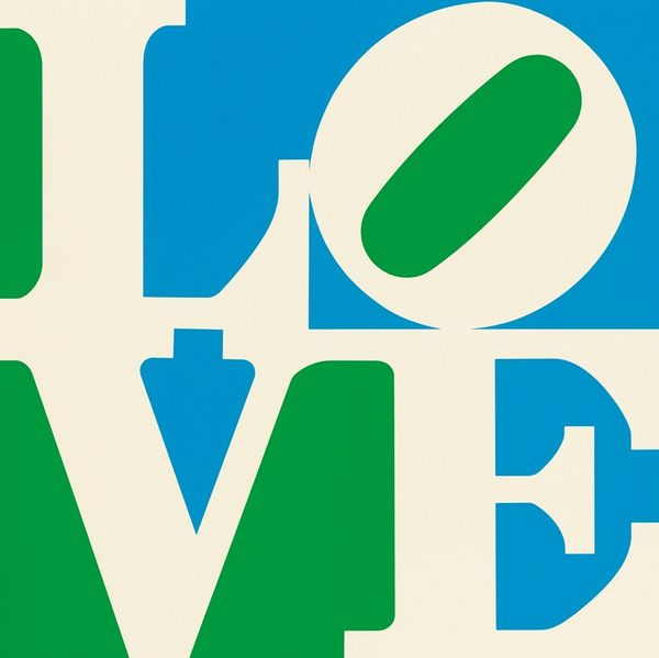
Robert Indiana’s ‘Hope’ feels like a sign, a flat graphic rendered in blocky stencils of red, white, and blue. The hard edges and crisp lines suggest an almost mechanical, mass-produced quality. Looking at the tilted ‘O,’ nestled in the upper right corner, I wonder about the choice to disrupt the perfect geometry. That single shift makes the word less stable and more dynamic. It's like a little hiccup, a moment of doubt or playfulness interrupting the otherwise straightforward message. The physicality of the paint is absent here, it's all about surface and symbol, and perhaps that’s the point. These colours are like a shorthand for Americana, for better or worse. I think of Jasper Johns, who also worked with letters and flags. Both artists challenge us to look at the familiar with new eyes, questioning the meanings we take for granted. Art is a conversation, a constant remixing of ideas across time. Indiana's 'Hope' reminds us that even the simplest forms can hold complex emotions.
Comments
No comments
Be the first to comment and join the conversation on the ultimate creative platform.
More like this