graphic-art, print
graphic-art
Dimensions height 126 mm, width 93 mm
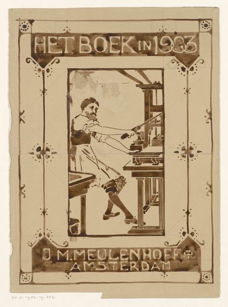
Editor: Here we have "Advertentie van Steendrukkerij voorheen Amand" by Johann Georg van Caspel, a print dating from 1880 to 1928. The limited palette gives it a unified and almost antique feel. I’m immediately struck by how the image is both representational and graphic, and that tension is really interesting. What do you make of this work? Curator: Formally, the use of line and shape dominates the work. Observe how Van Caspel divides the space. There is a very shallow depth of field with a background suggesting more printers and printing equipment. What catches your eye most in that juxtaposition of foreground and background? Editor: I guess, how stylized it is! The almost blocky forms of the figures, combined with the highly decorative border, flatten the image. It seems like everything is equally important in the composition. Curator: Precisely. The image is meticulously organized; its design directs your eye, wouldn’t you agree? Consider the typefaces used in relation to the image; how do these fonts play a role in constructing the image and its meaning? Editor: The strong, bold font feels very assertive and clearly communicates what is being advertised. Plus, the font, figures, and decorations feel part of the same design. It’s almost like it is less about depicting reality and more about creating an aesthetically pleasing surface. Curator: Yes, I would agree. By analysing its construction in such a manner, it's clear this work prioritises design elements and composition over straightforward representation. Editor: I hadn't considered the degree to which design informed the entire print. Curator: Thinking about Van Caspel’s print in terms of its pure aesthetic values makes us understand its impact and elegance anew.
Comments
No comments
Be the first to comment and join the conversation on the ultimate creative platform.
More like this