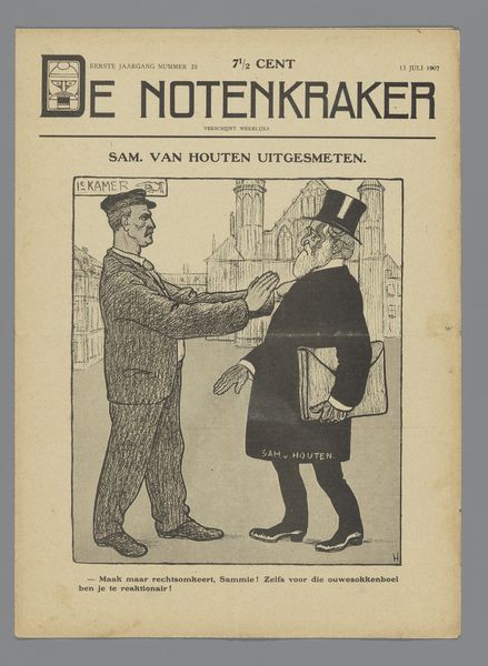
Affiche ter aankondiging van het tijdschrift 'De kroniek' Possibly 1895
theovanhoytema
Rijksmuseum
drawing, graphic-art, print, poster
drawing
graphic-art
art-nouveau
bird
symbolism
poster
Dimensions: height 389 mm, width 285 mm
Copyright: Rijks Museum: Open Domain
Curator: We're looking at a poster, “Affiche ter aankondiging van het tijdschrift ‘De Kroniek,’” likely from 1895, designed by Theo van Hoytema. It resides here at the Rijksmuseum. Editor: It's striking. Immediately, I'm drawn to the elegant, almost mournful atmosphere created by the monochromatic palette and those brooding storks. Curator: Hoytema was a master of lithography. This print beautifully showcases the Art Nouveau style and its engagement with symbolism, very much of its time. 'De Kroniek' was a journal keen to promote the arts, and this design is clever. Editor: Clever in what way? Curator: The storks evoke a certain Dutch pastoralism, even if tinged with melancholy. Storks themselves often symbolize, new life and domesticity, but their gaunt postures suggest the opposite in this visual context. Is 'De Kroniek' subverting the notion of home in some way? Editor: It’s the journal’s title at the top, rendered in that ornate, almost fairytale-like lettering, coupled with a progressive listing of contributors, signalling its place as a prominent cultural outlet. But beyond a visual hook, who was this artist and why are birds so central to his practice? Curator: Hoytema's work often featured birds, reflecting his deep interest in ornithology, he really put the nature he encountered around him front and centre. But as we peel away those nature layers we also confront something deeply rooted in social class: the journal's aim was progressive in design and sought a wide audience via subscriptions advertised at the bottom. The artist designed pieces which at face value were "pretty," or easy on the eye for audiences in an emerging consumer culture but the contents it held discussed socialist issues. Editor: So there's a play here: nature and ornithology for aesthetics while progressive thinking sits underneath. That blend speaks to broader trends as cultural output found ways to promote liberal, socialist, even anarchist philosophies and political thought. Curator: Absolutely, there's a real tension between decoration and societal critique here, something that often gets missed. I’m glad we drew that out. Editor: It gives me a fresh way of considering art’s dual role, that art can serve aesthetic and political functions, reflecting the tensions within society itself.
Comments
No comments
Be the first to comment and join the conversation on the ultimate creative platform.