drawing, paper, ink
#
drawing
#
aged paper
#
script typography
#
hand-lettering
#
old engraving style
#
hand drawn type
#
hand lettering
#
paper
#
personal sketchbook
#
ink
#
hand-drawn typeface
#
sketchbook drawing
#
handwritten font
#
calligraphy
Copyright: Rijks Museum: Open Domain
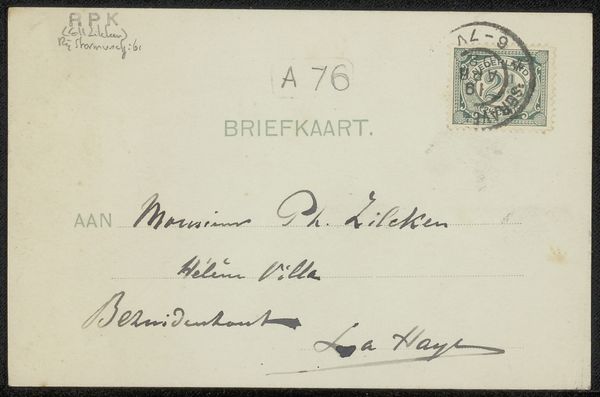
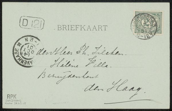
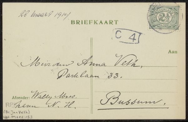
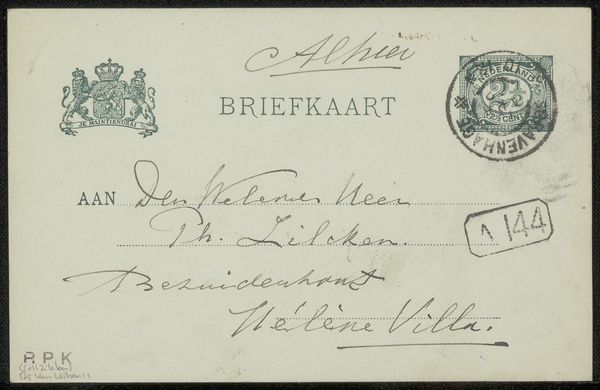
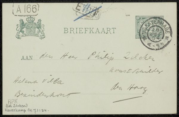
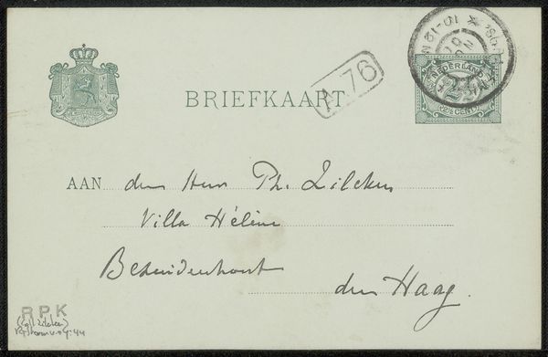
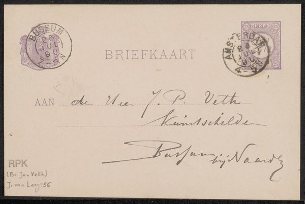
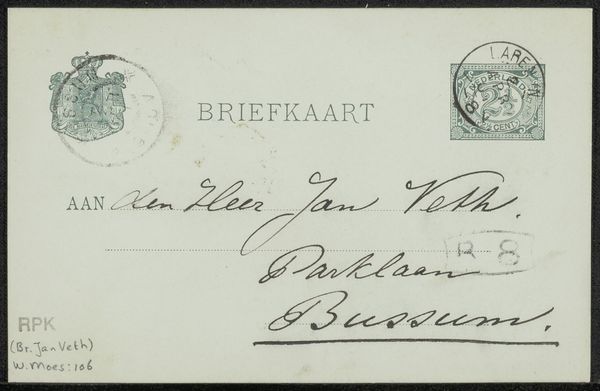
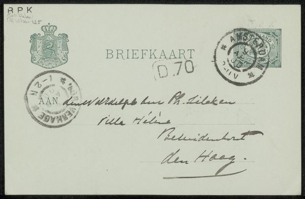
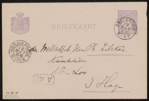
Curator: Let's turn our attention to this captivating piece, "Briefkaart aan Philip Zilcken," a drawing in ink on paper crafted before 1913 by Carel Nicolaas Storm van 's-Gravesande. It now resides here at the Rijksmuseum. Editor: Oh, a postcard! It's got that beautifully aged paper look that I just adore, makes me feel nostalgic, even if it's for a time I never knew. Look at that delicate calligraphy—almost like a forgotten dance. Curator: Precisely. The act of sending postcards was, and in some circles, still is, a gesture pregnant with social and cultural implications. In a time before instantaneous communication, it signifies deliberate connection, but also an engagement within a postal system and set of socio-political expectations tied to legibility, address, and dissemination. Editor: It’s wild to think someone meticulously wrote this out by hand. Did people just have better penmanship back then? The very deliberate curves and flourishes almost read as a little piece of art themselves! I bet you handwriting analysis would reveal interesting facts about its author... Curator: Certainly! There are layers of class and cultural capital embedded here, where mastery of script and etiquette became crucial signs of bourgeois cultivation, enabling entry into certain circles or professions. What this communicates through visual, material and epistolary language might challenge ideas on representation in more established and celebrated fine art practices from that era. Editor: Makes you wonder about the unseen narrative here, huh? A mundane communication elevated by an almost artistic care for the handwritten word and materiality. Curator: Indeed. It reveals how "everyday" or "low-brow" mediums contain vital insights. It calls into question what makes something art, or worth our critical attention, by virtue of form rather than context. Editor: Right. Thanks, Carel, for making me re-think something as humble as a postcard. Curator: And thank you for making us all reconsider our biases!
Comments
No comments
Be the first to comment and join the conversation on the ultimate creative platform.
More like this