drawing, paper, pen
#
drawing
#
script typography
#
hand-lettering
#
old engraving style
#
hand drawn type
#
hand lettering
#
paper
#
personal sketchbook
#
hand-drawn typeface
#
thick font
#
pen work
#
pen
#
handwritten font
Copyright: Rijks Museum: Open Domain
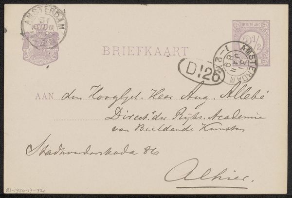
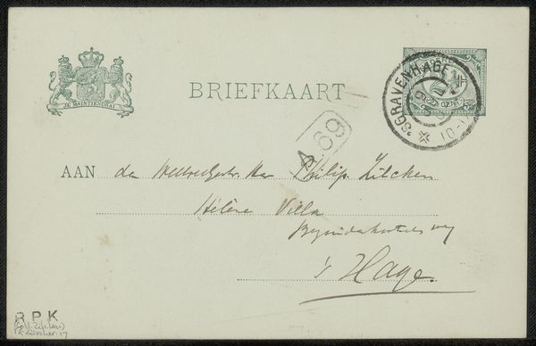
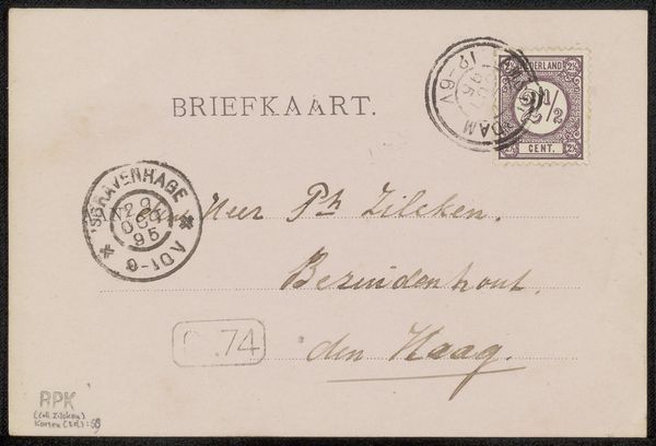
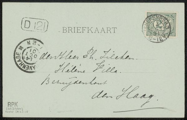
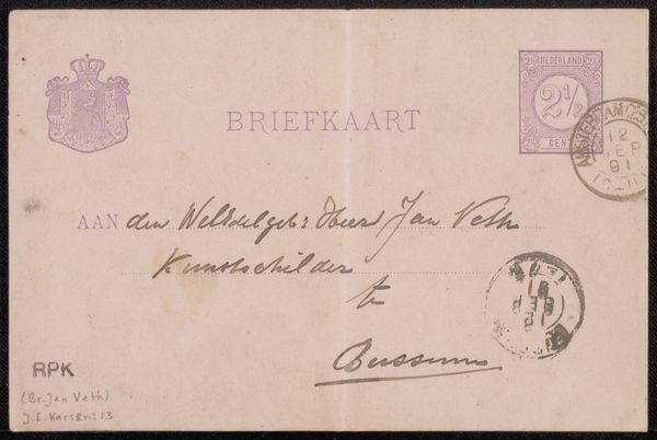
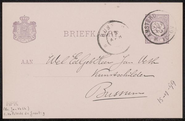
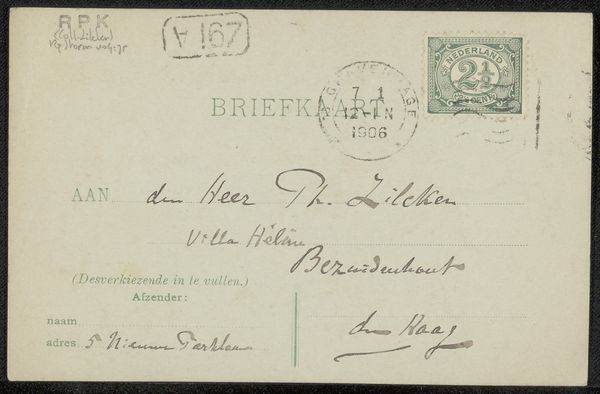
Curator: Today, we’re looking at "Briefkaart aan Jan Gerard Smits," believed to be from 1908, attributed to Julius Jacobus van de Sande Bakhuyzen, housed here at the Rijksmuseum. It's a simple pen and ink drawing on paper, the reverse side of a postcard. Editor: My immediate reaction is to the stark simplicity—the directness of the written word. It’s fascinating how line quality alone establishes mood here. Look at the confident curves, almost buoyant in places. Curator: Indeed. Notice how the script is almost a form of portraiture, hinting at the relationship between sender and recipient. There’s a formality, yet the handwritten nature offers intimacy. We see “Aan den Heer… J.G. Smits, Kunstschilder”, so “To Mr… J.G. Smits, Artist.” It's addressed to a fellow artist, which carries its own resonance. Editor: The pen work certainly has a beautiful textural quality. The heavier inked capital letters punctuate the lighter, flowing lowercase. The materiality and execution elevate a mundane postal item into something of significant visual interest. What is interesting here is the use of written line, form and texture where an artist often does this by color or tone. Curator: Absolutely, and considering its function, this simple card transmits layers of social and artistic meaning. It whispers of the artistic circles and connections of the time, even the social etiquette implied in the address. It uses convention, with its own embellishments of personal expression. Editor: The layout contributes too, it is almost Mondrian in form, with different areas that work together as parts. Even in this practical message, a creative structure emerges! The overall impression is like a fleeting conversation, almost poetic in its delivery. Curator: It's amazing how something as ordinary as a postcard, can offer us such a glimpse into the past. Editor: I completely agree; an economical masterpiece and a window into a particular artistic moment in time.
Comments
No comments
Be the first to comment and join the conversation on the ultimate creative platform.
More like this