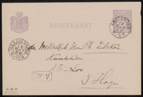
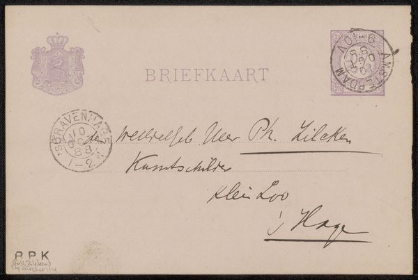
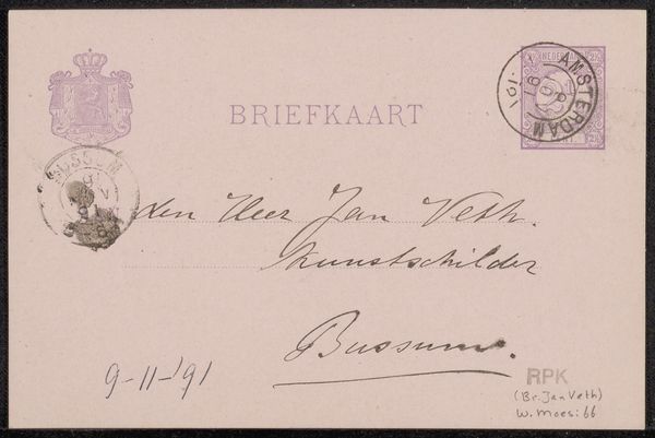
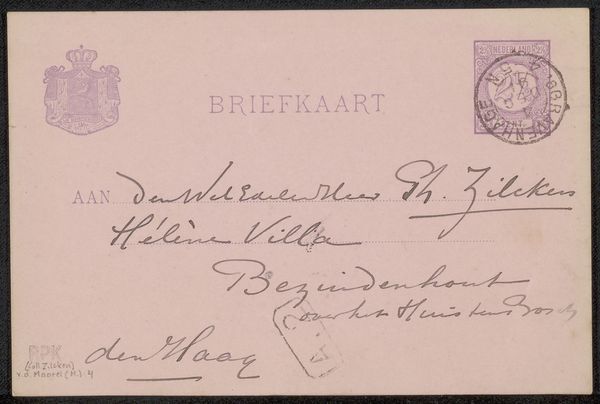
drawing, paper, ink
#
drawing
#
hand-lettering
#
hand drawn type
#
hand lettering
#
paper
#
personal sketchbook
#
ink
#
calligraphy
Copyright: Rijks Museum: Open Domain
Editor: This is "Briefkaart aan Jan Veth" by Jac van Looij, made before 1897. It's ink on paper, a humble postcard, but the handwriting is so elegant. What catches your eye about this piece? Curator: As a materialist, I'm drawn to the physical qualities first. This isn’t just about personal correspondence, but about systems of exchange, and class. How do the limitations of the physical card shape the message? Editor: That's an interesting question. I hadn’t thought about the format restricting the message itself. It seems informal, certainly. Curator: Exactly. Consider the postal system of the time. This postcard reveals the accessibility of communication, blurring lines between personal and public realms. Is this "art" or simply a means to an end? It is handmade, using the skill of calligraphy; is there a hierarchical difference between a painting and such a missive? What do you think? Editor: It's interesting how the artistry of the lettering elevates a mundane object. So the medium itself - ink, paper, the postal service - influences our interpretation? Curator: Precisely! We're seeing art operating within a material and social framework. The constraints – size, the postal regulations – helped define its purpose, and I would argue, also affected how we perceive the handwritten aesthetic on such a practical thing. Editor: I see your point. The simplicity makes it more relatable somehow. I never thought about how materials dictated artistic expression and affected societal dynamics in this way before. Curator: And now? How would you interpret its material meaning now, knowing this? Editor: I think it adds another layer of complexity and interest to the work – more than just the surface aesthetics. Thanks!
Comments
No comments
Be the first to comment and join the conversation on the ultimate creative platform.
More like this