before 1904
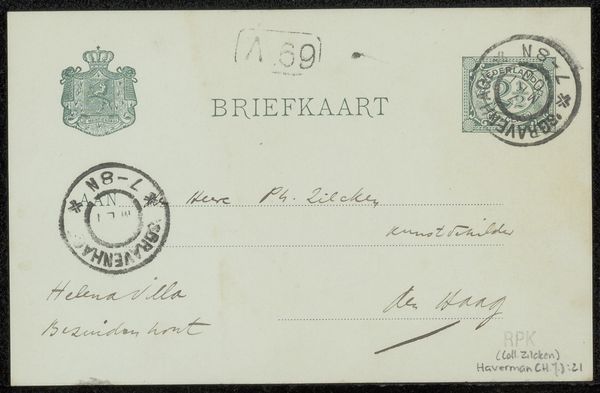
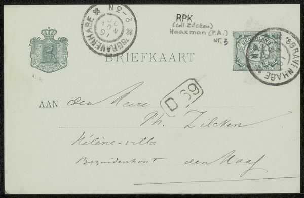
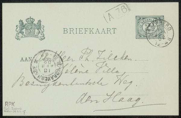
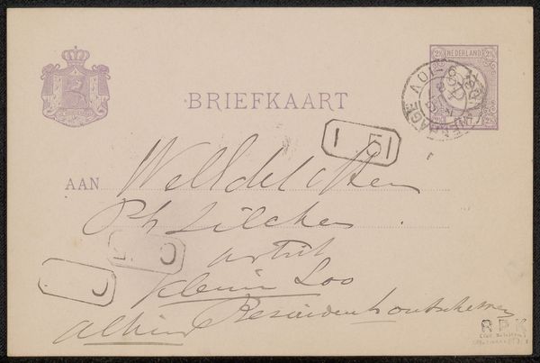
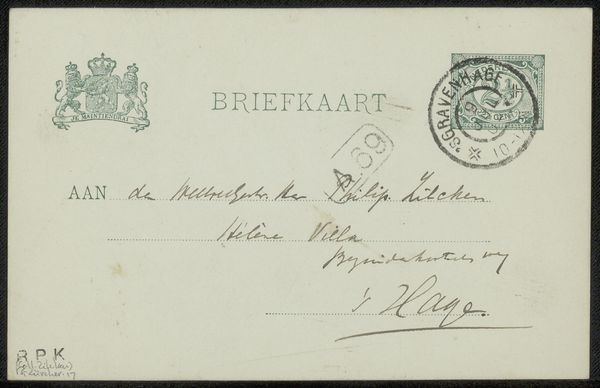
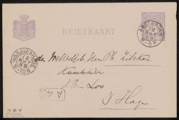
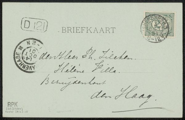
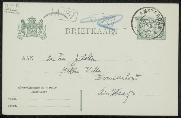
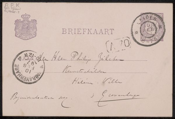
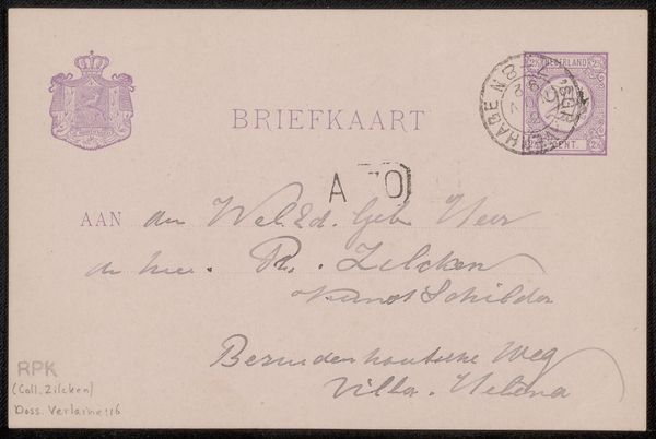
Briefkaart aan Philip Zilcken
Hendrik Johannes Haverman
1857 - 1928Location
RijksmuseumListen to curator's interpretation
Curatorial notes
Editor: Here we have Hendrik Johannes Haverman’s “Briefkaart aan Philip Zilcken,” made with pen and ink on paper before 1904. What strikes me first is the contrasting styles of type. What do you see in this piece, given the integration of various graphical and textual elements? Curator: A rigorous parsing reveals an aesthetic tension predicated upon deliberate juxtapositions. The printed, regulated typeface proclaiming “BRIEFKAART” sharply contrasts with the fluid, almost capricious handwritten script below. Observe how the weight and rhythm of the penned characters interact with the static pre-printed lines designed for address and message. Editor: So, the relationship between the mechanical and the personal creates the core dynamic? Curator: Precisely. The composition reveals a structured hierarchy disrupted by the intrusion of individuality. Even the postal markings, acting as orthogonal interjections, contribute to the textural and visual complexity, thereby activating the surface plane. Have you considered how the graphic weight of the handwriting establishes spatial relationships within the frame? Editor: I hadn’t thought of the handwriting as having "graphic weight" before, but now I see how it interacts with the official printed elements. I never looked at a postcard this way. Curator: Considering these nuances, does your understanding of the artwork shift, prompting you to perceive beyond its mere utilitarian function? Editor: It definitely does! Seeing the composition as a play between structure and the individual makes me appreciate how much intention can be packed into something as simple as a postcard. Thanks for pointing that out.