Copyright: Modern Artists: Artvee
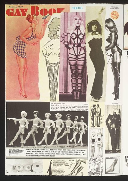
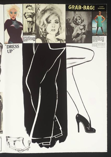
This poster by Robert McGinnis presents a world of oranges, yellows, and creams painted in broad strokes. The paint handling is so free, so casual, that the figures seem to emerge from a haze, as if they're not quite real. Look at the figure draped in an orange sheet, her face peering out with such theatrical intensity. The orange is punchy, and the edges are blurred, creating a feeling of movement. The colour here isn't just descriptive, it's emotional; it is pure mood. The paint is applied with a kind of breezy confidence, a 'take-it-or-leave-it' attitude that's both seductive and slightly aloof. McGinnis' poster work reminds me a little bit of Alex Katz, both artists share this interest in distilling figures down to their essential forms and colours. But where Katz is cool and detached, McGinnis is all about the tease, suggesting a world just out of reach. Ultimately, this work celebrates the power of suggestion and the ambiguity that makes art so endlessly fascinating.
Comments
No comments
Be the first to comment and join the conversation on the ultimate creative platform.
