print, typography
# print
#
typography
#
calligraphy
Copyright: Rijks Museum: Open Domain
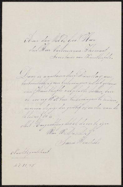
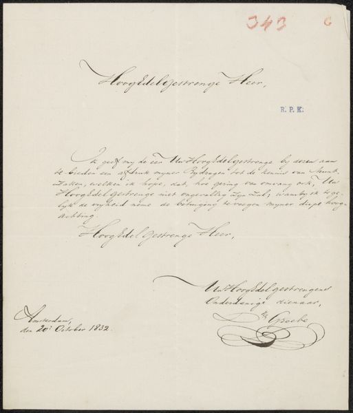
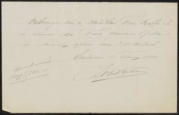
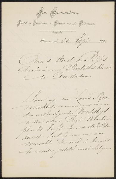
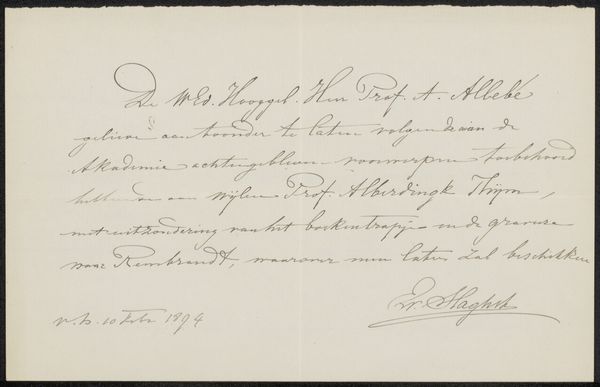
Curator: A first impression reveals that this print titled, “Huwelijksaankondiging aan Philip Zilcken,”—which, from what I understand, translates to something along the lines of, “Marriage announcement to Philip Zilcken”—seems delicate, and reserved in its execution, even. It has an air of quiet formality. Editor: Indeed. This work, possibly created between 1896 and 1899 by Pieter Jacobus Mulder, uses the medium of typography and print to construct meaning. The composition strikes me first: Two distinct blocks of text are presented symmetrically. Curator: Symmetry that reinforces the formal quality. Observe the elegant, flowing calligraphy. Each letter is carefully rendered, a testament to the craftsmanship. It suggests an investment in traditional forms, doesn’t it? Editor: Without question. The use of calligraphy serves as a cultural signifier, imbuing the announcement with sophistication and reinforcing social hierarchies. Consider also the act of dissemination; printing and typography served to announce not just love, but wealth, status and commitment. Curator: Absolutely, it’s less a romantic proclamation than a social act. Let's look closer. Notice the intentional spacing around the lettering that breathes and focuses attention, while contributing to the text's legibility. The stark contrast in ink intensity contributes to this effect. Editor: And how that typography, a technique which by that time would already have begun facing challenges from modern art movements, emphasizes conventional notions of beauty, but the context—the dissemination of announcements—situates this object firmly in its function, beyond aesthetics. How these texts adhere to such specific layout formats would also merit consideration… Curator: Right, we see an almost ritualistic adherence to textual organization that strengthens social structures. We must agree, it's so captivating when design meets societal intention. Editor: It allows us to contemplate just how art, in the form of something like typography, serves public relations and constructs reality as much as private moments. Curator: Examining Mulder’s typography in this piece makes one think about not just personal histories, but cultural history being brought to our eyes. Editor: Absolutely, and what starts off looking just “pretty” then morphs into such a potent, politically-embedded medium.
Comments
No comments
Be the first to comment and join the conversation on the ultimate creative platform.
More like this