#
aged paper
#
sketch book
#
hand drawn type
#
hand lettering
#
personal sketchbook
#
hand-drawn typeface
#
fading type
#
ink colored
#
sketchbook drawing
#
sketchbook art
Copyright: Rijks Museum: Open Domain
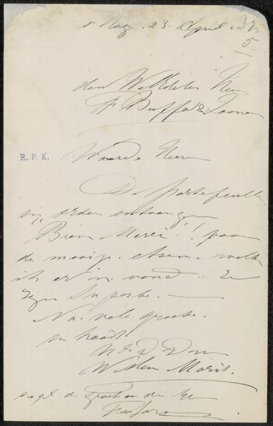
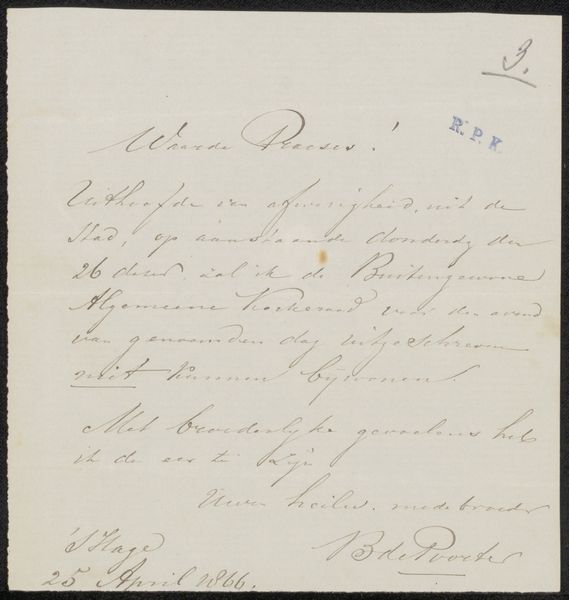
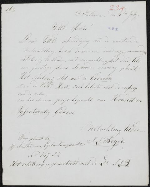
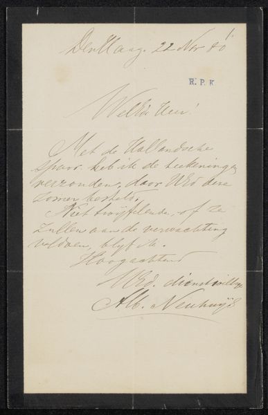
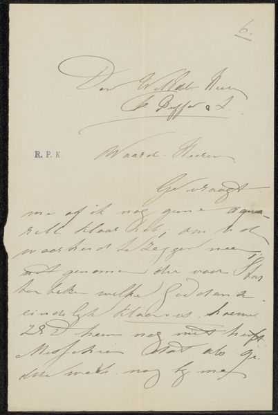
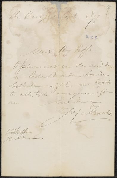
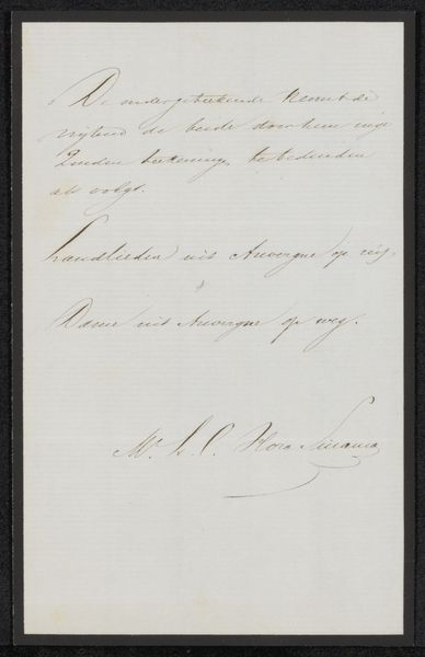
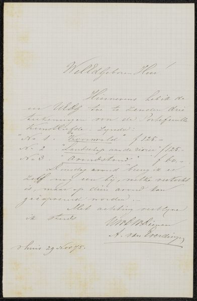
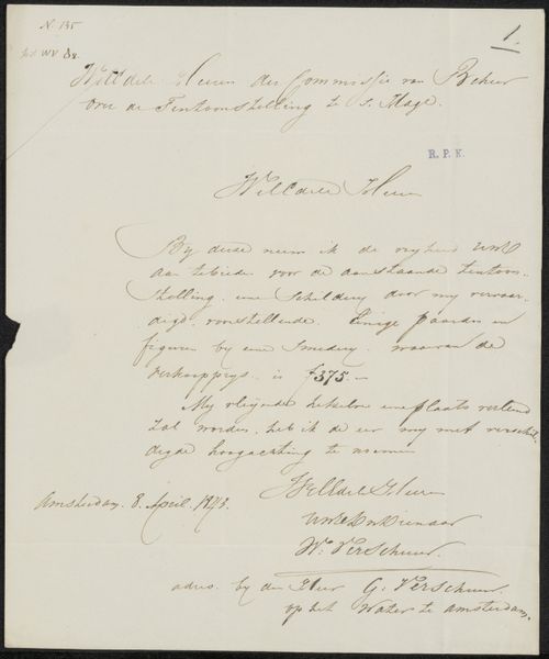
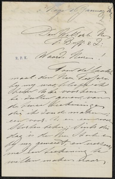
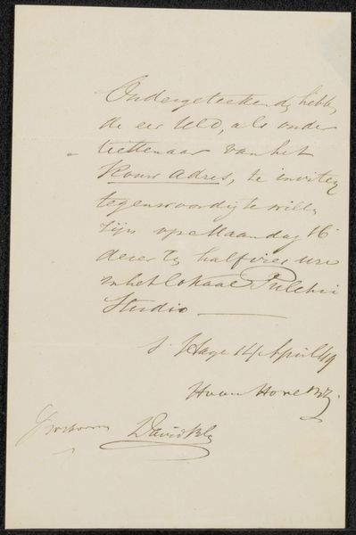
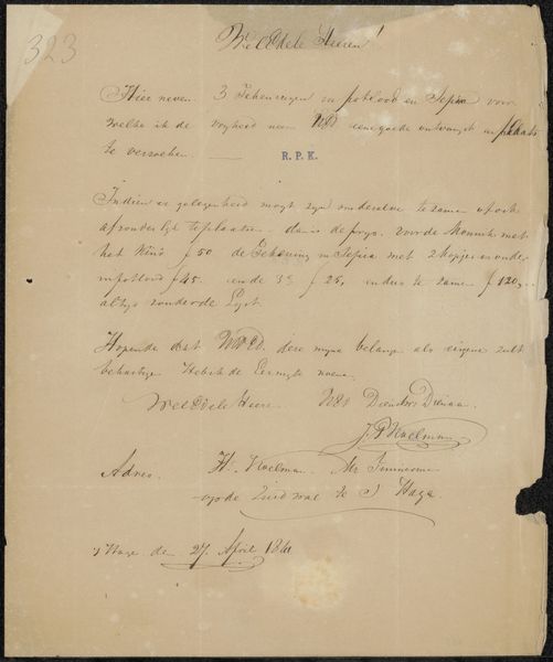
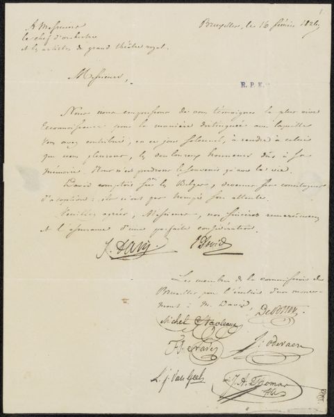
Curator: This is "Brief aan Johannes Bosboom" by Claude Jacquand, dating from 1814 to 1878. It seems to be a letter, possibly a draft or a personal note. Editor: It strikes me immediately as an intimate glimpse into another time. The faded ink, the delicate script – it evokes a sense of quiet reflection and private communication. Curator: Indeed. Notice how the composition is dictated entirely by the flow of the handwriting. The strokes vary in pressure, creating a rhythm across the page. The negative space, that aged paper, functions almost as a deliberate element, framing and grounding the text. Editor: And the very act of writing, especially calligraphy such as this, becomes a symbolic gesture of connection, doesn’t it? A physical manifestation of thought conveyed through specific symbols. Curator: Precisely! Observe the formation of the letters, their serifs, their loops and tails. Each has been carefully rendered, lending the text a tactile quality, something lost, perhaps, in our digital age. Look closely; you will notice a signature. What conclusions can we make from its prominence and placement? Editor: Well, the signature surely authenticates the communication, grounding it in Jacquand's personal narrative. In a symbolic reading, it might represent not just authorship but also commitment, a pledge attached to the contents of the message itself. Curator: And consider, too, the "RPK" that’s stamped adjacent to the author’s full name; it’s an addition to Jacquand’s scripted handwriting that might act as a secondary stamp of authentication, an addition from a historical collection of personal archives. The formal presence juxtaposed with the informal. The blue stands apart from the shades of black. Editor: The symbols give it this kind of quiet permanence, you know? The shapes are so simple, it's basically pure art. But because of the words that they help to write, it shows off this hidden world with the recipient. Curator: A very apt assessment. It's these layered details, from the overall compositional choices down to the particular nuances of handwriting and form that reveal what is really hidden inside the symbolism here. Editor: Ultimately, studying these letters is like catching a ghost of connection. This intersection of personal touch and broader cultural currents truly helps amplify a certain significance. Curator: Yes, it pushes the art to its ultimate heights.
Comments
No comments
Be the first to comment and join the conversation on the ultimate creative platform.
More like this