drawing, mixed-media, paper, ink
#
portrait
#
drawing
#
aged paper
#
mixed-media
#
light coloured
#
hand drawn type
#
personal journal design
#
paper
#
personal sketchbook
#
ink
#
fading type
#
romanticism
#
sketchbook drawing
#
storyboard and sketchbook work
#
sketchbook art
#
design on paper
#
calligraphy
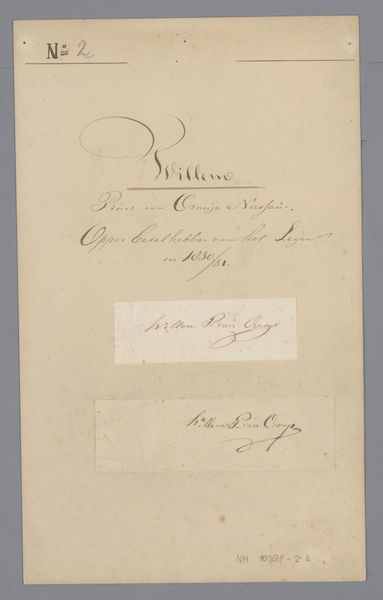
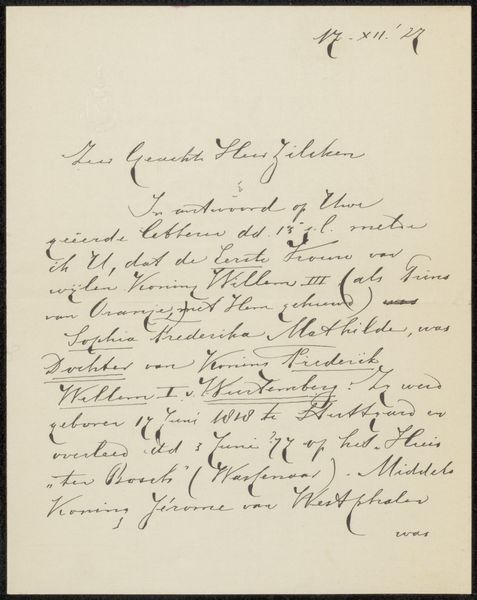
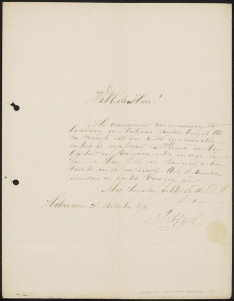
Dimensions: length 32.8 cm, width 20.1 cm
Copyright: Rijks Museum: Open Domain
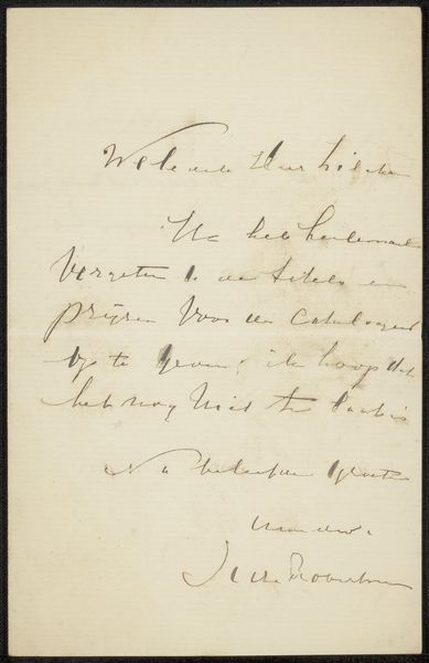
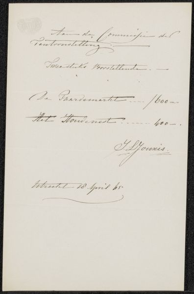
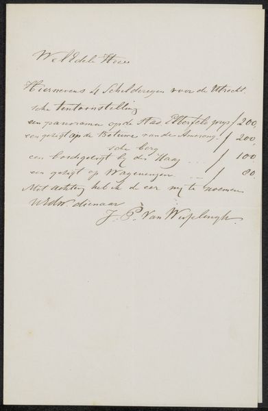
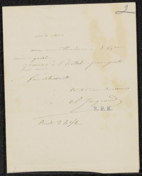
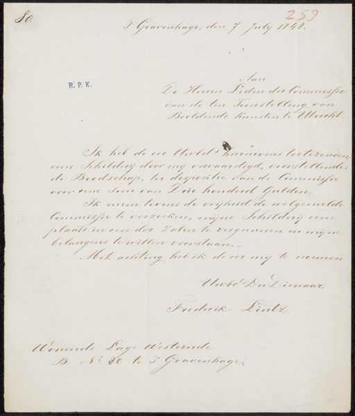
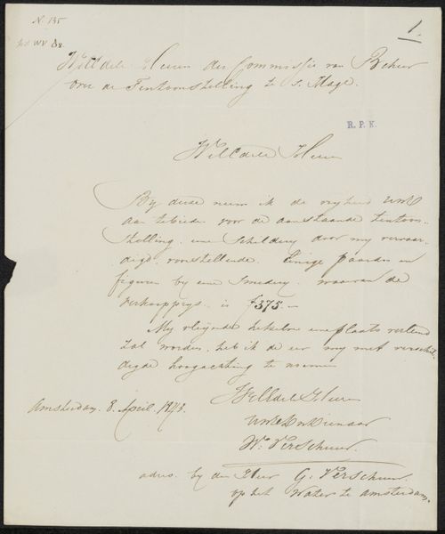
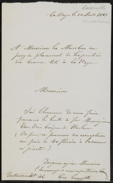
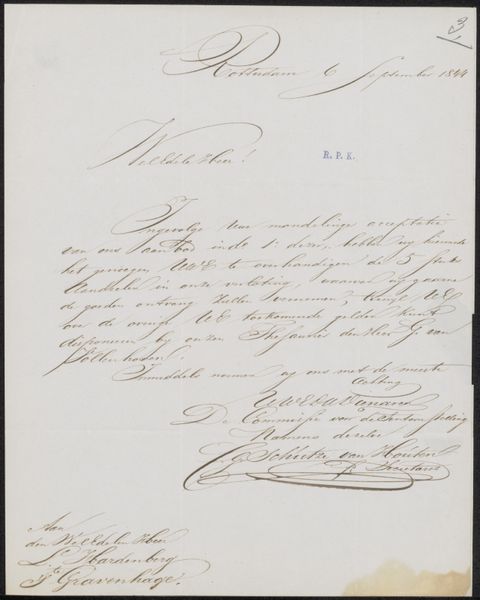
Editor: Here we have "Handtekeningen prins Frederik," or "Signatures of Prince Frederick," dated between 1800 and 1850. It's a drawing using ink on paper, and it's part of the Rijksmuseum collection. What strikes me first is how the various inscriptions, seemingly unrelated, are arranged vertically, drawing my eyes down the page. What do you make of the visual composition of this piece? Curator: The vertical arrangement is indeed critical. Consider how the eye is guided by the differing scripts and the calculated placement of the signatures. Note the relationship between the calligraphic flourishes of the heading and the signatures below. Ask yourself how the differing weights of ink contribute to a sense of depth on a flat plane, and what meaning derives from that? Editor: I see what you mean about the depth created. The script at the top is denser, and seems heavier than the signatures below it. What about the fading quality of the ink itself? Curator: That's a very astute observation. The fading effect, or perhaps a deliberate choice of lighter ink in certain areas, is paramount to our understanding. Look closely at the topmost inscription and consider what feeling that choice conveys. Could it evoke a sense of impermanence? Also, consider the formal qualities of the signature itself, divorced from its symbolic weight as a mark of identity. Observe the line quality, the negative space it defines; what does it reveal? Editor: So you're suggesting we analyze it purely as a study in line and form, regardless of what the words say or represent? Curator: Precisely. The objective here is not simply decipherment but a decoding of visual grammar, a structural analysis that transcends the explicit message. Editor: That gives me a fresh way of looking at the work. I hadn’t considered the purely aesthetic impact of the ink and script itself before thinking about the context of Prince Frederick and his time. Curator: Indeed, that careful observation reveals much more of how art operates.
Comments
No comments
Be the first to comment and join the conversation on the ultimate creative platform.
More like this