print, textile, typography, engraving
#
dutch-golden-age
# print
#
textile
#
typography
#
engraving
Dimensions: height 535 mm, width 327 mm
Copyright: Rijks Museum: Open Domain
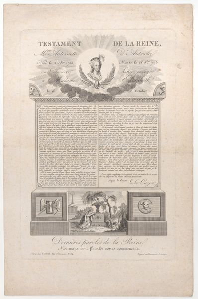
Curator: Looking at this, I can almost hear the rustle of the paper—the meticulous creation of "Rouwklacht bij het overlijden van Willem V, 1806," or "Lament on the Death of William V, 1806." It’s an engraving made by Jacobus Wendel. It really shows how typography can be so evocative. Editor: My initial feeling is of controlled grief—very formal, very precise. All those regimented lines of text feel like societal expectations holding back raw emotion, it's a mourning that must follow a very strict social code. Curator: It’s a fascinating piece, particularly because it brings together the traditions of print and textile art. You can see how the engraved text is carefully laid out almost as if it were part of a woven design. It almost feels like a mourning tapestry, which speaks to me about the widespread grief throughout different levels of society and artistry at the time. Editor: Right. Considering the date—1806—I start to wonder about production. How quickly could something like this be reproduced and distributed? This would have impacted how quickly information spread across communities during the early 19th century and beyond traditional methods such as town criers and handwritten notifications. How widely was it distributed? Curator: That’s the power of printed mourning materials, though. It ensured that a sense of collective experience was curated and accessible to the many. Editor: Do you see the choice of fonts as deliberate or arbitrary, here? Is there any particular reasoning behind the letter sizing or font choices made during the inscription of Prince William’s death notice? I bet we can extract a lot of meaning from something that would easily have been overlooked or disregarded due to the more important and prevalent factors to notice at the time. Curator: I think it speaks to a very self-conscious performance of grief—using font and layout to subtly amplify the weight of the message and project that gravity to a wider audience. The almost baroque, dramatic title that leads to orderly body of work beneath. Editor: So, from a more human and intimate object of grief we pivot toward wider-reaching statements and performative public grieving through more available, shareable formats? It's less the lament itself and more a tool of creating wider sentiments… It shifts what constitutes grief, from personal acts to something socialized. Curator: It's the fascinating, transformative capacity of an artist and materials to change perspectives even regarding sentiments that would normally remain private or be expressed at different mediums such as painting. Editor: Definitely makes me reevaluate "Memento Mori."
Comments
No comments
Be the first to comment and join the conversation on the ultimate creative platform.
More like this