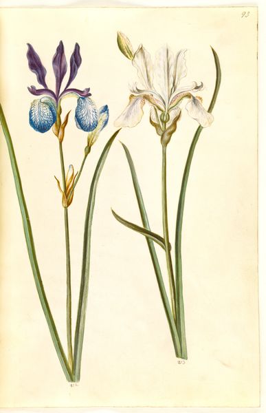
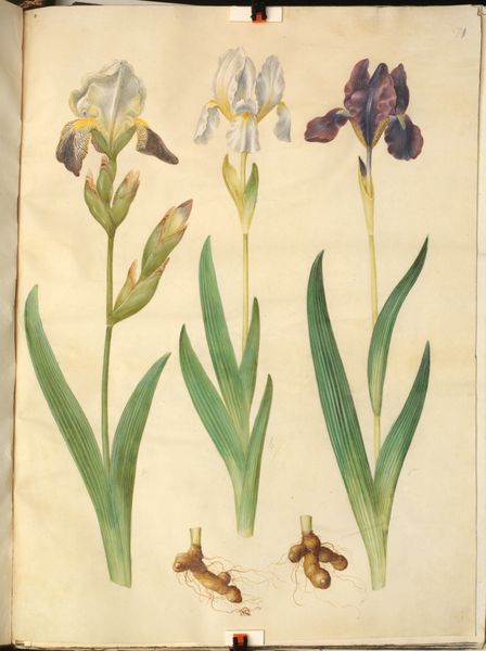
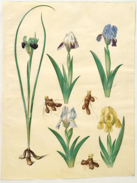
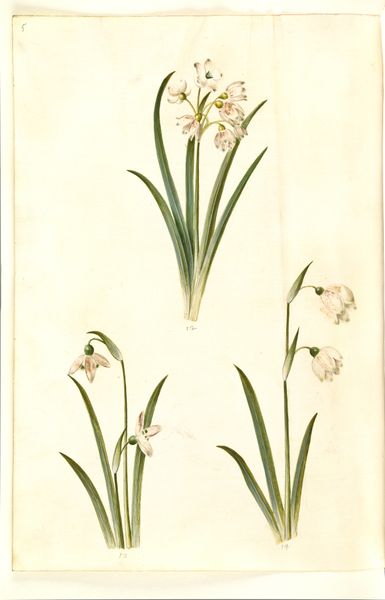
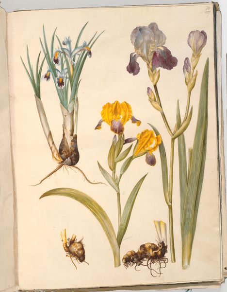
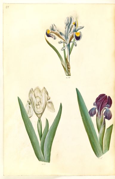
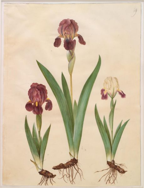
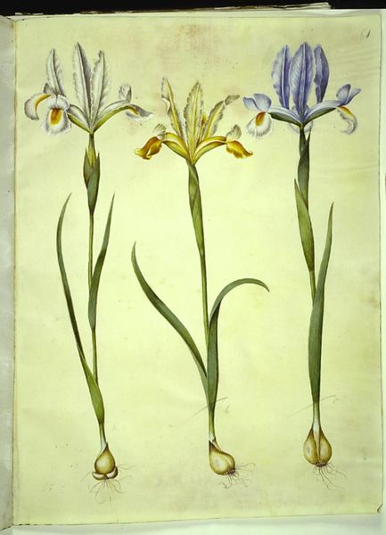
Iris pumila (lav iris) eller Iris lutescens (dværg-iris); Iris graminea (græsbladet iris) 1649 - 1659
0:00
0:00
drawing, gouache, watercolor
#
gouache
#
drawing
#
water colours
#
gouache
#
watercolor
#
watercolour illustration
#
watercolor
Dimensions: 505 mm (height) x 385 mm (width) (bladmaal)
Editor: Here we have "Iris pumila" created between 1649 and 1659 by Hans Simon Holtzbecker, a botanical study rendered in gouache and watercolour. I find its presentation strikingly direct, almost clinical, with the delicate irises evenly spaced across the surface. What do you see in this piece? Curator: I find the appeal of Holtzbecker’s work rests in the almost scientific detachment of the representation. Note the meticulous rendering of each iris, capturing the subtle variations in color and form. There’s an elegant austerity, achieved through the calculated arrangement of forms on the page, wouldn't you agree? Editor: I do, it is almost like an entomological plate, with its clean lines and symmetry. Is there significance in the differing irises' hues? Curator: Precisely. While context may lend itself to the interpretation of symbolism through colour, our main interest as formalists resides in understanding its chromatic relationships within the work itself. How do those differences guide your eye around the composition? Editor: The contrast between the dark purple iris and the pale whites and blues draws me in, creating a visual rhythm, and a path for my eyes. I notice the use of white space surrounding the flowers also seems critical. Curator: It is quintessential. The deliberate employment of negative space serves to further isolate each specimen, transforming it into a subject worthy of careful contemplation, doesn't it? Holtzbecker uses each mark intentionally to create the rhythm and lead our eyes to focus on specific focal points. It becomes not simply about representing flora, but an exercise in visual organization, and an engagement with colour theory. Editor: Thank you, I hadn't considered the negative space in that light before, or how powerfully he employs colour to manipulate the focal point, and guide your eye around the image. Curator: I'm delighted to share those insights. Approaching artwork as an exploration of structural form is just one path to analysis.
Comments
No comments
Be the first to comment and join the conversation on the ultimate creative platform.
More like this