painting
#
abstract expressionism
#
concrete-art
#
abstract painting
#
painting
#
pattern
#
form
#
geometric pattern
#
abstract pattern
#
geometric
#
geometric-abstraction
#
abstraction
#
line
#
modernism
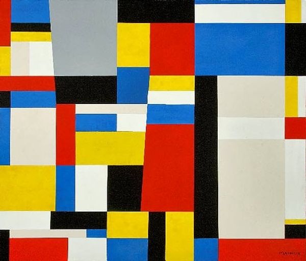
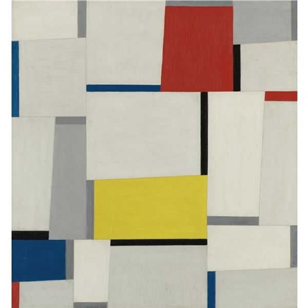
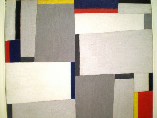
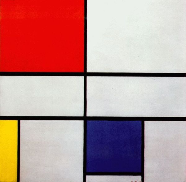
Copyright: Fritz Glarner,Fair Use
Curator: Stepping in front of us is Fritz Glarner's "Relational Painting" from 1951, currently housed here at the Whitney. Glarner's work epitomizes concrete art, a strain of modernism focused on pure geometric form and color. Editor: Whoa. My first thought? Organized chaos. Like someone took Mondrian, shook him up in a cocktail shaker with a few extra grey rectangles, and poured him out. It’s stimulating, but also a tad… unsettling. Curator: Precisely! The relational aspect is key. Glarner sought to disrupt the rigidity often found in geometric abstraction. The seemingly random placement of these asymmetrical rectangles challenges our ingrained desire for order, I find. He wanted to create a dynamic visual experience, a relationship between form and color. Editor: I get that – the asymmetry creates this tension. Like nothing quite lines up, and those jolts of primary colors prevent your eye from ever really resting. It makes me think about how constructed reality really is and wonder about underlying societal and political shifts from the post-war era. Curator: He actually called these compositions "Relational Paintings" because, as you mentioned, he aimed to express the dynamic relationships within the picture plane. The composition seems so effortless but, in fact, I think is heavily organized and designed to highlight its asymmetric aspects. There's a definite push-pull between order and discord. Editor: There's something inherently optimistic, almost utopian, in all that Mondrian-esque structure, isn’t it? But this… this is Mondrian after a stiff drink. Still beautiful, still striving, but acknowledging that maybe things aren't quite so easily balanced. And that sliver of gray… It adds a melancholic layer. Curator: Well put. The gray softens the harsher edges and gives those brilliant hues a stage on which to play. It highlights the shift away from the perfect geometry his peers seemed determined to render in the interwar years. Editor: This piece, it feels alive and ever-shifting; just like actual life I guess, only distilled into pure geometric form. Curator: And ultimately asks us to consider how these forms relate, not just to each other, but to us, the viewers, caught in their delicate web.
Comments
No comments
Be the first to comment and join the conversation on the ultimate creative platform.
More like this