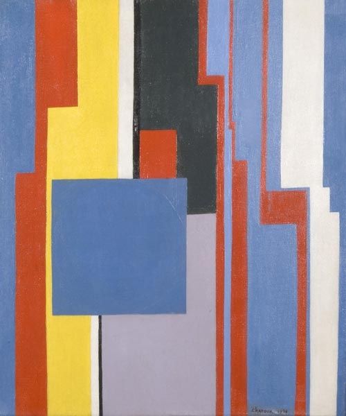
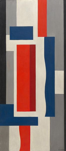
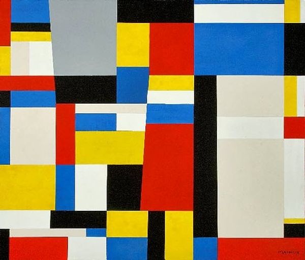
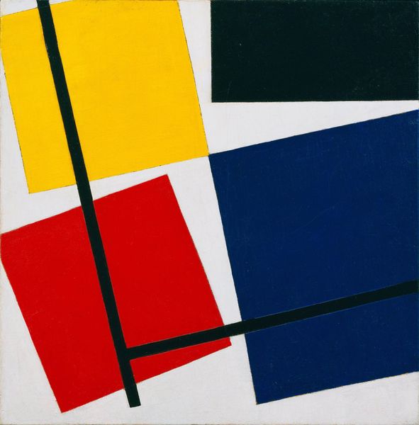
painting
#
de-stijl
#
abstract expressionism
#
painting
#
pop art
#
geometric
#
abstraction
#
line
#
modernism
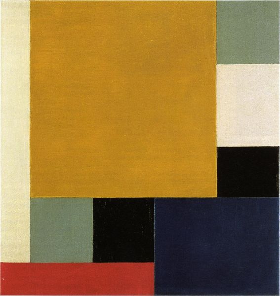
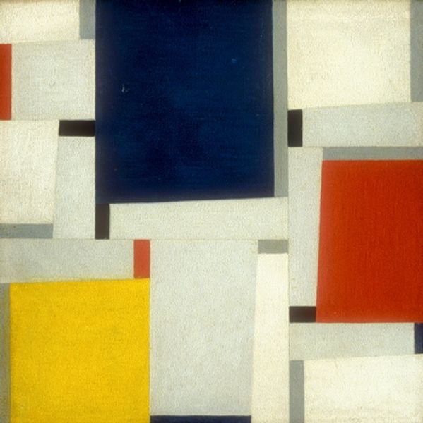
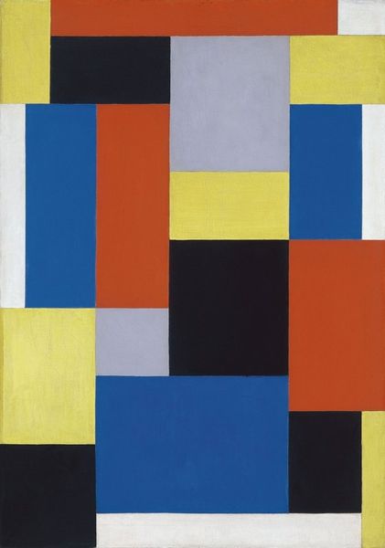
Copyright: Fritz Glarner,Fair Use
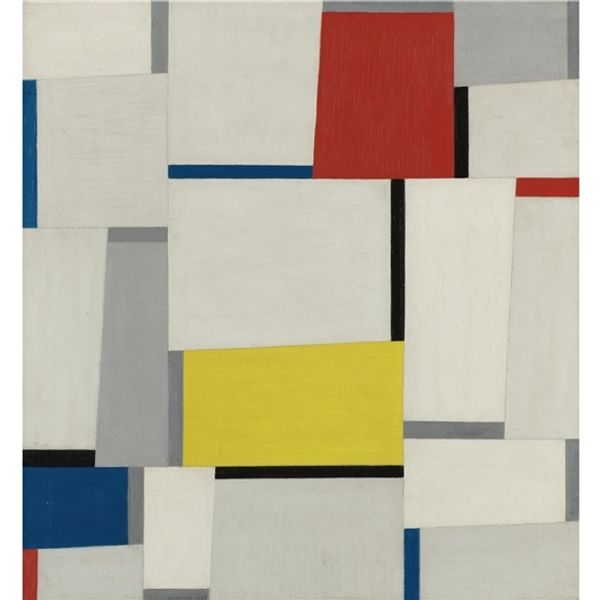
Curator: Here we have Fritz Glarner’s "Relational Painting" from 1951. Editor: It's strikingly calm, yet dynamic. The asymmetrical balance of rectangular forms gives it this pulsing, vibrating quality. The white positively glows. Curator: Glarner was deeply influenced by De Stijl and Neo-Plasticism, particularly Mondrian. But unlike Mondrian's strict grid, Glarner embraced a freer composition within similar constraints. He called these his "Relational Paintings". Editor: Relational, yes. There's this definite push and pull between the shapes, a kind of visual conversation. The limited palette – red, yellow, blue, white, and black – emphasizes their spatial relationships. What kind of connection to history are you seeing in this work? Curator: The limited color palette is interesting, because it speaks to the desire for universality, as you suggest: These were the colors with the greatest power to symbolize larger archetypes about progress, modernism and purification after both World Wars, but what are your thoughts? Editor: Interesting. You bring in historical and psychological associations that didn't even occur to me. My primary concern with this canvas is a purely structural reading of how Glarner achieved this illusion of spatial depth on a two-dimensional plane. The use of the slightly off-white versus true white to imply that some forms recede… It is stunningly executed, regardless of meaning! Curator: Though abstract, these relational paintings also imply something architectural—fragmented urban landscapes or modernist building facades—emblematic of post-war reconstruction and the dream of a new, rationalized world. So many historical layers embedded! Editor: Ah, that adds a poignant layer to what I initially perceived as mere formalism. Curator: Exactly! And Glarner's deviations from the strict De Stijl grid can also symbolize a breaking free, the imperfection and humanity that resists rigid systems. Editor: Seeing this with the connection you mention certainly deepens its complexity. It's no longer just an exercise in form. Curator: These color relations evoke a harmony amid imbalance – a visual metaphor, I feel, for resilience after immense trauma. Editor: Absolutely, I think I’m now much more aware of both what makes this work so special. I appreciate your cultural perspective on Glarner’s spatial exploration and restricted palette!
Comments
No comments
Be the first to comment and join the conversation on the ultimate creative platform.
More like this