painting, oil-paint, textile
#
abstract-expressionism
#
abstract expressionism
#
abstract painting
#
painting
#
oil-paint
#
pop art
#
textile
#
oil painting
#
neo expressionist
#
geometric
#
abstraction
#
line
#
modernism
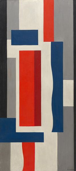
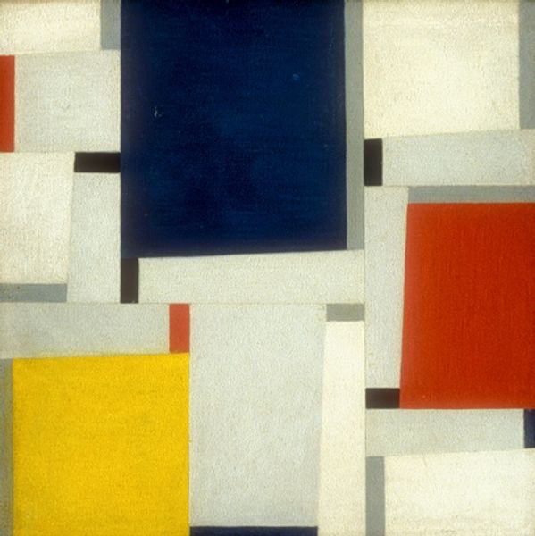
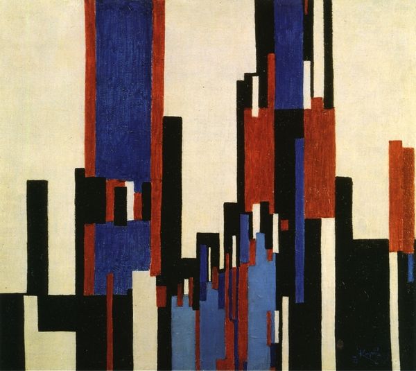
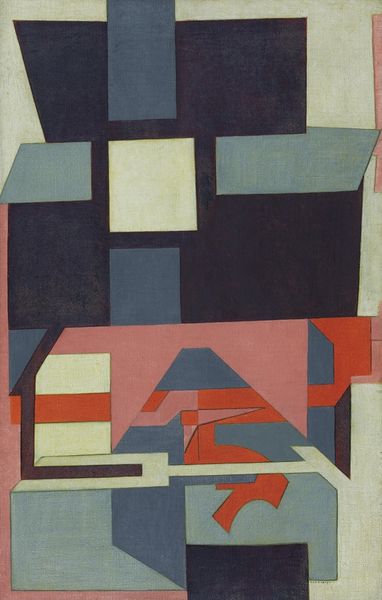
Copyright: Lothar Charoux,Fair Use
Editor: Lothar Charoux's "Untitled," created in 1956 using oil paint, strikes me as almost architectural in its arrangement. The blocks of color and strong lines suggest a city, or maybe the blueprint of one. What stands out to you? Curator: I am drawn to the way this work utilizes simple shapes—squares, rectangles, lines—to evoke a sense of depth and order. Don't you think the choice of these particular colors feels very deliberate? It makes me think about constructed realities. This imagery taps into a deep cultural memory of structure, from the grid-like city plans of ancient Rome to the towering skyscrapers of modern urban life. Editor: You see that architectural symbolism really strongly. I get the city reference but it’s more…subconscious? I initially focused more on the dynamic between the cool blues and warmer reds and yellows. How would you place this work within its historical context? Curator: Given that it was painted in 1956, this painting emerges from a period grappling with rebuilding and redefining itself. It carries this emotional weight. Do you notice how some shapes are neatly defined while others have blurred edges? Editor: Yes, now that you mention it, I do. That juxtaposition does give the piece an uneasy, almost unstable quality. I was so caught up in the colors and geometry, I totally missed that at first glance. Curator: Precisely. This is where the symbolic power lies. The artist uses a familiar visual language of geometry and structure to ask profound questions about stability and change. We search for a familiar image because the abstraction triggers deep emotions. Editor: That's a fascinating point. I hadn’t considered the post-war reconstruction angle so directly. Looking at it now, the colors feel almost…optimistic, but also perhaps a bit naive. Thanks, this was helpful. Curator: My pleasure. Art like this always reminds us that images hold complex layers of meaning.
Comments
No comments
Be the first to comment and join the conversation on the ultimate creative platform.
More like this