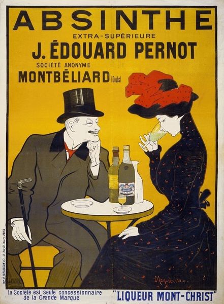
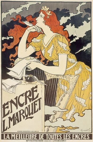
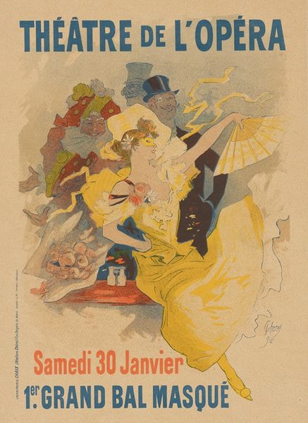
lithograph, print, poster
#
portrait
#
art-nouveau
#
stylized advertisement
#
lithograph
# print
#
figuration
#
genre-painting
#
poster
Copyright: Public Domain: Artvee
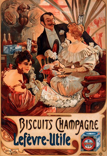
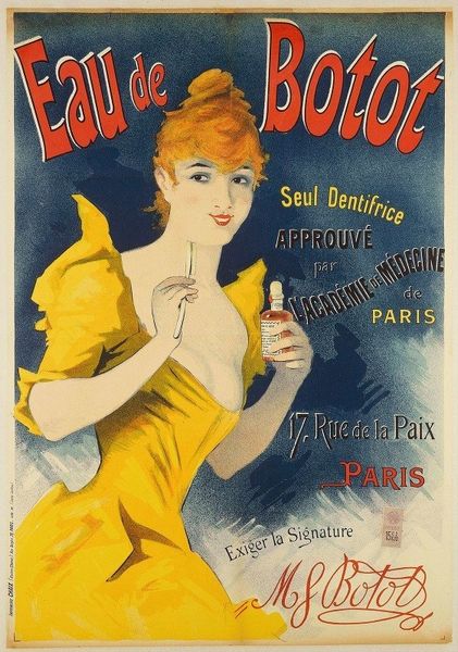
Curator: Cappiello’s 1900 lithograph, "Amandines de Provence," is such a joyful little slice of Belle Époque Paris. Editor: A literal slice, judging by the biscuit she's devouring! What immediately strikes me is the colour palette: a striking ultramarine against the ochre of her dress and the lettering. It's a very deliberate aesthetic for a poster that really elevates the consumable product. Curator: Absolutely, and that stylish simplification is characteristic of his distinctive style. It’s more than just biscuits; it’s an invitation into a sun-drenched fantasy, no? Editor: More a commercial proposition if you think about it! The flattening of perspective, that bold outlining – it’s pure Art Nouveau adapted for mass production. These weren’t individual artworks hanging in a salon. This was advertising meant for walls. Cappiello, like his contemporary Toulouse-Lautrec, wasn't just depicting; he was selling, and this poster helped H. Lalo Biscuits secure that Silver Medal at the Paris Exposition of 1900. It served its designed purpose. Curator: But, look at the woman! Isn’t there an unmistakable, unapologetic *pleasure* etched on her face? It goes beyond simple consumerism. It speaks to a moment, a mood, of pure indulgence. She elevates it! That knowing gaze draws the eye... You get caught thinking, what's *she* so happy about? And that gets your stomach growling, right? Editor: It speaks to her social class. This isn't just *any* woman—it’s a leisure-class subject, depicted at a table presumably laid out with manufactured food items, commercially bottled champagne, an image removed entirely from the production of food and materials on which her pleasure depends. Let's be honest. Her very appearance speaks to a society that afforded such frivolity and enjoyment of commercially-available materials. Curator: Well, in that case I rather appreciate how Cappiello uses graphic design to subtly nudge us towards... biscuits and perhaps a drop of bubbly! It feels lighthearted even knowing what it's trying to do. Editor: A celebration of early advertising! A testament to how material conditions shape art and visual communication and make such posters, so ubiquitous and beautiful, possible in the first place.
Comments
No comments
Be the first to comment and join the conversation on the ultimate creative platform.
More like this