drawing, ink, pen
#
drawing
#
script typography
#
hand-lettering
#
old engraving style
#
hand drawn type
#
hand lettering
#
personal sketchbook
#
ink
#
hand-drawn typeface
#
ink drawing experimentation
#
pen work
#
sketchbook drawing
#
pen
#
calligraphy
Copyright: Rijks Museum: Open Domain
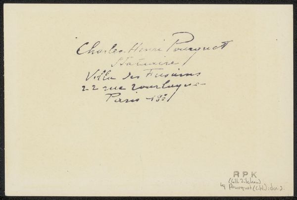
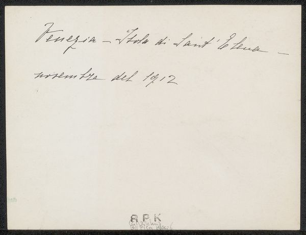
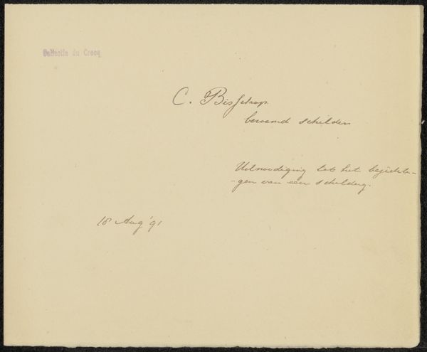
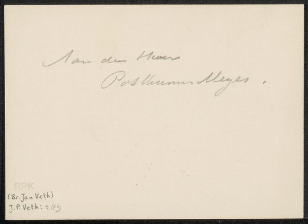
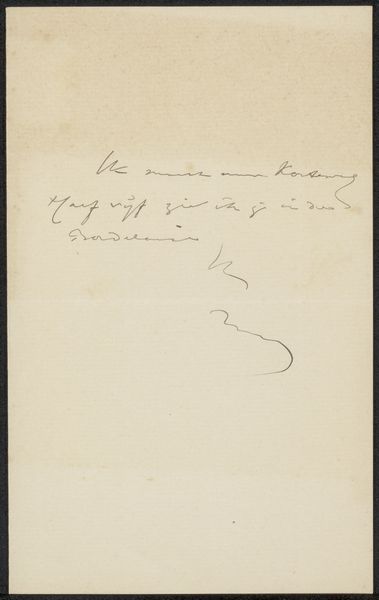
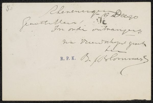
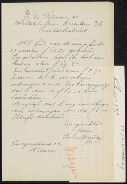
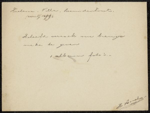
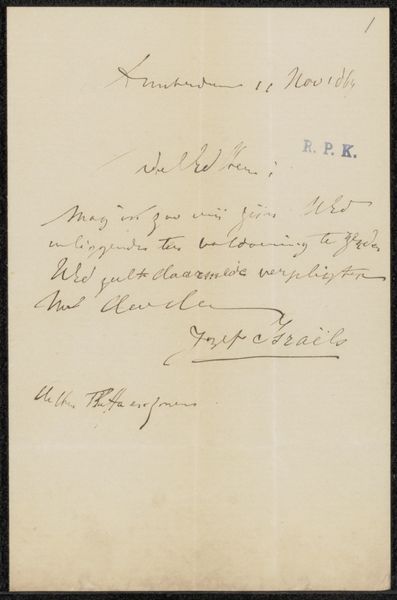
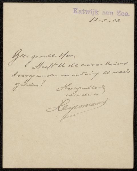
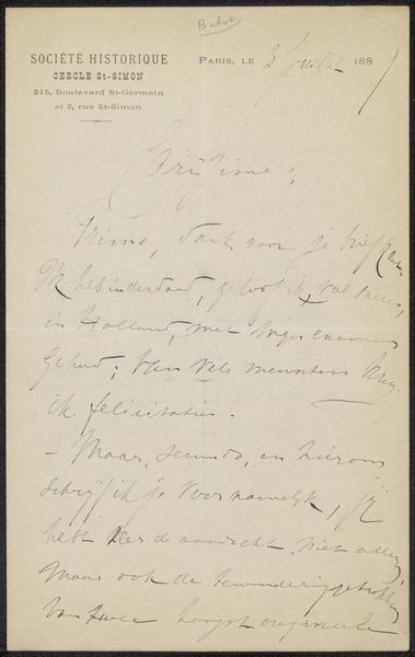
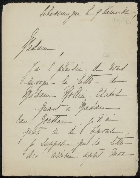
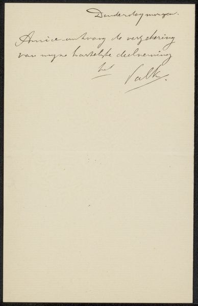
Curator: This work, simply titled "Prentbriefkaart aan de familie van Philip Zilcken," is an ink drawing, presumed to predate 1930. Editor: It appears to be an elegant, almost ephemeral script; the strokes possess a delicacy, offering an intriguing, intimate peek into correspondence. Curator: Precisely. Its aesthetic interest resides in its very functional nature elevated to art through calligraphic mastery. Note the intentional variations in line weight; the ascenders and descenders dance gracefully. Editor: It strikes me as both deeply personal and tied to production practices. The materials—ink and paper—speak volumes about access, privilege, and the act of writing in an age before mass communication truly took hold. Who was this Zilcken, and what was the significance of a drawn card versus a printed one? Curator: That is the intriguing question this artifact poses. Structurally, observe how the text is arranged, its implied balance achieved not through symmetry, but dynamic asymmetry—a sophisticated play of form. Editor: Absolutely. I think exploring the social life of handwriting itself in a pre-digital era opens doors. What sort of training went into achieving that level of penmanship? Were there specialized scribes catering to various social strata, impacting labor structures? Curator: We see here the interplay between the personal and formal. The elegant script bespeaks intention and artistic refinement within even the context of something so humble. Editor: Agreed, I find that grounding art in these mundane yet expressive items yields a profound awareness of skill and the material conditions of the period. It makes one contemplate how skills evolved and what materials are required for producing written work, even correspondence. Curator: Ultimately, the card operates at multiple levels, serving both a practical function and as a delicate aesthetic object. Editor: An intersection where labor, material and the aesthetic combine into an intimate window. Thank you for guiding me through this interesting piece.
Comments
No comments
Be the first to comment and join the conversation on the ultimate creative platform.
More like this