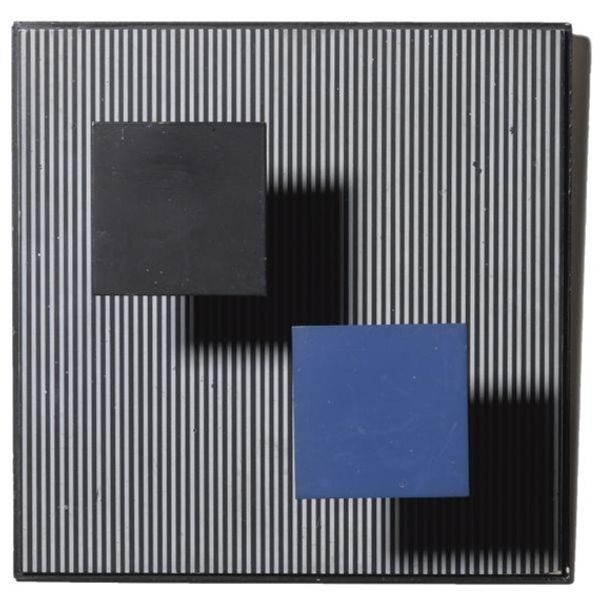
Copyright: Cesar Paternosto,Fair Use
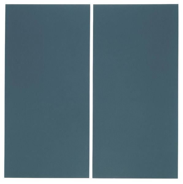
Cesar Paternosto made this 'Black and Blue 3' using paint to challenge how we see and think about minimalism. The colors here are so deliberate, a tight edit of black, blue, and white, with a subtle range of whites that create the structure of the piece. You can see the surface has a kind of quiet texture, like the paint has been really worked into the canvas, not just applied, but considered, each layer talking to the one beneath it. There’s a small blue rectangle near the top right – it’s like Paternosto is using these little color pops to pull us in, asking us to look closer, to question why they are there. Paternosto's way of playing with space and color feels like a nod to Mondrian, but with a softer, more human touch, and it reminds us that art is always in conversation, borrowing, and riffing off what came before. What does it mean when an artist lets ambiguity in? That’s something to ponder!
Comments
No comments
Be the first to comment and join the conversation on the ultimate creative platform.
More like this