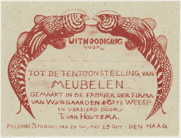
print, woodcut, poster
organic
art-nouveau
woodcut effect
bird
organic pattern
woodcut
poster
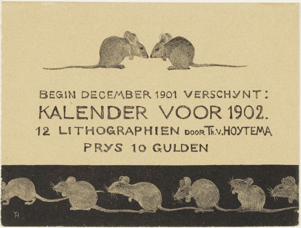
Dimensions: height 109 mm, width 127 mm
Copyright: Rijks Museum: Open Domain
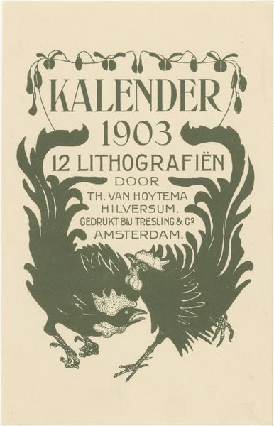
Theo van Hoytema made this calendar announcement in 1905, and it was printed using lithography. There's a graphic boldness here, a real simplification of form and colour. Look how the flat planes of ochre and black almost create a feeling of mosaic. The texture is interesting: it's like the ink has been laid down with a deliberate roughness. See the way the ochre bird motifs sort of ‘float’ against the black background? The colour creates a focal point, but it is the texture that gives the work its depth. I'm particularly drawn to the way the artist has rendered the two birds on either side of the central image; they appear to be in conversation with each other. It reminds me of some of the bold graphic work by someone like Emil Nolde, although Hoytema has a delicacy and restraint that is all his own. Ultimately, this piece feels like a gentle reminder that art is always in dialogue.
Comments
No comments
Be the first to comment and join the conversation on the ultimate creative platform.