drawing, print, paper, ink, architecture
#
drawing
# print
#
paper
#
ink
#
cityscape
#
architecture
#
realism
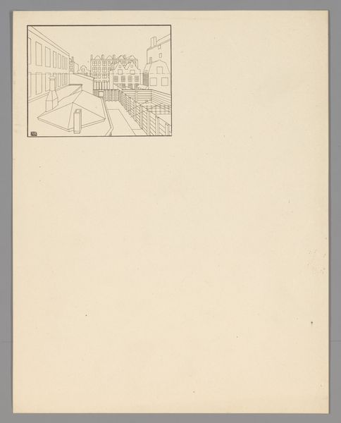
Dimensions: height 454 mm, width 332 mm
Copyright: Rijks Museum: Open Domain
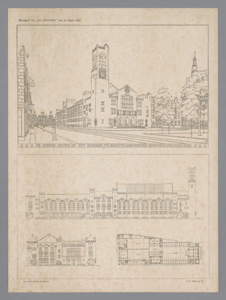
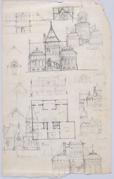
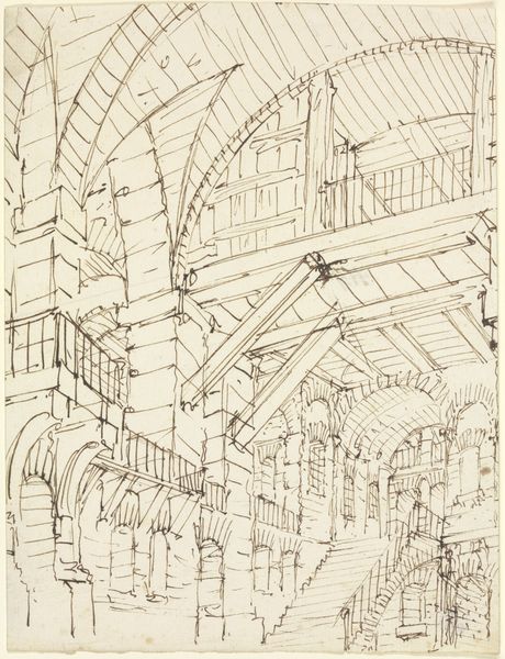
Curator: Let's discuss "View of and Interior of the Beurs van Berlage in Amsterdam," a drawing and print created in 1898. It's rendered in ink on paper and currently resides in the Rijksmuseum. Editor: My initial thought? This piece feels…antiseptic. There's a chilling lack of intimacy despite all those architectural details meticulously rendered. Curator: I find the architectural rendering to be very precise. The use of ink emphasizes structure, form, and the material construction itself. Berlage, of course, was instrumental in evolving Dutch architecture through a shift toward rationalism and functionality, and away from more ornamental historicism. Editor: That cold functionality hits me hard. The exterior is rigid, but the interior is a little unsettling. The figures inside are dwarfed by the sheer scale of the space, and there's this overbearing feeling of surveillance, almost as if the building itself is watching them. Curator: Right, think about how this building functioned as a stock exchange. Berlage's design prioritized the efficient and transparent operation of the market. The high ceiling and open floor plan allowed for easy oversight and regulation of traders. And the transparency inherent in the glass ceiling symbolized an honest exchange. Editor: I can't escape this sense of…emptiness? It almost seems as if life's been drained from the space. Even with people in the drawing, the building overwhelms them with its sheer scale and unadorned functionality. Does the absence of ornament convey any sociopolitical ideals through this design? Curator: Absolutely, consider that Berlage rejected decorative excesses precisely because he linked them to social inequality. Simplicity was associated with socialism, a push against the ornamentation used by the wealthy, and promoting the accessibility to design. Editor: I appreciate gaining that crucial historical context. I am still moved by the absence I perceive in this work that initially disquieted me, but it is an intentional void intended to point toward transparency in trading and design accessibility for all. Curator: Yes, so, by considering process and social context, it becomes more than just ink on paper—it’s a statement.
Comments
No comments
Be the first to comment and join the conversation on the ultimate creative platform.
More like this