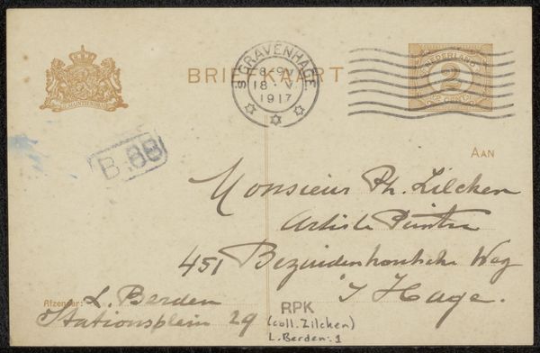
drawing, paper, ink
#
drawing
#
paper
#
ink
Copyright: Rijks Museum: Open Domain
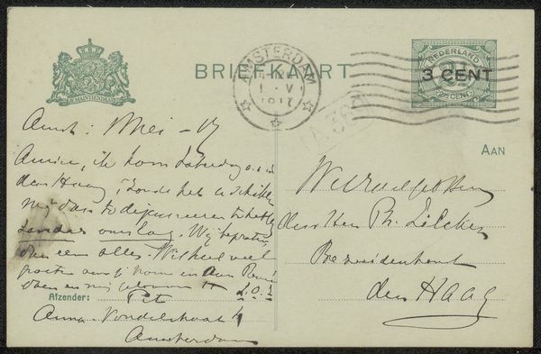
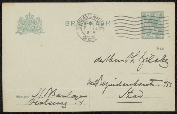
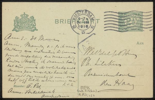
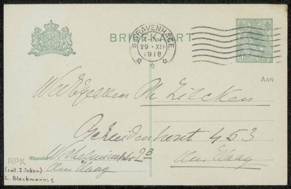
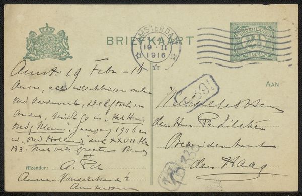
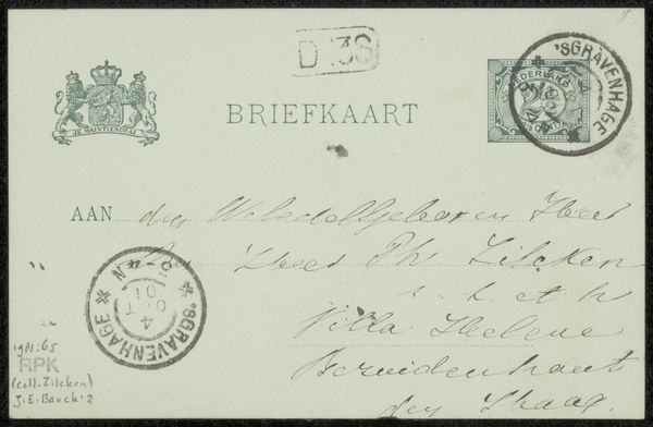
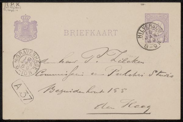
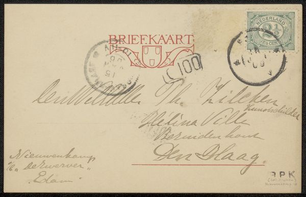
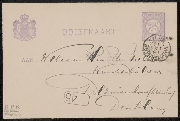
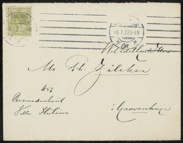
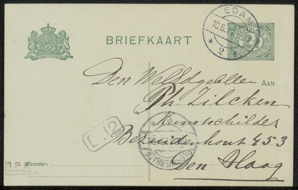
Editor: Here we have a postcard, “Briefkaart aan Philip Zilcken,” possibly from 1918, by Richard Bisschop, done in ink on paper. It’s… well, it's a postcard! Seems like the artist dashed off a quick note to a friend. It has a slightly nostalgic mood, given the handwriting and vintage stamp. What stands out to you in this piece? Curator: Oh, absolutely, it's a time capsule, isn't it? Imagine the world in 1918, still reeling, writing quickly about one's travels! And there's a strange intimacy in seeing someone’s handwriting. Bisschop's flourish… It gives you the feeling that words, not images, carry all sorts of interesting artistic content! Doesn't the handwritten element bring the author alive to you, across more than a century? Editor: Definitely! It makes it more personal, especially knowing it's intended for a friend. It is sort of exciting to see something so functional treated as a tiny piece of art! The handwritten element gives this tiny artwork another layer. Is the postal element an aesthetic choice, or is it simply what it appears to be: a mundane and overlooked artform that’s easy to engage with? Curator: Exactly! It's a fusion, right? It takes a utilitarian object and turns it into something quite profound, imbued with personal and artistic intention. Editor: I guess I never thought of the humble postcard as having potential as an artwork before now. Thank you! Curator: My pleasure! Now you’ll never see a mailbox in quite the same way.
Comments
No comments
Be the first to comment and join the conversation on the ultimate creative platform.
More like this