ink
#
ink
#
calligraphy
Copyright: Rijks Museum: Open Domain
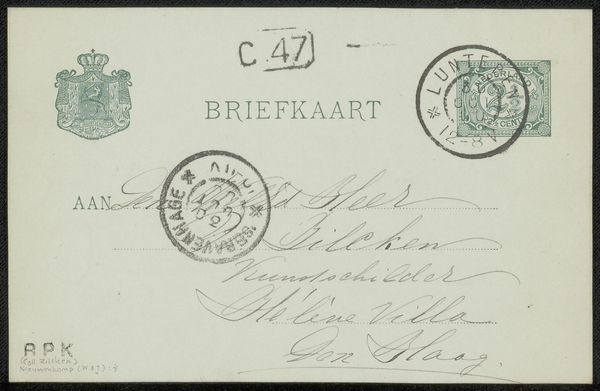
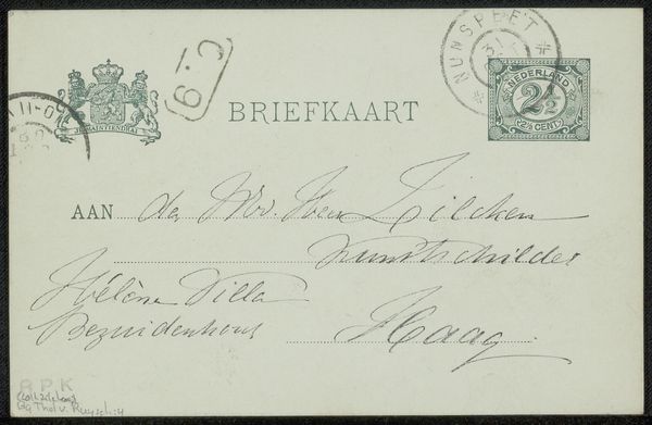
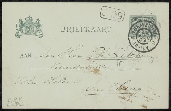
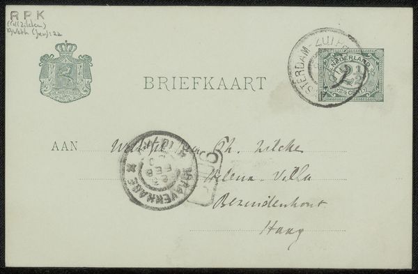
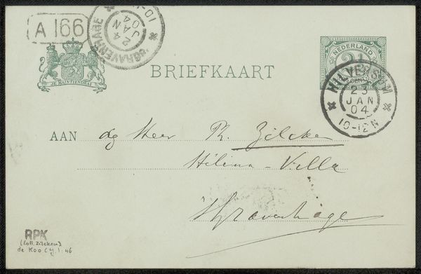
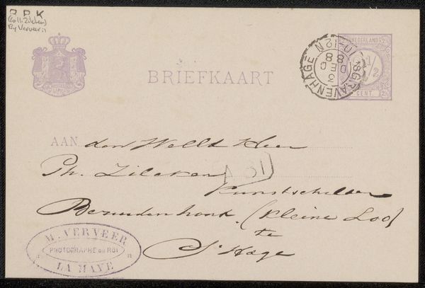
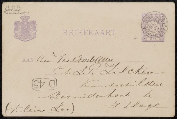
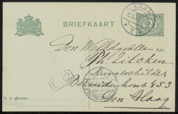
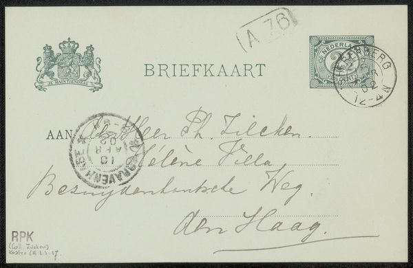
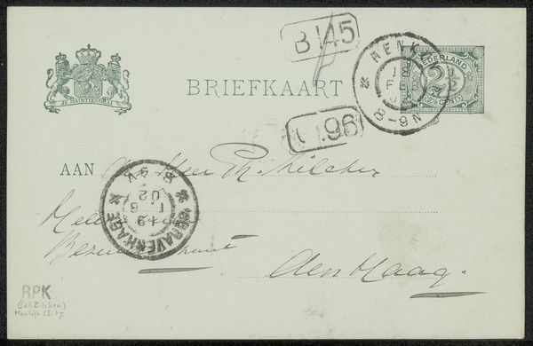
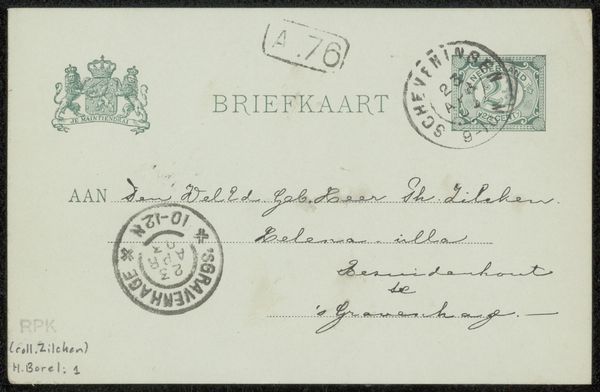
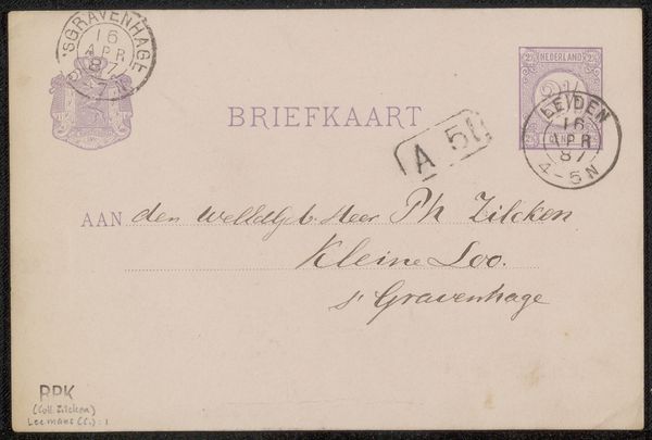
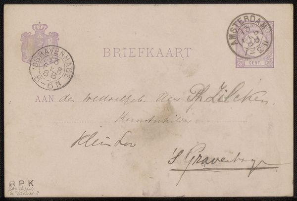
Curator: This is a postcard to Philip Zilcken by J.E. Bauck, created sometime between 1901 and 1914 using ink. What are your first impressions? Editor: Well, besides the beautiful script, I'm struck by how official it looks, almost bureaucratic, yet still personal. With all those stamps, it feels very grounded in its time. What kind of historical context should we consider when looking at this? Curator: I’d say consider the burgeoning postal services of the early 20th century and the democratization of communication. Before widespread phone use, postcards served as crucial social connectors. Notice the Dutch coat of arms; how does this governmental symbol contribute to the seemingly “official” feel you mentioned? Editor: That makes sense! The coat of arms definitely adds to the sense of formal authority, making it seem almost like an official communication even though it is clearly a personal message. Was Zilcken a public figure? Curator: He was an artist and art critic. Considering this, might the card's design be making a statement about the intersection of art, authority, and the public sphere during that time? It also prompts a question - would Bauck, the sender, intentionally include that governmental symbol? Editor: Interesting. It's almost as if the postcard format itself, despite its intimate purpose, became a stage for projecting these social and political dynamics. I hadn't thought about how even everyday correspondence could be interpreted that way. Curator: Exactly. By examining something as seemingly mundane as a postcard, we gain insight into the relationship between individuals, institutions, and evolving modes of communication at the turn of the century. Editor: So, even something as simple as sending a postcard reflected larger societal shifts. I'll definitely look at seemingly casual art with a broader understanding of their environment now.
Comments
No comments
Be the first to comment and join the conversation on the ultimate creative platform.
More like this