print, typography, poster
# print
#
book
#
typography
#
poster
Dimensions: height 360 mm, width 290 mm, thickness 40 mm
Copyright: Rijks Museum: Open Domain
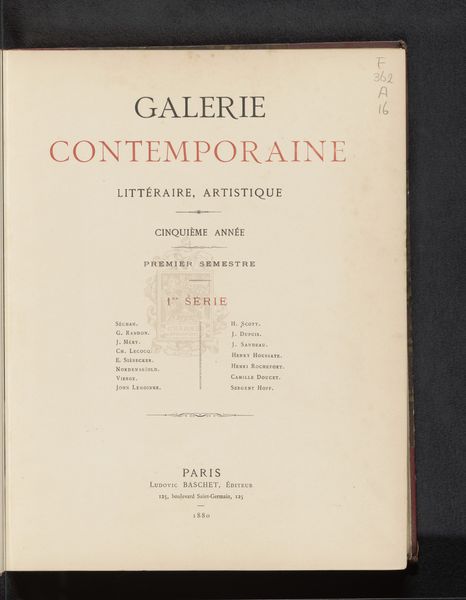
Curator: This typographical print, a poster really, serves as the title page for the "Galerie Contemporaine Artistique: Peintres et Sculpteurs," dating back to 1881. The listing hints to painters and sculptors found inside. What is your immediate response? Editor: Clean, almost austere. The typography's straightforward, yet the title's hierarchy in size and color–black, then red–suggests an underlying tension, perhaps a commentary on the era's artistic hierarchy. It's making a statement, but quietly. Curator: It absolutely speaks to hierarchy and access. “Galerie Contemporaine Artistique” was a periodical. In the context of 1881 Paris, the term "contemporary" must have been contentious! Who decided who and what would be included or excluded and on what basis of "art"? Editor: And who was it for? Look at the publisher's imprint. "Ludovic Baschet, Éditeur." These publishing houses held significant sway, shaping the market, influencing taste, essentially acting as gatekeepers for who got seen and by whom. Curator: Exactly. It’s impossible to look at something like this without thinking about Pierre Bourdieu's concept of cultural capital. These artists being listed are actively trying to accrue and exchange in symbolic capital that is art production, influencing visibility and canonization within art history. The very format of this typography signifies its function. Editor: Yet the typography also promises something democratic: accessibility through the medium of print. It suggests an effort to disseminate contemporary art beyond elite circles, engaging a wider audience. Did the journal actually accomplish that? Curator: It likely made inroads. Remember that printmaking as a medium holds powerful significance, reaching those unable to afford original artwork but desiring to stay relevant amidst social changes and connect with art beyond limitations such as education, money, or class status. This became especially significant as cities such as Paris expanded rapidly during that time period. Editor: Absolutely, but at the same time, it's reinforcing certain power structures simply by who is getting featured. That dual role makes it interesting—both a reflection and an instrument of its time. Curator: Indeed, understanding that dichotomy allows us to move beyond simply admiring its visual style. Editor: It provides valuable insight, urging a comprehensive and multifaceted approach.
Comments
No comments
Be the first to comment and join the conversation on the ultimate creative platform.
More like this