graphic-art, print, paper, typography
#
graphic-art
# print
#
impressionism
#
paper
#
typography
Dimensions: height 358 mm, width 288 mm, thickness 35 mm
Copyright: Rijks Museum: Open Domain
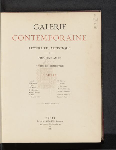
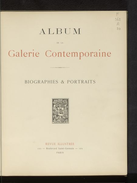
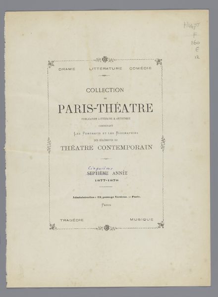
This is the title page of ‘Galerie contemporaine: littéraire, artistique’, printed in 1877 in Paris by Ludovic Baschet. The page has a pale background punctuated by typographic elements. Note how Baschet uses typography not just to convey information but also to create a visual hierarchy and aesthetic experience. The title, ‘Galerie contemporaine’, is set in large, bold, red serif letters, immediately drawing the eye. Below, in smaller, black serif, the subtitle elaborates on the gallery’s literary and artistic focus, functioning as a descriptive layer. Further down, even smaller text specifies the semester and series, providing contextual details without overwhelming the design. This arrangement reflects the semiotic function of typography: larger, bolder fonts act as signifiers of importance, while the specific font choices evoke the period’s aesthetic sensibilities. The layout is balanced, yet the aging of the paper introduces a layer of chance and texture, challenging the rigid structure with an element of the unpredictable. This tension between order and entropy invites us to reconsider how meaning is constructed and perceived.
Comments
No comments
Be the first to comment and join the conversation on the ultimate creative platform.
More like this