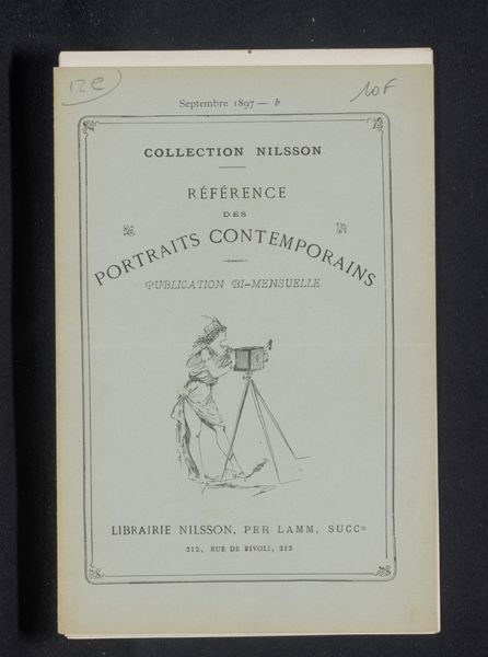
Compiègne et ses monuments / par Cyrille Bultheel; avec dix ill. phototypiques de Augustin Boutique 1895
0:00
0:00
Dimensions: height 282 mm, width 195 mm, thickness 3 mm
Copyright: Rijks Museum: Open Domain
Curator: The piece before us is the cover of a book entitled "Compiègne et ses monuments" by Cyrille Bultheel, featuring phototypical illustrations by Augustin Boutique, dating back to 1895. It also seems to have functioned as a poster. Editor: My first impression is how wonderfully muted the colour is; a kind of faded grandeur that really evokes the turn of the century. And the composition is interesting. Curator: Indeed, the dusty rose background draws the eye immediately, doesn't it? Consider the material conditions of its production. It’s a print and photograph, mediums then increasingly accessible thanks to advancements in industrial processes. Its function goes beyond simple illustration; the book as object highlights the burgeoning tourist industry and local pride. The mass production capabilities transformed the consumption of information, where the city became a commodity. Editor: I completely agree, the context is essential! Think about how Compiègne was seen at the time—a town with both royal history and a burgeoning industrial presence. This publication would be deeply embedded in the local cultural fabric, boosting its image and solidifying its importance through its monuments. Who was the targeted audience? A nostalgic, upper-class crowd or middle class tourists, eager for accessible local culture? Curator: Perhaps both. The choice of "phototypiques" is also crucial, speaking directly to contemporary material fascination with reproducibility. But consider this beyond tourism; how does this product perform labor? Is it intended for the workers in Compiègne? It surely celebrates the means of cultural and artistic production, not only documenting but also constructing a specific image of the city, carefully selected to reflect specific interests, mostly of local political actors. Editor: Precisely. The photographs within would've shaped perceptions, cementing a particular narrative of Compiègne for public consumption and perhaps to generate even more wealth through cultural events and local history. The placement of the printing company name further emphasizes the civic importance of that work, as you stated. Curator: It is very self-aware! Thinking about it all now, the object really invites an investigation of media culture at that time. Editor: Exactly. It's fascinating how this cover distills so many layers of history and meaning into a single, deceptively simple artifact. It pushes you to reconsider the narrative.
Comments
No comments
Be the first to comment and join the conversation on the ultimate creative platform.
