graphic-art, print, typography
portrait
graphic-art
aged paper
art-nouveau
homemade paper
script typography
paperlike
hand drawn type
personal journal design
personal sketchbook
typography
hand-drawn typeface
publication mockup
delicate typography
Dimensions: height 360 mm, width 290 mm, thickness 40 mm
Copyright: Rijks Museum: Open Domain
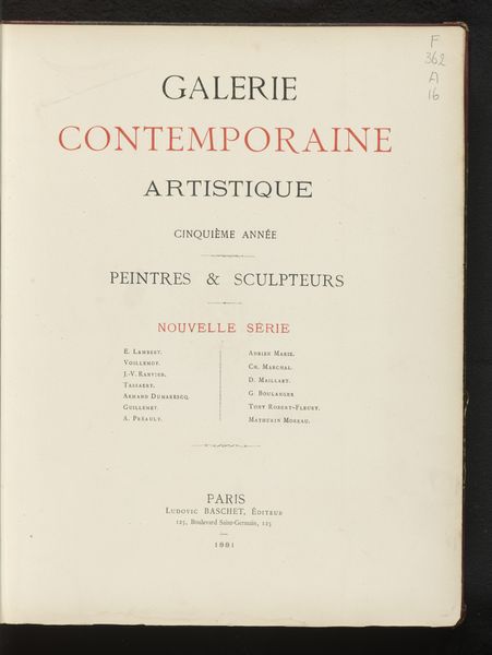
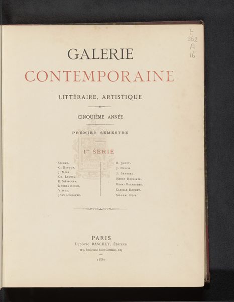
Curator: This is the title page of "Galerie contemporaine artistique: peintres et sculpteurs," from 1883, printed on what appears to be handmade paper. Editor: The openness is what strikes me—all that blank space around the text, like a stage set before the players arrive. It whispers of understated elegance. Curator: That generous use of space serves as a container for symbols. Notice the Bernard emblem—a heraldic crest centered on the left page. These crests speak to social status, acting as calling cards and declarations of identity, embedded into the fabric of Parisian publishing. Editor: And speaking of fabric, look closely at that paper. It has a handmade quality with a toothy, fibrous texture—you can almost feel the labor in it. Each sheet a unique production. Were these luxury art journals catering to wealthy patrons? Curator: Yes, indeed. Consider how typography acts as image here—carefully chosen fonts signal artistic sensitivity, almost mirroring a curator's eye selecting art for exhibition. Even the color, the muted shades of reddish brown against the cream paper, resonates with artistic intention. Editor: I wonder about the names listed there. The collaborative efforts, often overlooked. Who were these figures behind the scenes, ensuring that production happened seamlessly? That’s where I look for true insight to cultural influence. Curator: The names listed likely point to artists highlighted within the volume. This acts as a historical catalogue; beyond surface aesthetics are intricate layers communicating volumes about 19th-century taste and art economies. Editor: Exactly—so many hidden social dynamics at play. Thanks to this print, these artisans—printers, engravers—are not forgotten. I admire that delicate script as more than design. Curator: Yes, a record keeper it remains. Understanding graphic art in print gives tangible forms to histories—artistic lineages expressed as ink on paper. I am fascinated how this speaks of its era so vividly. Editor: Me too. We often elevate ‘fine art’ objects. It's a reminder there’s so much artistic history—so many stories—in ordinary paper.
Comments
No comments
Be the first to comment and join the conversation on the ultimate creative platform.