painting, oil-paint
#
de-stijl
#
abstract painting
#
painting
#
oil-paint
#
geometric composition
#
rectangle
#
geometric-abstraction
#
abstraction
#
line
#
modernism
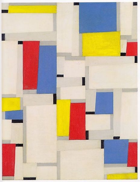
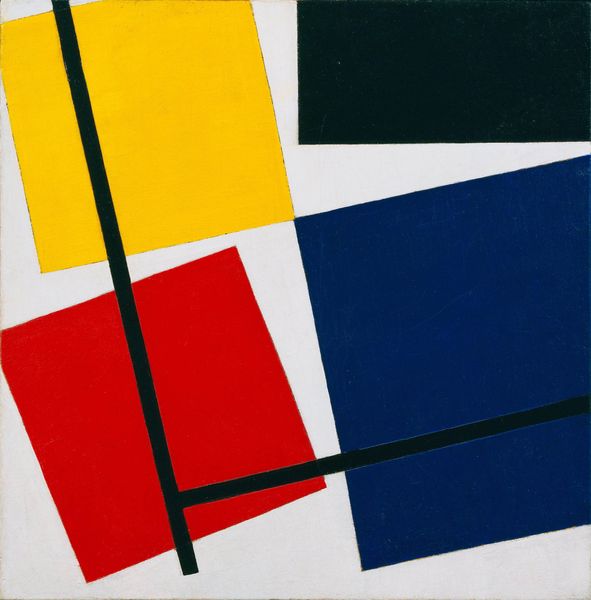
Dimensions: 41 x 33.5 cm
Copyright: Public domain
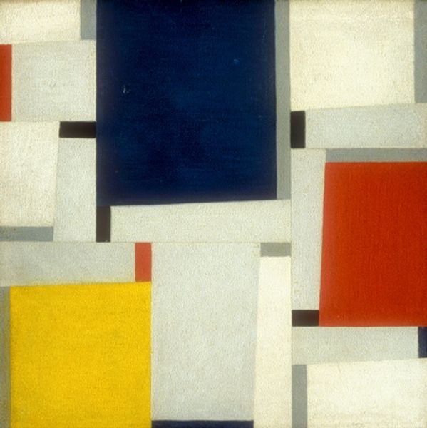
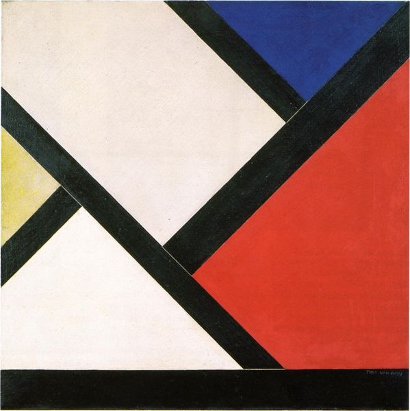
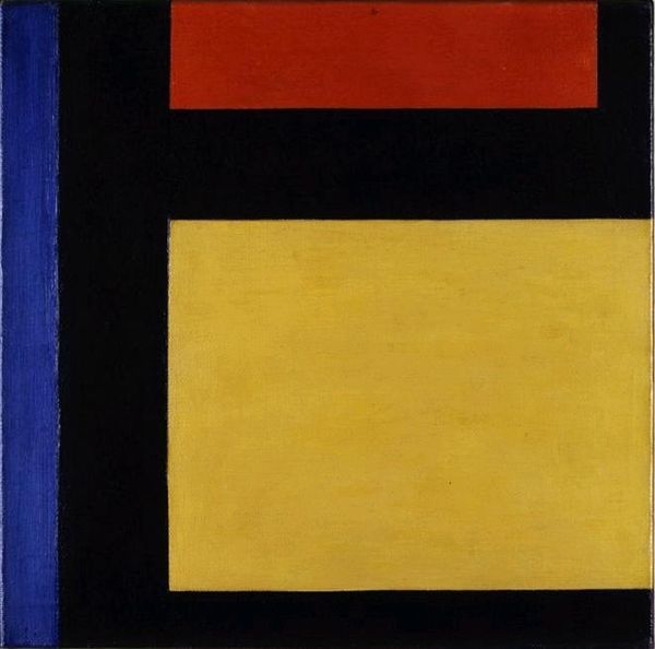
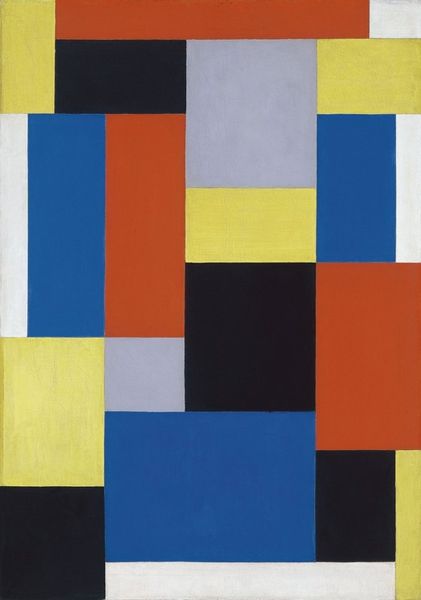
Theo van Doesburg made this oil on canvas piece, Composition XXI, sometime in his lifetime. What strikes me immediately is the crispness and the geometry: rectangles in primary hues plus black, white, and gray. It’s like a child’s building blocks, but arranged with an adult’s sense of compositional rigor. Looking closer, there’s a real physicality to the paint. It’s not perfectly smooth, you can see the brushstrokes, which gives it a handmade feel. Take the large black rectangle near the top. There’s a slight texture, a kind of drag in the paint that makes it seem less like a flat plane and more like a surface with depth. And then there are the thin black lines that cut across some of the rectangles, anchoring the planes, creating tension. Van Doesburg was a contemporary of Mondrian, and you can see some similarities in their use of geometric forms and primary colors, but Mondrian’s lines are always vertical or horizontal. Van Doesburg complicates things a bit – literally, since he introduces diagonals into his work later on. It’s this kind of playful experimentation, the idea that art is a process of ongoing exploration, that I find so compelling.
Comments
No comments
Be the first to comment and join the conversation on the ultimate creative platform.
More like this