drawing, paper, ink
#
drawing
#
paper
#
form
#
ink
#
calligraphy
Dimensions: height 163 mm, width 209 mm
Copyright: Rijks Museum: Open Domain
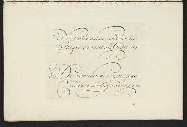
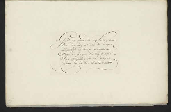
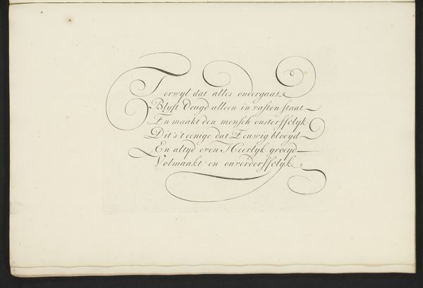
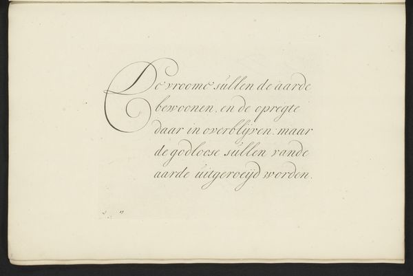
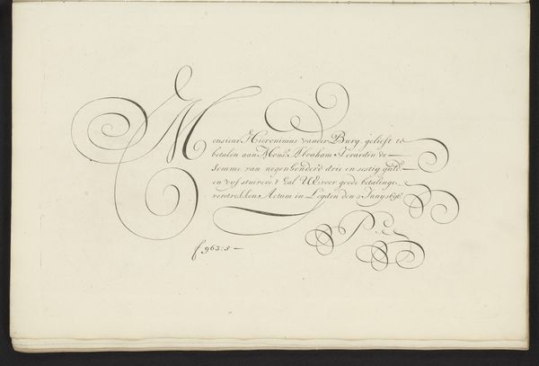
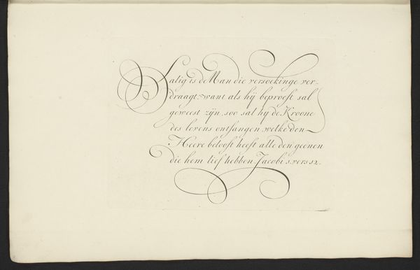
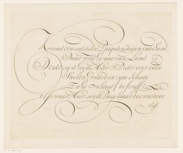
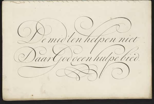
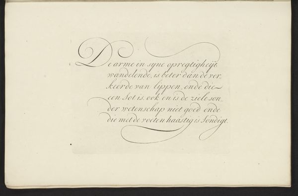
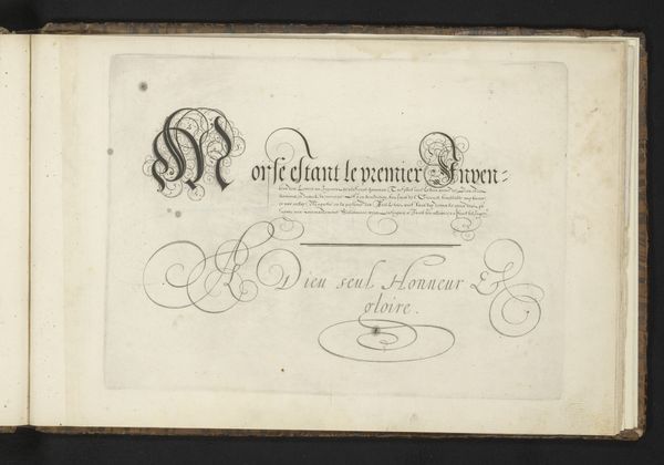
Bastiaan Boers created this elegant calligraphic work, “Schrijfvoorbeeld: Die trots is van gemoed,” using ink on paper. The eye is immediately drawn to the flowing, ornate script, which dominates the composition. The lines swell and taper, creating a delicate dance between thick and thin strokes, a characteristic of the Dutch calligraphy of the time. The overall effect is one of restrained elegance. The text itself, divided into two stanzas, is not merely informational, but becomes a visual element through its arrangement and the inherent beauty of the lettering. The negative space around the text is as important as the inked lines, providing balance and allowing each word to breathe. The script's rhythm—its curves and loops—suggest a deep connection to both formal aesthetics and the cultural codes that valued such refined craftsmanship. Consider how the artist uses the semiotic system of calligraphy to challenge fixed meanings, inviting viewers to contemplate not just the literal words, but the artistry embedded within each stroke. It serves as a powerful reminder that art is always open to ongoing interpretation, engaging us in a discourse far beyond its immediate aesthetic appeal.
Comments
No comments
Be the first to comment and join the conversation on the ultimate creative platform.
More like this