drawing, paper, ink
#
drawing
#
paper
#
ink
#
genre-painting
#
northern-renaissance
#
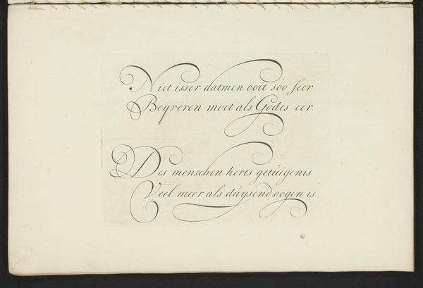
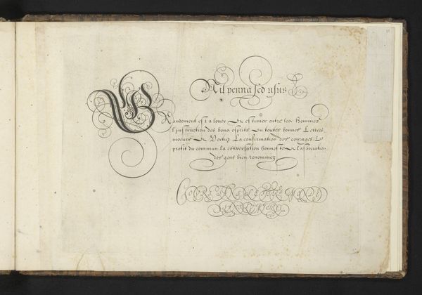
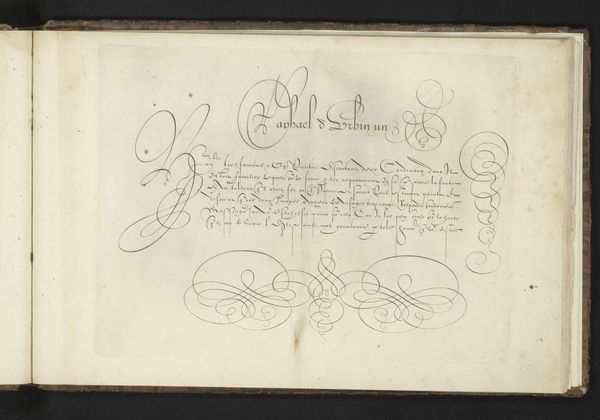
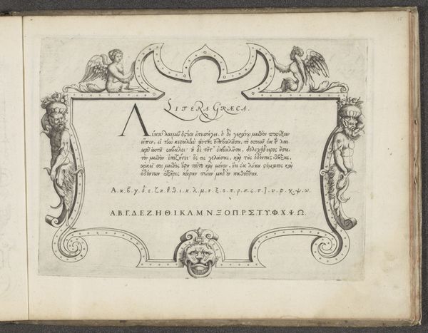
calligraphy
Dimensions: height 197 mm, width 267 mm, height 227 mm, width 345 mm
Copyright: Rijks Museum: Open Domain
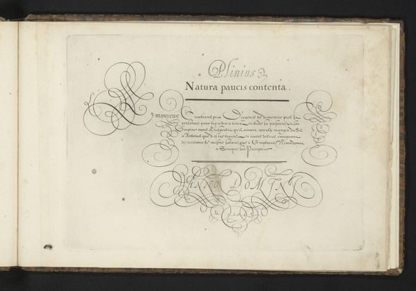
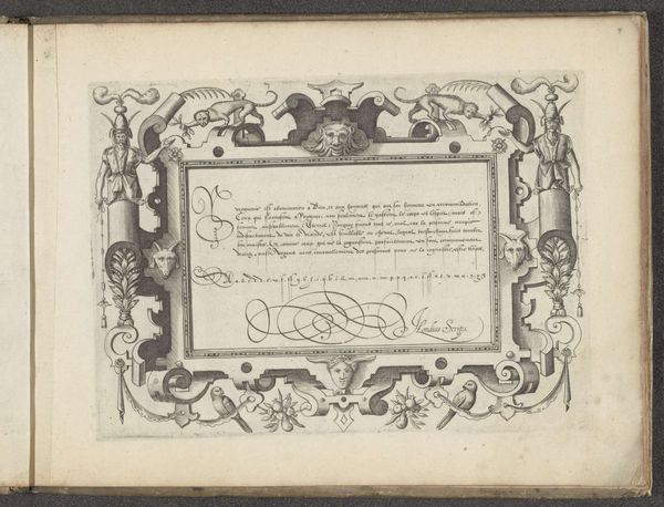
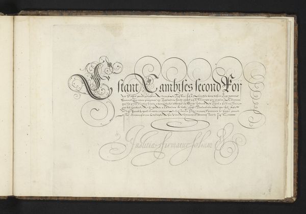
Curator: What strikes me first is the incredible delicacy. The wisps of ink, the careful curves... it's like holding a breath made visible. Editor: Precisely! The work before us is a drawing by Cornelis Dircksz. Boissens, titled "Schrijfvoorbeeld: Moijse estant le premier inventeur (...)," dating back to 1605. Executed in ink on paper, it exemplifies the Northern Renaissance interest in calligraphy, don’t you agree? Curator: Calligraphy elevated to high art! And you can almost feel the quill dancing across the page. It feels reverent, even spiritual. "Dieu seul Honneur et gloire," it says – God alone, honor, and glory. It's all very deliberate, isn't it? This glorification of God? Editor: Certainly. Placed within the context of its time, calligraphy served as a tool for both communication and artistic expression. The visual rhetoric here emphasizes devotion to God—very common during the late Renaissance with different reformations impacting most facets of everyday life. Curator: Mmh, there's a real dance happening on the page – a ballet of dark ink against the light paper. Look at how the capital letters become these swirling forms, so ornamental, contrasting the rigid forms of the writing behind it, like a celebration or…a rebellion, even. Editor: An interesting reading. These extravagant flourishes are indeed a feature in Northern Renaissance calligraphy, used to show an elevated rank or status of the writer. A delicate negotiation with power and devotion, perhaps. But overall, the symmetry and formal nature of the work reflects order, rather than dissent. Curator: I like thinking of it as both at once, order and a secret kind of joy. It makes me feel hopeful for the future. Editor: A sentiment I greatly appreciate. I'm compelled to delve more into similar themes from this era of history.
Comments
No comments
Be the first to comment and join the conversation on the ultimate creative platform.
More like this