1605
Drie Nederlandstalige drempeldichten
Listen to curator's interpretation
Curatorial notes
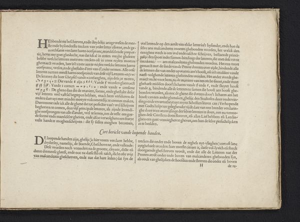
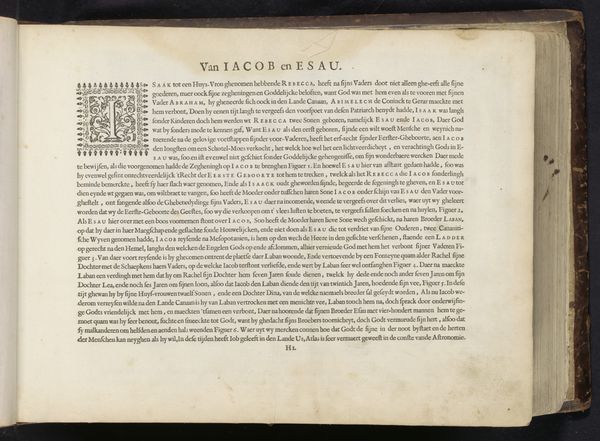
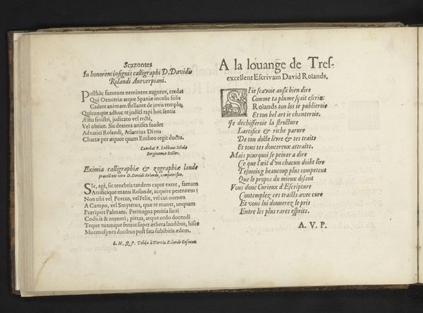
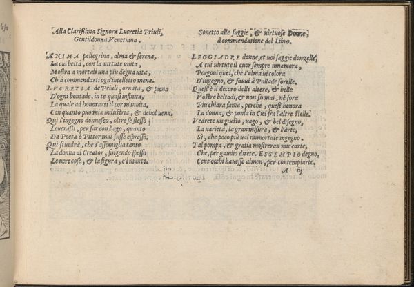
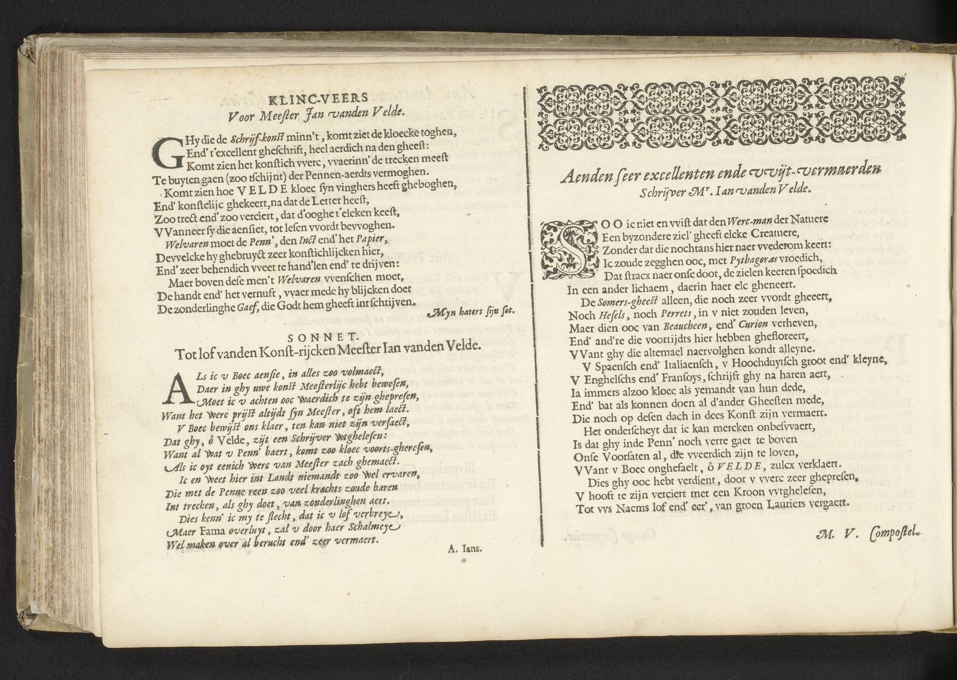
Curator: Welcome to this digital guide. We are looking at "Drie Nederlandstalige drempeldichten" which translates to "Three Dutch Threshold Poems" by Antonius Smyters, printed in 1605. This piece beautifully showcases the art of typography in the Dutch Golden Age. What are your first thoughts? Editor: Woah. It's a wall of elegant text. At first, it seems severe and formal, like a legal document or maybe a theologian's writing, but then I zoom in and the detail in the letterforms becomes truly exquisite. There’s a strong feeling of both artistry and control. Curator: Control is a good word. Formal elements dominate. The blackletter font, or textura, provides a visual texture in itself. Notice how the poems are framed on either side of the pages—a decorative border gives way to justified text. Editor: It reminds me of embroidered samplers, and other woven artifacts. But, yes, as a purely graphic experience, that almost brutal density has a strange attraction. What's the meaning behind these being called "threshold poems?” Curator: They would've been placed at the beginning of a book, a threshold for the reader entering the text. So the artist carefully selects type, layout and, especially, ornaments and tailpieces. Semiotically, this shapes the interpretation of what follows. Editor: So, it is as much design as poem... interesting. These old letterpress layouts required an incredible eye and sense for how words occupy visual space. You can sense the dedication—a meditation almost, within these constructed typographic shapes. The choice of frame for the verses must have been a highly considered act! Curator: Exactly! Each detail plays a role in leading the eye and engaging the mind before a reader engages with the body of the main text itself. This is something that is lost now with digital layouts. Editor: Right! And this kind of piece invites a completely different interaction—one that rewards patience, stillness... perhaps the way this all appears is, in itself, a 'poem', no? A poem built with type and leading and kerning... Curator: Indeed, this typographic artwork offers layers to consider—from structural elegance to the intimate art of reading. Thank you for adding depth to the encounter. Editor: Thank you. My perspective shifted simply by taking the time to focus and linger within its detailed construction. A fitting lesson offered in its visual architecture!