graphic-art, textile, acrylic-paint, poster
#
graphic-art
#
art-nouveau
#
vienna-secession
#
pattern
#
textile
#
acrylic-paint
#
text
#
geometric
#
sketch
#
abstraction
#
line
#
poster
Dimensions: 42 x 33.5 cm
Copyright: Public domain
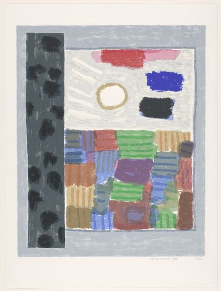
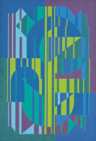
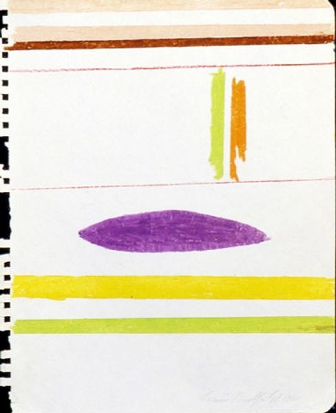
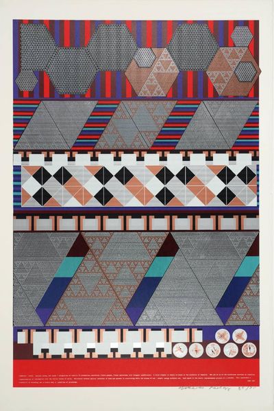
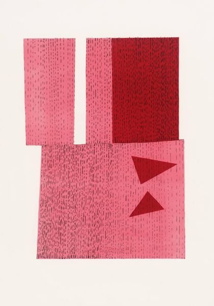
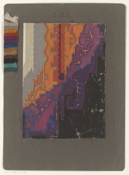
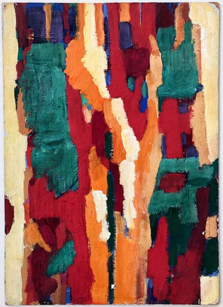
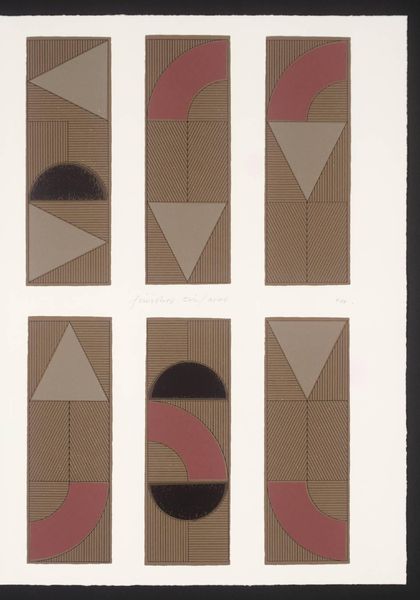
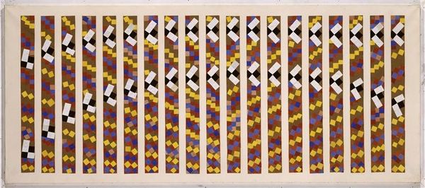
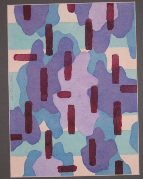
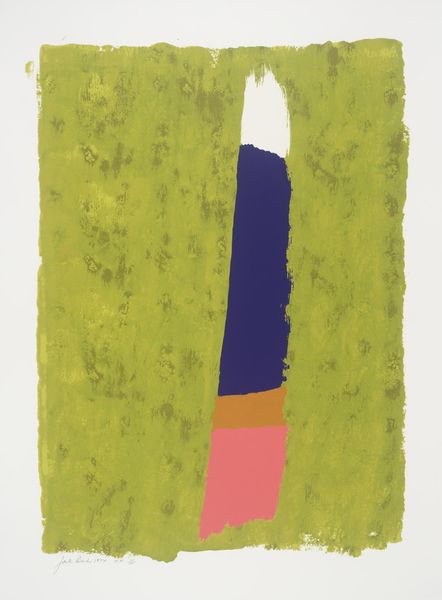
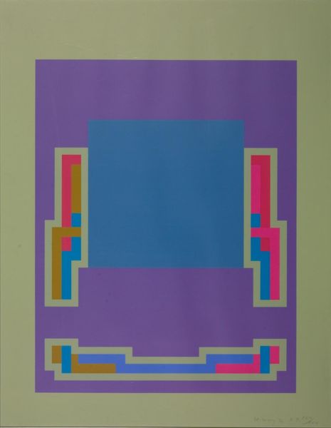
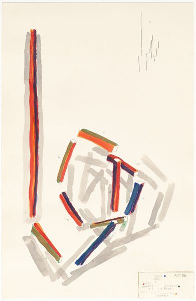
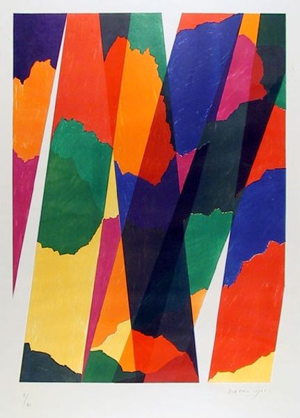
Editor: We're looking at Koloman Moser's "Sketch for a Poster of the Vienna Workshop," created in 1904 using graphic art media like textile, acrylic paint, and poster design techniques. I am immediately struck by how stylized and flat the imagery is. What compositional elements stand out to you in this work? Curator: Indeed. We observe a deliberate emphasis on planar composition and line. Note the near absence of chiaroscuro, forcing the viewer to engage with the relationships between blocks of color. Do you perceive a hierarchy in the arrangement of the geometric and figurative forms? Editor: The figure, with its limited color palette, contrasts sharply with the larger, vibrant green and blue block pattern. Could that signify something about the Vienna Workshop's priorities or aesthetics? Curator: Possibly. Or perhaps, a study in contrasts and balance is the point itself. Consider the figure’s rigidly symmetrical face, rendered almost icon-like, set against the implied dynamism of the wavy lines down the center. Does that create tension or harmony? Editor: It feels a bit tense, almost as if the figure is constrained by the rigid design elements. What does the formal analysis reveal about Moser's intentions? Curator: Formalism doesn’t venture to explain ‘intentions’, only to meticulously describe and decode. The essence resides in how elements relate: color, shape, line. The poster reduces form to pure graphic information. Perhaps to demonstrate modernity and rational artistic process. What new understandings did we reveal through that close looking? Editor: By really focusing on those design relationships, I see how it’s not just decorative, but structurally meaningful in its visual language and constraints.
Comments
No comments
Be the first to comment and join the conversation on the ultimate creative platform.
