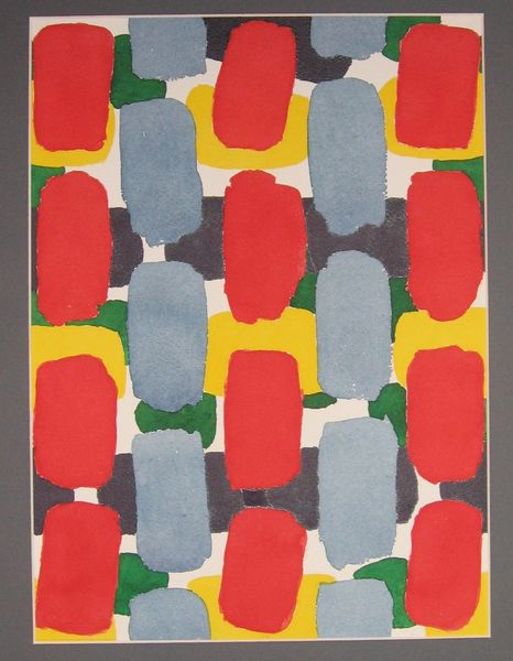
watercolor
#
editorial print
#
printed
#
pastel soft colours
#
pattern
#
pastel colours
#
watercolor
#
geometric
#
bright pastel
#
abstraction
#
pastel tone
#
pattern repetition
#
imprinted textile
#
layered pattern
#
printed materiality
Copyright: Hryhorii Havrylenko,Fair Use
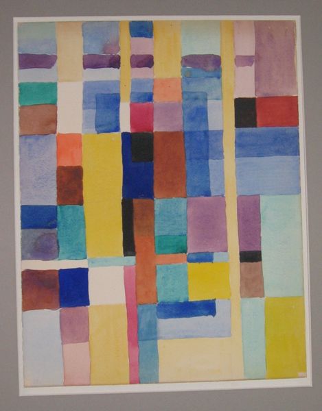
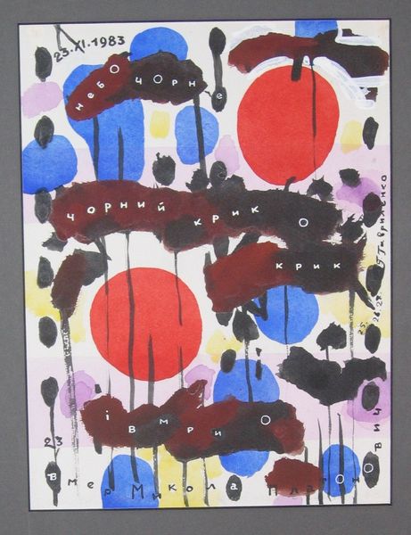
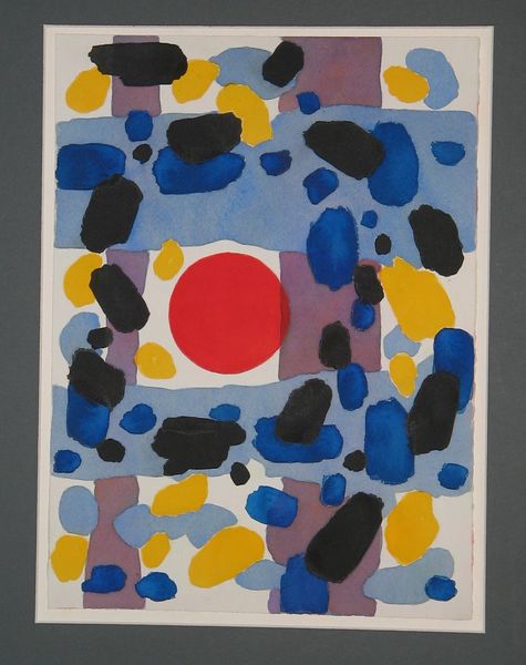
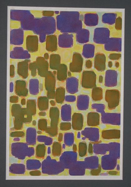
Hryhorii Havrylenko made this 'Composition' sometime in the 20th century with what looks like watercolor. The color palette is muted, a mix of blues, purples, and reds that feel both calming and quietly intense. The shapes are soft and organic, but the composition has a rigid order to it. Look at how the washes of watercolor bleed and blend, creating depth and texture. The dark red marks, almost like bars, are placed over these shapes, creating a tension between the fluid background and the structured foreground. It's like Havrylenko is setting up a conversation between freedom and control, between the accidental and the deliberate. There's something about this piece that reminds me of Agnes Martin, the way she used repetition and subtle color to create these meditative spaces. But Havrylenko has his own voice, his own way of balancing chaos and order. It’s this ambiguity that makes the piece so compelling; it invites you to bring your own experiences and emotions to the surface.
Comments
No comments
Be the first to comment and join the conversation on the ultimate creative platform.
More like this