#
script typeface
#
script typography
#
hand-lettering
#
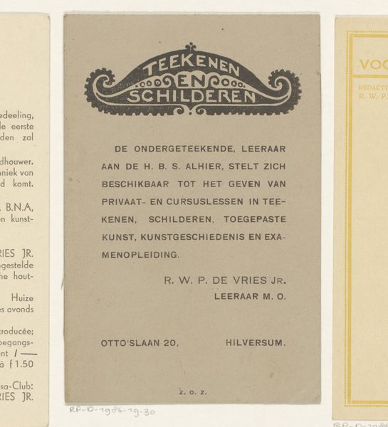
hand drawn type
#
hand lettering
#
hand-drawn typeface
#
thick font
#
golden font
#
word imagery
#
small lettering
Dimensions: height 34 cm, width 27 cm
Copyright: Rijks Museum: Open Domain
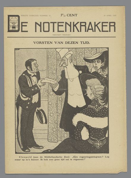
Curator: Here we have a piece entitled "Lied voor de Russische Kinderen," or "Song for the Russian Children" in English, dated 1921. The music is by Rosy Wertheim. Editor: The first thing that strikes me is how art nouveau it feels. Those stylized wheat shafts and the curlicued letters give a comforting sort of vibe which I guess maybe masks a more sorrowful sentiment lurking behind the work. Curator: That sorrow definitely resonates. Look closer, and you begin to perceive echoes of hardship woven into the design itself. Consider how the lettering mimics hand-drawn typeface of the era, indicative of its creation. Editor: I see that. It reminds me of protest posters, mixing vulnerability and conviction. It is more urgent than pretty. And what’s the significance of the wheat shaft symbol at the top? Is that referencing food shortage at that time? Curator: Exactly! Wheat often carries a heavy weight in iconography, symbolizing abundance, sustenance, and hope—but also famine, especially pertinent given the context of post-revolution Russia. In this work, it likely nods towards the severe food shortages affecting Russian children. Editor: It becomes clearer now, with this information. The title combined with the wheat gives off mixed emotions. It's the hope of help alongside the acknowledgment of deep need. The fact that it was sung by 60 Dutch children emphasizes that sense of care and responsibility, of children singing for children. Curator: Yes, and that performance context really illuminates the artwork’s emotional core, bringing to light the universality of childhood fragility, resonating especially in periods marked by profound socio-political unrest. The small angel right above the composer's name enforces such tenderness and caring. Editor: Looking at it now, I feel a deeper connection. It is as though this vintage image becomes a call back across time reminding us of our shared humanity in the face of suffering. Curator: Precisely, its endurance transforms it into a timeless symbol representing empathy and collective action during dire times, urging compassion beyond borders.
Comments
No comments
Be the first to comment and join the conversation on the ultimate creative platform.
More like this