print, typography, engraving
old engraving style
hand drawn type
typography
romanticism
decorative-art
engraving
Dimensions: height 180 mm, width 110 mm
Copyright: Rijks Museum: Open Domain
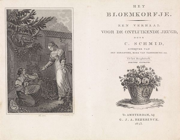
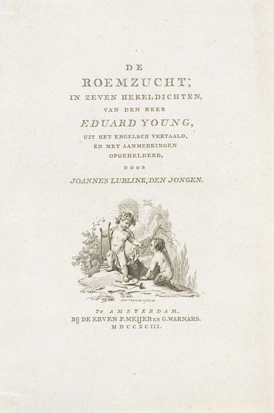
Curator: This is the title page for "Het Bloemkorfje," or "The Flower Basket," from 1828, made by Abraham Veelwaard. It is an engraving, showcasing typography and decorative art common to Romanticism. Editor: It’s delicate, almost ephemeral, isn't it? There’s a certain naive charm, but the black and white contrasts are pretty stark. There is also a heavy contrast between text and image, which gives the piece some dynamism. Curator: Yes, the flower basket image holds a specific appeal. Consider flowers themselves as potent symbols, often representing innocence, fragility, but also a hidden, powerful resilience and continuation through blooms and seeds. Baskets also signify an abundant container of domestic bliss. How interesting that those things appear to preface something described as being for "the developing youth." Editor: I see a constructed, almost curated image of youth itself being presented. What is deliberately on display and being presented versus that which has been consciously discarded? In 1828, childhood was being increasingly idealized. Was there a specific societal anxiety this object aimed to alleviate or distract from? Curator: Very possibly. The Romantic era embraced an idealized vision of the world. What message would this composition convey at a time when childhood and moral storytelling were closely interwoven? Is this engraving inviting readers toward virtue and beauty as seen through the flower basket, or is it selling something quite contrived and controlled by outside ideas and standards? Editor: Exactly. "The developing youth" are presented with something controlled, fragile and idealized as the basis of their upbringing and, as we now understand, this imposed ideal doesn’t reflect the complicated realities of living and the complexities of existing and self discovery that children would, invariably, face. It brings up so many tensions and contradictions. Curator: Thinking of it that way brings a somber note to the delicate appearance of this piece. Editor: Right. But somberness is sometimes needed to move beyond the facade.
Comments
No comments
Be the first to comment and join the conversation on the ultimate creative platform.