#
script typography
#
hand-lettering
#
old engraving style
#
hand drawn type
#
hand lettering
#
hand-drawn typeface
#
stylized text
#
thick font
#
handwritten font
#
historical font
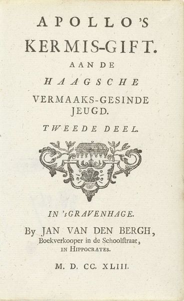
Dimensions: height 152 mm, width 95 mm
Copyright: Rijks Museum: Open Domain
Editor: So, here we have the title page for *Apollo’s Kermis-Gift, Part 1* from 1743, by Jan van den Bergh. Looking at the engraved typography, it’s so formal and yet festive. What stands out to you in this work? Curator: What strikes me is the intended audience: the "Haagsche Jeugd"—the youth of The Hague. “Kermis-Gift,” or carnival gift, hints at playful content. The presence of Apollo, god of music and arts, subtly elevates this entertainment, imbuing it with cultural significance. Consider the role of printed material in shaping the identities of young people during the Enlightenment. How did access to such works reinforce or challenge existing social hierarchies? Editor: That's fascinating, the idea of accessible material subtly reinforcing class. Curator: Exactly. While seemingly lighthearted, it's important to consider who *had* access to such material. The typography itself, with its decorative flourishes, signals a level of craft and expense. The location listed—"in the Schoolstraat, in Hippocrates"—connects the text to a specific place of learning and commerce. Editor: So even something as simple as a title page offers insights into social and educational structures. Curator: Precisely! It prompts us to question whose voices were amplified and whose were marginalized within these emerging public spheres of knowledge and amusement. What stories are *not* being told here? Editor: I hadn't thought about it that way. Now I see how this title page functions as a cultural artifact, hinting at deeper social and political dynamics. Curator: And that, ultimately, is where the real value lies – in excavating these hidden narratives.
Comments
No comments
Be the first to comment and join the conversation on the ultimate creative platform.
More like this