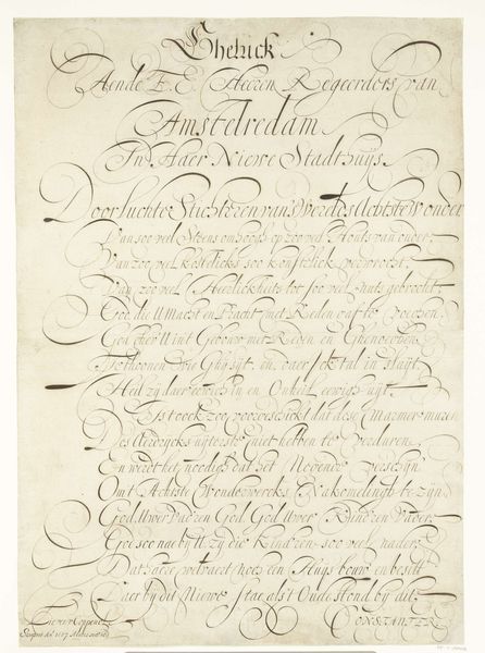
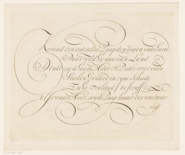
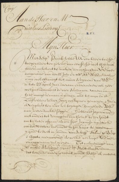
Kalligrafisch schrift gewijd aan de kaarten van de aarde en de hemel in de vloer van het Amsterdamse Stadhuis 1657
0:00
0:00
lievenwillemszcoppenol
Rijksmuseum
drawing, paper, ink
#
drawing
#
narrative-art
#
baroque
#
dutch-golden-age
#
paper
#
ink
#
geometric
#
calligraphy
Dimensions: height 710 mm, width 505 mm
Copyright: Rijks Museum: Open Domain
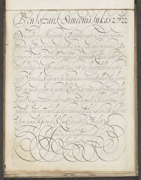
Curator: This intricate calligraphic drawing, rendered in ink on paper, comes from the hand of Lieven Willemsz. Coppenol in 1657. It’s titled “Calligraphic script dedicated to the maps of the earth and the sky in the floor of the Amsterdam City Hall” and is currently held at the Rijksmuseum. Editor: My immediate impression is that the artist wanted to make script into image. Look how the dense and ornate calligraphy creates visual weight and directional flow, like a well-composed painting! It's mesmerizing. Curator: Absolutely. The piece exemplifies Dutch Golden Age calligraphy, and beyond that, offers social commentary. The Amsterdam City Hall was a center of governance and commerce. To dedicate this art to its floors links terrestrial and celestial maps and, by implication, connects civic and divine authority. Editor: Right. And from a formal perspective, we see masterful use of line—the thick and thin strokes creating dynamism and rhythm. Note, too, the almost geometric organization underlying the apparent freedom of the script. There's deliberate structure there, creating a hierarchy on the page. Curator: Exactly. Consider, too, the labour involved. This isn’t mere writing; it's skilled craftmanship meant to instruct visitors about cosmological order, and in so doing it reflects civic pride. One wonders who were the intended viewers for this statement of cultural values. Editor: The flourish becomes philosophical. The looping ascenders and descenders add a tactile quality to this symbolic discourse on Earth and Sky. The baroque elegance seems less about immediate legibility and more about profound visual engagement with civic identity and virtue. Curator: Perhaps such visual emphasis helped establish clear distinctions about Amsterdam as a cultural center in an increasingly interconnected world economy. Editor: Looking closely, you are able to see that beyond the functional and artful skill involved in making the script, Coppenol crafted more than just an example of accomplished calligraphy, he invites one to think more deeply about Amsterdam’s Golden Age relationship to knowledge.
Comments
No comments
Be the first to comment and join the conversation on the ultimate creative platform.
More like this