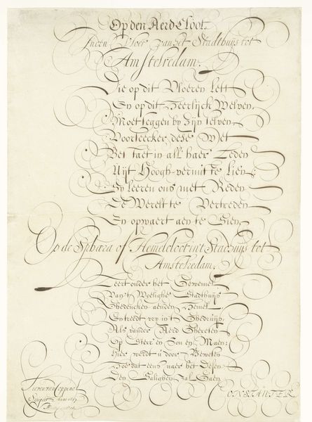
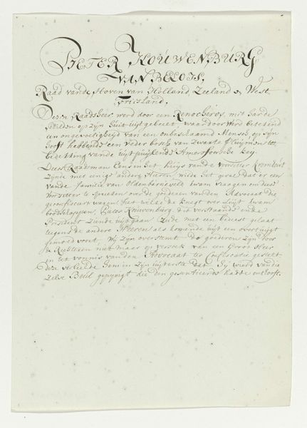
Kalligrafisch schrift opgedragen aan het stadsbestuur van Amsterdam ter gelegenheid van het nieuwe Stadhuis 1657
0:00
0:00
lievenwillemszcoppenol
Rijksmuseum
drawing, paper, ink
#
portrait
#
drawing
#
dutch-golden-age
#
paper
#
ink
#
calligraphy
Dimensions: height 706 mm, width 504 mm
Copyright: Rijks Museum: Open Domain
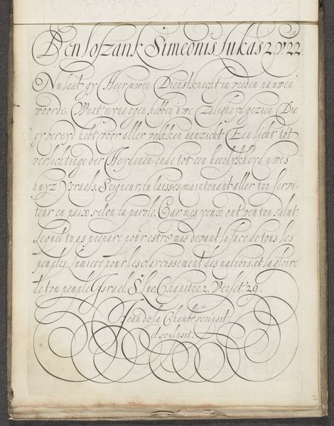
Editor: This striking piece is called "Kalligrafisch schrift opgedragen aan het stadsbestuur van Amsterdam ter gelegenheid van het nieuwe Stadhuis," or "Calligraphic Writing Dedicated to the Amsterdam City Government on the Occasion of the New Town Hall," created in 1657 by Lieven Willemsz. Coppenol. It's crafted with ink on paper. I'm immediately drawn to the rhythm and flow of the lines, the dramatic thicks and thins of the script. What do you see in this work, looking beyond its function as a piece of writing? Curator: The inherent tension between the order of language and the exuberance of ornamental line work is what captivates me. Consider the composition as a visual event. Each stroke is a deliberate mark, contributing to a dynamic whole, like a carefully orchestrated dance. The interplay between positive and negative space creates a push and pull effect, where legibility vies with pure, unadulterated form. Observe how the flourishes act as counterpoints to the text. Editor: So, the script isn’t just about communicating a message, but more about the aesthetics of writing itself? Curator: Precisely! In this piece, Coppenol uses calligraphy to move beyond the textual. Ask yourself: What does the weight of each line communicate? How does the texture created by the ink’s varying density affect your reading of the script as form? Note how Coppenol isn't simply transcribing but constructing. He gives concrete form to what would otherwise be incorporeal. Editor: That's fascinating. I hadn't considered the varying weight of the lines and how that contributes to a sense of depth and texture. The "performance" of the line really enhances the effect of formality, almost architectural, similar to the New Town Hall itself! Curator: Indeed! And perhaps the grandness of the strokes are deliberately arranged to emphasize the greatness of Amsterdam and its new hall. Form itself takes centre stage, superseding all other qualities and functions, so a new interpretation takes hold. Editor: I now see this calligraphy as less about communication, and more as the convergence of visual forces with powerful forms, rhythm and dynamism, making me truly reconsider my approach to works like this! Curator: Agreed. By isolating form from content, we reveal its latent energy and appreciate its intrinsic value.
Comments
No comments
Be the first to comment and join the conversation on the ultimate creative platform.
More like this